

Hyphenation is one of those typographic details that can easily be overlooked by designers and production artists who might take for granted that their software will handle it all OK. But while today’s design applications are quite robust and have the capacity to fine-tune type, it is up to the user to determine if, when, and how much to hyphenate, and to set the software to behave accordingly.
Hyphenated words are a necessary evil in much typesetting, especially in narrow columns. When text is set ragged, hyphenation will help create a better looking, tighter rag; for justified text, it will help maintain the natural color and texture of the type, requiring less stretching and squeezing of spaces and characters. Hyphenation also allows more words to fit in a line.
Given that hyphenation settings are a personal preference, it is generally considered acceptable to have two consecutive lines ending in a hyphenated word–but no more. Be careful not to have too many hyphenated line endings in a paragraph, even if they are not in successive rows, as this will affect readability. In addition, it is considered typographically undesirable to have two-letter hyphenation breaks at either the beginning or the end of a word.
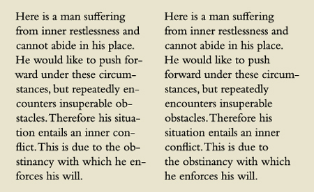
The setting on the left contains an unacceptable eight hyphens in a row, including two-letter breaks, all of which reduce readability and comprehension. The text on the right is greatly improved, containing only one hyphenated word.
Some people (designers and clients alike) dislike hyphenation and avoid it entirely. I caution against this all-or-nothing perspective, as the occasional hyphenation in a mostly unhyphenated text can make a big improvement. For instance, wide columns can often go without hyphenations except for the occasional manually inserted hyphen to fix a bad rag here and there. In addition, setting text that contains numerous long words (such as medical or pharmaceutical copy), as well as text set in foreign languages with very long words (such as German), can result in a rag that is extremely deep and unattractive; in these instances, the addition of the occasional hyphenated word can improve the rag, making for a cleaner, neater appearance.
Hyphenation Settings
Today’s design software allows you to customize the hyphenation settings to your liking. But if you don’t explore this option, you are stuck with the defaults, surrendering control of your type to your software. Most defaults are set with hyphenation turned on, and depending on which software you use, can be preset to allow two-letter hyphenations and unlimited hyphenations in a row. At the bare minimum, I recommend changing the default settings to allow a minimum of three-letter hyphenations and no more than two in a row. In addition, it is a good practice to deselect Hyphenate Capitalized Words, Last Words, and Across Columns, all of which can result in some mighty unattractive and undesirable word breaks if left selected.
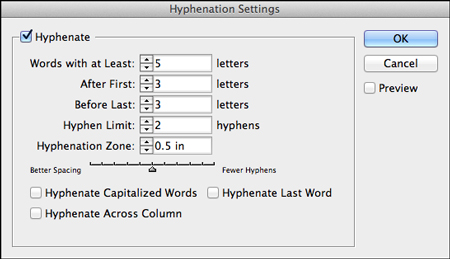
InDesign’s Hyphenation Settings Panel showing my recommended baseline settings, which differ from the built-in defaults.
InDesign’s Hyphenation Settings Panel has several other options to help you control your type. If you don’t want short words hyphenated, you can increase the Words with at Least option. Hyphenation Zone and Hyphenation Slider are two other settings you can play around with to adjust the location and quantity of hyphenations. I confess I do not alter these settings, preferring to manually adjust rags in order to have complete control. But for large projects with lots of text and multiple pages, you might want to explore them to help automate your software to achieve the best results with the least amount of manual fine-tuning.
Discretionary Hyphens
When manually hyphenating a word within text, it is advisable to use a discretionary hyphen rather than a standard hyphen. A discretionary hyphen is visible when a word is hyphenated at the end of the line but disappears if the text reflows and the word in which it’s placed no longer needs to break, eliminating the need for the hyphenation. This way you will avoid those nasty hyphenated words unexpectedly appearing in the middle of a line.
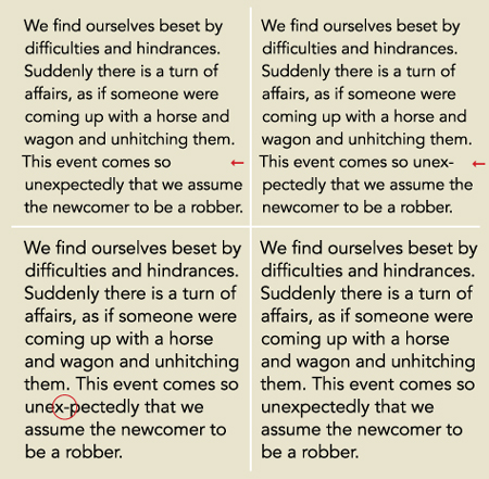
This unhyphenated text has one short line which creates an unbalanced rag (upper left); the addition of one hyphen greatly improves the rag (upper right). When adding manual hyphenation, as in this case, use a discretionary hyphen so that if the setting changes and the hyphen is no longer needed, it will disappear (lower right) rather than remain in the middle of the word (lower left). Excerpts from the I Ching.
Discretionary hyphens can be accessed in InDesign by choosing Type > Insert Special Character > Hyphens and Dashes > Discretionary Hyphen; or, by pressing Command+Shift +hyphen/Ctrl+Shift+hyphen.
This article was last modified on January 13, 2021
This article was first published on April 26, 2013
Commenting is easier and faster when you're logged in!

Recommended for you
TypeTalk: A New Column on Creativepro.com
Welcome to the debut of TypeTalk, a monthly question-and-answer column on typogr...
Make Monograms the Easy Way
Monograms — those symbols made up of two or more overlapping letters...
The Indispensable Adobe Type Primer
Looking for a concise yet thorough and authoritative guide to choosing and setti...