

Press Release
FontShop’s best-selling and most-blogged-about faces span the gamut from traditional to groundbreaking, sober to spirited, and each one deserves a spot in the discerning typographer’s palette.
Click here for links to all of these typefaces.
Panno Text from Bold Monday
Panno Text is a reworking of the previously released Panno Sign. Glyphs and spacing have been fine-tuned, and several weights added, with the goal of adapting the typeface to text settings and sizes.
Alternate glyphs and other OpenType features are included. Central European languages are supported.
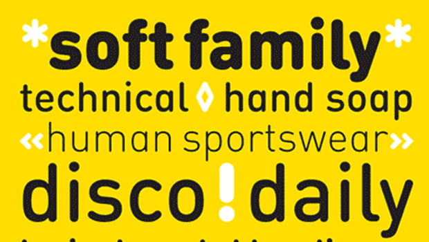
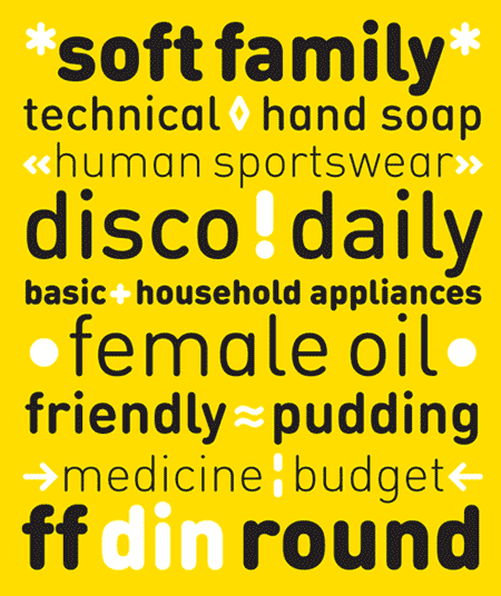
FF DIN Round from FontFont
This welcome addition to FontFont’s most popular family brings a softness to FF DIN’s industrial sterility. FF DIN Round is more than a “search-and-replace” rounded version of its predecessor. Albert-Jan Pool and his team redrew each letterform to maintain the structure of the original. This ensures FF DIN and FF DIN Round will work well together in logos, slogans, price tags, etc. as compatible parts of advertising campaigns and corporate identities. FF DIN Round is not only a good companion to FF DIN, its smooth and friendly curves make it work on its own for branding strategies for family cars, bikes, household appliances, sportswear, shoes, or medical products. It’s also very legible on screen and available in Web format.
FF DIN Web & FF DIN Web Condensed from FontFont
We know a lot of you have been waiting for this one. With its straight sides and open forms, FF DIN was made for the pixel-grid restrictions of the screen. This web-optimized version looks great and reads well whether it’s used for a headline or text. Albert-Jan Pool’s interpretation of the old German road sign typeface is truly poised to take its next historical step: onto the web.
Sense and Sensibility from ShinnType
A super family of two contrasting styles of roman with italic, Sense and Sensibility have matching stem widths, vertical metrics, and horizontal scale. Sense is the new modernist sans serif with a “big” look and lots of weights, and Sensibility its humanist counterpart. Compact, elegant, and strong, Sense commands any kind of page, while Sensibility enlivens it–from the largest headline to the smallest text.
Vinkel from Typolar
Composed, clean and slightly angular, as its name says–warm and round in the right places too. The sans serif type family Vinkel is a handsome hybrid with an excellent balance of neo-grotesque and humanist DNA. Vinkel comes in eight weights from Thin to Extra Black, all with italics, small caps, several sets of numerals, arrows, alternate characters, and more.
Brevia from HVD Fonts
Though it’s soft with brush-made details, Brevia’s structure is straight, making it work for longer texts. Its very large x-height also allows it to perform nicely in very small sizes. The design is ideal for cosmetics, service, food, and advertising environments – anywhere a pleasant feeling should be conveyed. Equipped for professional use, the large family includes an extended character set to support Central and Eastern European as well as Western European languages, small caps, a full figure set, and a set of arrows.
Aktiv Grotesk from Dalton Maag
Helvetica may be the world’s most popular typeface but one man is having none of it. Type designer Bruno Maag of Dalton Maag views the ubiquitous modernist typeface’s popularity with a mixture of bemusement and irritation. So he has decided to do something about it. With the Dalton Maag team he has created Aktiv Grotesk, a typeface designed to provide an alternative (and, he hopes, improvement) to Helvetica.
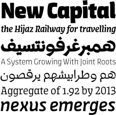
FF Amman from FontFont
FF Amman is one of the largest bilingual families ever made, one of the few designed bilingually from scratch and the first containing true Arabic italics. The project began as Yanone’s graduation project at Bauhaus University in Weimar, Germany. In late 2008, Yanone set out to Amman, the capital of Jordan, to re-brand the municipality in preparation of its centennial celebrations. The typeface with several typographic novelties has been used widely for all kinds of municipal services in Amman. The family consists of seven sans and four serif weights, each with their true italics and both Latin and Arabic character sets.
Parry (Updated) from OurType
Both the serifed Parry and its sans counterpart Parry Grotesque have been updated to include four new weights: Ultra Thin, Thin, Light, and Extra Black. This update also includes fine-tuned glyphs and spacing, as well as Pro character sets for every weight.
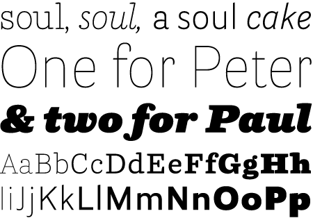
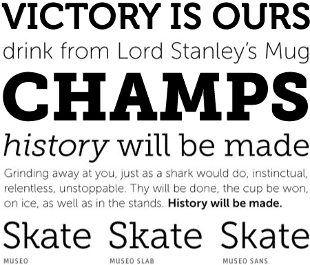
Museo from exljbris
This highly original design began with the letter ‘U’, a single stroke with ends bent to form slab-like terminals. From that design Buivenga developed a lowercase, then additional weights, and eventually a matching Sans family and a more conventional Slab family. All three variations are clean, legible faces and excellent alternatives to overused typefaces from the entire spectrum of sans and slab serif classifications.
Tanger Serif from Typolar
From its nearly monolinear Ultra Light to the curvaceous Heavy, Tanger Serif represents a broad mix of unusual style and design decisions that somehow come together as a single, versatile family. And this family is a large one: three widths, each with seven weights. A full range of small caps and figures are included. Extended Latin support too.
FF Suhmo from FontFont
Inspired by classic typewriter fonts such as Courier and American Typewriter, Suhmo shares their ability to work well in both headlines and text. But this face is decidedly contemporary, with a subtle playfulness in its loops and swashes and a slight stroke contrast. The forms are derived from the handwriting process and often cross the baseline or the x-height. Suhmo’s extensive character set includes numerous special characters and ligatures, several figure sets and small caps throughout all 8 styles.
Magneta from TypeTrust
Magneta is a crisp, contemporary new serif face by Neil Summerour designed for editorial, headlines, or where more visually complex systems are needed. The Normal and Condensed widths are available in six different weights with matching italics, small caps, oldstyle figures, swashes, stylistic and discretionary ligatures. Majuscule ligatures in the roman styles and a set of decorative ornaments–including geometric, floral, curvilinear patterns and much more–add some spice to the family.
Skolar from TypeTogether
David B?ezina designed Skolar with scholarly and multilingual publications in mind. The typeface maintains its credibility while incorporating a subtle personal style, neither neutral nor conspicuous. Prominent serifs and low-contrast modulation add to its robustness, and, together with a relatively large x-height, improves the typeface’s readability in small sizes. This six-weight family and large character set is flexible enough for complex text settings and editorial work.
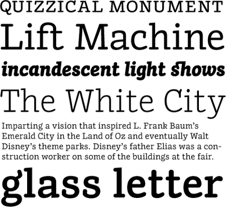
Tabac from Tomáš Brousil
Tomáš Brousil’s Tabac is a versatile type system for books, magazines, and newspapers. An Old Style type with vertical stress, open letter forms, distinct wedge-shaped serifs, a slightly reduced cap height, and a large x-height provides the basis for this expansive suite of typefaces. The four grades address every possible application, from the crisp, high contrast of Grade 1 for display setting, to the sturdy shapes of Grade 4 for small text and printing in less than ideal conditions. The fully-featured OpenType fonts include small caps, nine sets of numerals, and numerous symbols specifically aimed at the newspaper and magazine market, like arrows, stars, playing card and chess dingbats, weather icons, and so on.
Fayon from OurType
A fresh take on the Didot style, OurType Fayon is a contemporary, high performance family for text. Designed by Peter Mohr.
Available in 7 weights with accompanying italics. Central European language support included in Pro versions. See the various OpenType features available in Fayon OT and Fayon Pro.
Go to page 2 for even more of the best!
This article was last modified on August 12, 2021
This article was first published on December 29, 2010
Commenting is easier and faster when you're logged in!

Recommended for you
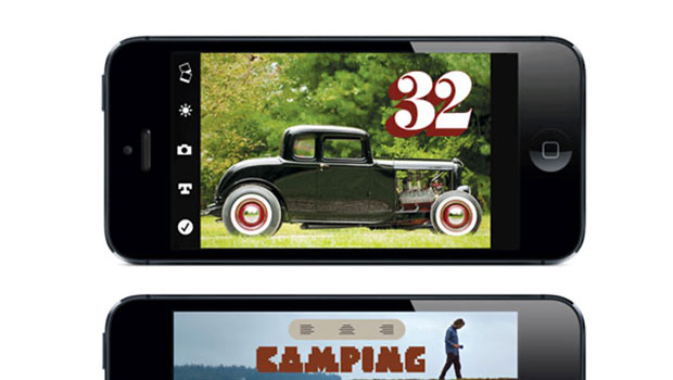
Free Photo-lettering App from House Industries
House Industries is known for producing high-quality typefaces and artwork, as w...
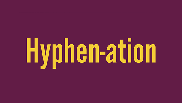
Take Control of Your Hyphenation
Hyphenated words are a necessary evil in most typesetting, especially in narrow...

Willoughby Design and the Evolution of a Typographic Paper Promo
Nothing makes a designer happier than paper and type. So when Neenah Paper asked...