


I learned the hard way; you don’t have to.
This year, determined to use the technology I so regularly write about, I decided to send out digitally printed Christmas cards to friends and family. But I leapt headfirst into an online printing service only to find that hindsight is indeed 20/20. The final card, featuring a nicely printed but highly oversaturated family photograph, has garnered compliments from friends and family, so perhaps I’m overcritical, but I feel entitled. The experience of preparing and ordering the card showed me firsthand some of the technology’s weaknesses, and how some rookie mistakes can affect the job.
Caveat Printer Emptor
This is where I have to provide a caveat. I spend so much time writing about publishing technology that I’m not left with a lot of time to actually do a lot of digital publishing. That’s why I latched onto the idea of ordering my cards from a dot-com printer this year, but it’s also why I consider myself representative of thousands of folks out there that are smarter than the average bear when it comes to technology, but hardly an in-the-trenches, practicing expert. In other words, I represent a vast segment of the consumer or “prosumer” market. If I have problems so too will many other folks.
As I said, the cards have engendered a lot of compliments — something a Christmas card has never done for me before, which tells me the whole endeavor was a success. The site I used is Shutterfly.com, but the lessons I learned about color management and communication between designer and print partner might apply to other sites and print-buying processes as well.
I choose Shutterfly because I’d received cards from others who used the service; I knew it was backed by Adobe; and I wanted an automated system that would make it easy for me to order the cards and to design them with a template. Its system works like this: You upload your digital images to an “album,” and then you can share those albums online or get prints in the form of, well, prints or greeting cards. Shutterfly prints the cards on a Fuji Frontier digital printer and ships them to you.
The service also automatically analyzes pictures and automatically applies adjustments to improve exposure and color through a technology it calls VividPics. It also allows you, through a few buttons in the browser window, to do things like crop or enlarge photos, make them sepia-toned, and remove red eye. These automatic features may have led to my card’s undoing.
Don’t It Make Her White Dress Blue
So what were my problems? The first came down to that digital adage that what you see onscreen doesn’t look like what you get in print. Indeed, after I scanned my photograph onto my Mac, what I saw in Photoshop on my computer didn’t look like the preview the dot-com offered me in my browser. I’m used to that, though. Because I usually hand art off to a production department, I typically don’t use color management in Photoshop 6.0 and I don’t worry about color. Mercifully, that’s always someone else’s baby.
Still, I have come to recognize that whites appear bluish when I look at them onscreen in Photoshop, and indeed that was the case with the photo I scanned for my card (see figure 1). I actually trusted the color JPEG preview in Navigator much more than the color of the same image in Photoshop –the flesh tones looked pretty healthy, the blue tint in my daughter’s white dress was gone — so I felt pretty good about the photo as I set about to order the cards.

Figure 1: The photo of the happy family was first scanned into Photoshop. Note the expected bluish cast to the pants and dress.
As I went through the ordering process, however, I began to have doubts. The site was streaming me through decisions about how I wanted to have the cards mailed and prompting me to choose templated borders and greetings. I began to get nervous when it really sunk in that there was no other proof besides the interactive preview I saw onscreen. I began to worry that the photo’s bluish cast would reappear in print, and I had jumped into the ordering process without perusing any of the “how we work”-type pages, so I wasn’t aware that there would be automatic corrections applied.
I began to hope that an individual smarter than myself would be intercepting the order and viewing the photo to make sure it was perfect, and I thought how nice it would be if the service would incorporate a PDF proof stage, so that I could view the color in yet another application for reassurance, or print to a color device to check hues, balance, and saturation.
On top of this, I completely missed the tabbed image-editing panel in the lower-right portion of the screen: Not until I retraced my footsteps after the fact did I see that I could do some manual editing right there in the browser by clicking in the image to remove red-eye, or choose an effect such as Soft Focus or Sepia. More importantly, I didn’t see that I could scroll down and choose to cancel the automatic color correction capability — which would have alerted me to the fact that automatic correction was going to be applied (see figure 2). Ironically, then, automatic color corrections were indeed made to my image, which makes me even more frustrated that the skin tones still came out too yellow and the shadows too dark — far more so than they appeared in Photoshop or in my browser.
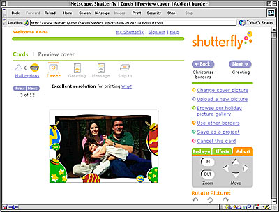
Figure 2: In Shutterfly’s online preview, the option to turn off automatic color correction appears when you scroll down past the Effects tab in the lower right corner.
As most of my complaints about my cards have to do with color management, I’ll shoulder half the blame, because I really can’t say where the process broke down. Was it because of how Photoshop vs. Navigator rendered the color, or how my system vs. Shutterfly’s understood the colors, or does Shutterfly’s VividPics image enhancement technology leave something to be desired?
In any case, aside from the color problem, the print quality was excellent. The cards were digitally imaged on photographic paper, which is a heavy, bright stock that’s archive quality and fade resistant; the lettering is crisp and sharp. And the cards were delivered to my doorstep within a couple of days, a fact that I can hardly complain about. Yet considering the cost of the service, I think I’m entitled to a few gripes: These cards weren’t cheap. They cost more than three times their traditional analog counterparts.

Figure 3: The final card, scanned and saved as a JPEG in Photoshop: Note the yellow skin tones.
Take Note
Why should you care about my digital Christmas cards? Because I hope you can learn from my mistakes. If you plan on using an online printing service, whether for the holidays or for other purposes, take note of the following:
- First, pay a little more attention (or rather, just pay attention) to the color and quality of your image in Photoshop. Don’t rush through the editing process, and get it to look right before you upload it to a dot-com printer.
- Before you buy the service, make sure you know what you’re requesting: Read the FAQ and About Our Service pages so that you provide them with the best possible image for their systems and presses, and so that you have a clear understanding of whether and how the company will touch up your images — and opt to have them not touched up if you’re like the file the way you submitted it.
The Human Touch
I must say, however, that if I go this route next year, I might seek out a dot-com where I know that a real live person, a professional, is going study the art I provide and make sure I’m not shooting myself in the foot with my lousy photo-editing skills. Online and digital printing is all about “streamlining” and “automating” processes and while those things might be good for the printer, I’m not convinced that those concepts are as good — or as technologically ready for prime time — for average consumers.
There’s a reason writers like me are always harping on the importance of communication between print provider and design professional: The human element in the print buying experience cannot be undervalued, even with technology as advanced as it is today. And as long as we consumers are going to be paying a premium for digital technologies and services, we really should be assured that we’ll get what we want. That’s what will keep these dot-com printers in business, not technology that automates print order processes and automatically removes red-eye.
Read more by Anita Dennis,
Full-disclosure alert: creativepro.com is owned by PrintingForLess.com, a Web site that facilitates four-color printing over the Internet. To read about the services provided by PrintingForLess.com , click here. — The editor
This article was last modified on December 13, 2001
This article was first published on December 13, 2001
Commenting is easier and faster when you're logged in!

Recommended for you

How to Use the Adaptive Wide Angle Filter in Photoshop
Grossly distorted wide angle photographs are ugly and confusing. Photoshop...

How to Create Panoramas in Lightroom
As with a lot of things in digital photography, creating panoramas was once more...

InDesign How-to Video: Move Layers From InDesign to Photoshop
In this week’s InDesignSecrets video, David Blatner shows off a script to send a...