


By and large, fractions are a hassle to typeset, so work-arounds have become the norm. However, there are some occasions that demand fractions. Maybe we’ve gotten used to referring to business-sized paper as “8.5 by 11 inches,” but a hat size of “6.875”? It just won’t do.
Fractions come in three basic forms, as shown here:
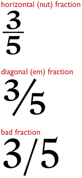
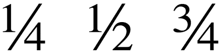
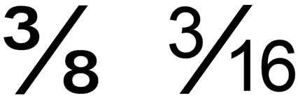
Almost all fonts contain some pre-built fractions, and some OpenType fonts allow OpenType-savvy applications to build good-looking case fractions automatically. If you’re after nut fractions (so-called because the single-digit variety are one en—a.k.a. a nut—wide) you’ll probably have to build them laboriously yourself, because very few fonts contain them. Virtually all text fonts include the following pre-built diaganol fractions:
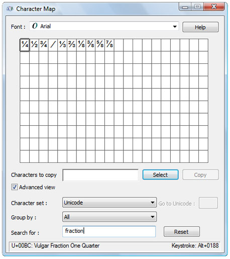
But some contain more, and Windows and OS X give you the tools to find them. On a Mac, open Font Book, select the font you’re interested in, and select Repertoire from the Preview menu. This shows you the font’s complete character set, and you can rummage around to see what’s on offer. Windows Character Map (found in the Program menu) does a better job of this. Having selected the font you want to investigate, use Search to look for “fraction.” All the fractions in the font will be displayed, as well as the fraction bar, the character used for separating numerator from denominator.
Searching for the word fraction in Windows Character Map reveals all the fractions in a font. From here you can paste them into your pages.
Things get more complicated when you want fractions that aren’t on the menu, so to speak: for example, sixteenths or hundredths. The easiest route is to use an OpenType font with a layout feature that allows fractions to be created automatically. Most so-called “pro” OpenType fonts have this capability. To see if a particular font supports this feature, choose the font in your program’s Character panel or tool bar and use the OpenType menu to see what layout features it offers.
To do this in InDesign, select OpenType from the Character menu, and a flyout shows what features are available. Those in [brackets] are not available. Clicking a feature turns it on. You do the same in QuarkXPress, but you access the list by clicking on the OpenType icon in the Measurements palette.
When you’ve selected the OpenType Fractions option, every time the program sees numerals separated by a slash ( / ; also known as a virgule, or solidus), it will convert the sequence into a fraction. If you apply the option to selected text, all numeral-slash-numeral sequences in it will be converted. If you turn on fraction-building with no text selected, any numeral-slash-numeral sequences typed in from the current cursor position onward will be converted.
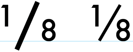
During this conversion, the program replaces the slash with a fraction bar.
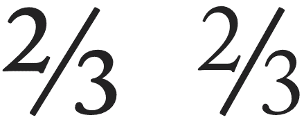
The fraction bar (right) varies from a slash, or solidus (left), in three ways. First, it base aligns (the baseline here is shown in blue), whereas a slash is typically a descending character. Second, it is a kerning character, which causes numerator and denominator characters to snuggle up against it. Third, its weight is designed to harmonize with that of the fraction numerals.
The program also scales down the size of the numeral(s) preceding the fraction bar and raises them up to top-align with it. The numerals following the bar are scaled down to the same percentage and left base-aligned. Many OpenType fonts also prescribe that the scaled-down numerals are made slightly bolder and wider, so they’re more legible and match their weights better with the full-size text around them.
This illustration compares the appearance of an automatically generated OpenType fraction (left) with an equivalent fraction built by hand (right). The OpenType fraction’s numerals are somewhat bolder, making them easier to read.
OpenType fractions are easy to create, but in return you surrender some control over how they look. First, you have no control over the size of the numerators and denominators. And while you can kern the numerals in such a fraction in InDesign, if you try it in QuarkXPress, the fraction will fall apart.
Many OpenType fonts that can’t create fractions this easily still let you get the job done. The trick is to select the numerator numeral(s) and then choose Numerator from the OpenType menu. Do likewise for the denominator numerals using the Denominator OpenType option. You’ll have to set the fraction bar yourself.
If you use a Mac, setting a fraction bar is easy: just type Shift-Option-1. When using Windows, there is no keystroke combination for accessing this character, so you’ll have to paste it into your text using Character Map or the Glyphs panel in InDesign and QuarkXPress.
Fractions without OpenType
Meanwhile, back in the real world, you’re often using fonts that can’t work this magic. This applies to so-called “standard” OpenType fonts as well as the gazillions of PostScript Type 1 and TrueType fonts that predate OpenType.
In these situations, QuarkXPress offers a handy fraction-building tool. Unlike its OpenType fraction controls, you can’t just turn it on and have fractions appear as you type. You need to select the target text first and then select Make Fraction from the Style/Type Style menu.
The controls for defining what your fractions look like are found in the Fraction/Price section of the Preferences menu. Here, the values you choose for type size and position are expressed as percentages, allowing them to apply equally well at any point size or leading.
The offset referred to in the QuarkXPress Fraction/Price dialog box translates into a baseline shift equal to that percentage of the leading.
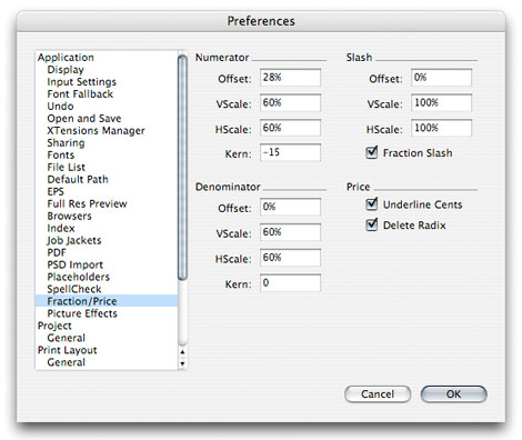
The size of your numerators and denominators should depend on a combination of taste and utility. The most important thing is that they’re legible. At common text sizes, the figures can range down 5-point or less. In most fractions, the numerals are between 50% and 60% of the size of the integers and full-size text they appear in.
To set your QuarkXPress preferences at the high end of this range, use the following values, and make sure you’ve checked Fraction Slash:
Numerator:
Offset 28%
V(ertical) scale 60%
H(orizontal) scale 60%
Kern 0
Subscript (denominator):
Offset 0%
V(ertical) scale 60%
H(orizontal) scale 60%
Kern 0
There’s no universal kerning formula, so start with no extra kerning and see how it goes.
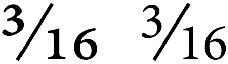
The results of QuarkXPress’s Make Fraction command (right) compare favorably to those from using its OpenType Fractions option. As with hand-built fractions, they’re somewhat lighter.
Note that all of these automatic fraction-building tools, whether QuarkXPress’s own or those derived from OpenType fonts, work only with fractions that contain only numerals. The keystrokes n/10, for example, will not be converted. If you need a fraction like this—or if you’re using InDesign without an OpenType “pro” font—you’ll have to build it manually.
Here’s a basic fraction recipe, again using a fairly large value for numerator and denominator point sizes: First scale the numerals of both numerator and denominator to 60% of the size of the text around them. Now select the slash that separates them and substitute a fraction bar. Use a semibold face, if available, for numerators and denominators to get apparent weight balance with regular-weight integers. But don’t change the weight of the fraction bar; leave that Regular weight. Now apply a baseline shift to the numerator to raise it to top-align with the fraction bar. A little hand-kerning to get the spacing correct, and you’re done.
In the fraction on the left, the same weight is used for both integer and fraction numerals. On the right, the weight balance is improved by using semibold for the fraction numerals.
In InDesign, you can make this process easier by using the program’s Preferences to create Superscripts and Subscripts whose sizes and positions make them work as numerators and denominators. Doing this, though, means that your superscripts may not work well in the role of footnote indicators, and that your subscripts won’t work any more for math or chemistry expressions, as in the ubiquitous expression CO2.
In InDesign, superscript and subscript specs are defined in the Preferences/Advanced Type dialog box. Here, a “position” expresses a baseline shift equivalent to that percentage of the leading for the character.

Here are some sample values for using superscripts and subscripts as numerators and denominators:
Superscript (numerator):
Size 60%
Position 28%
Subscript (denominator):
Size 60%
Position 0%
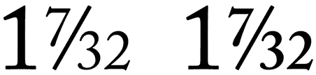
One last finicky observation: If you’re using a font that contains common fractions, you should avoid mixing them with “uncommon” fractions that you’ve built by hand. The problem here is that the characters in prebuilt fractions have different proportions and weights than the ones you can create by scaling integers. The following image—with the prebuilt fraction on the left—illustrates this mismatch:
The only way to make sure all your fractions look the same is to hand-build all of them.
This article was last modified on August 12, 2021
This article was first published on July 7, 2010
Commenting is easier and faster when you're logged in!

Recommended for you

TypeTalk: 10 Ways to Increase Readability and Create Inviting Text
Use these techniques to make text-heavy material more attractive and easily dige...

Track Down Obscure Glyphs in InDesign
There are many characters that don’t appear on standard keyboards. Here’s how to...

Kerning: A Master Class
I’ve just finished reviewing two rounds of printed page proofs from the se...