


Photographers are almost always on the lookout for contrast. Watch experienced digital photographers and you’ll see them constantly check their camera’s histogram, partly to ensure that they haven’t over- or under-exposed, but also to make certain they’ve captured as much tonal range, or contrast, as possible. Because the human eye is more sensitive to luminance than to chrominance, our eyes are drawn to contrast. Improving the contrast in an image — either through exposure control when shooting or processing after the fact — usually results in a better picture.
But sometimes, too much contrast can be a problem. A high-contrast image can appear busy and confusing, especially if the subject matter is already complex. The viewer’s eye is drawn to bright areas in an image, so a picture with a lot of contrast might create a confusing mess of conflicting brightnesses that lead the eye away from your intended subject.
When shooting, you decrease contrast the same way you increase contrast: simply change the amount of over- or under-exposure. Decreasing contrast in an image editor like Adobe Photoshop can be a little more complicated. While you can increase contrast with a simple Levels or Curves adjustment, trying to brighten shadows without screwing up highlights often requires complex masking operations. Fortunately, Photoshop contains tools that make contrast reduction relatively easy.
It’s the Shadows, Stupid
Backlight troubles are probably the most common high-contrast problem. Any time you shoot into a window, or toward the sun from a position of shadow, you run the risk of troublesome backlight. Backlighting isn’t always a problem, of course. If you’re trying to shoot a silhouette, or using backlighting to create halo effects, then you’re actually exploiting the high contrast of your scene.
However, when you want a good picture of a foreground element, too much light in the background can often shade your foreground to the point of obscurity, as seen below.

This idiot photographer (whose resemblance to me is completely coincidental) thought he was being clever by shooting into this mirror. Unfortunately, the camera’s meter couldn’t cope with the extreme backlight, resulting in an idiot-obscuring underexposure of the foreground. Fill flash would have been the ideal solution, but for the mirror.
In the above example, correctly exposing the highlights involves tremendously under-exposing the shadows. In other words, there’s too much contrast in this situation.
Reducing the brightness of the highlights is impossible, because they’ve blown out to almost complete white — there’s no information there to be recovered. But the shadow areas can withstand some brightening to open them up and make the foreground more visible. The easiest way to do this is with a simple gamma adjustment using Photoshop’s Levels control.

Using Levels to create a gamma adjustment opens up some of the shadow areas in this image, making it less contrasty and bringing a little more focus to the foreground.
While this technique works, the gamma adjustment does cost me a little more highlight detail. If you’re using Photoshop CS or CS 2, there’s a better way.
The Magical Shadow/Highlight
Consider another high-contrast image:

Can this picture be saved? Bonus points if you correctly identify the Macintosh celebrity in the photo.
While the harsh lights and shadows create interesting geometric patterns and serve to bring focus to the subject standing in the foreground, the details in the background are lost. Gamma correction isn’t the answer because it blows out the highlights.

Performing a gamma adjustment using levels opens up the shadowy areas but trashes the bright highlights.
Photoshop CS introduced the Shadow/Highlight tool (located under the Image>Adjustments menu). Unlike the Levels and Curves tools, which adjust the relevant pixels in an image simply because you told them to do so, Shadow/Highlight has its own intelligence. For each pixel in the image, Shadow/Highlight analyzes the surrounding pixels to better understand how much brightening or darkening to apply. The results can seem magical, with shadow areas opening up to reveal tremendous detail while highlight areas remain completely untouched.
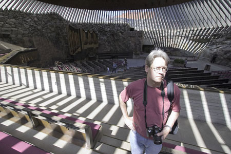
After using Shadow/Highlight command, the image has brighter shadows with uncompromised highlights.
Shadow/Highlight’s default dialog presents a very simple interface with separate sliders for adjusting the shadow and highlight levels.

The Shadow/Highlight controls are easy to use. Check the Show More Options box for greater control, which I’ll cover in a future column.
In many cases, Shadow/Highlight works so well that it’s almost like having a giant fill flash you can add to the scene after the fact.

Shadow/Highlight allowed me to reduce the contrast in this photo by brightening the foreground without affecting the bright highlights of the windows.
Everyday Contrast
While excessive contrast is easy to spot in a harsh backlighting situation, it’s not always so obvious. When you shoot in intense sunlight, the shadows in your image can be too strong. Hard, dark shadows are great for defining texture on some surfaces, but on others they can distract or make your subject too busy.
Using the Shadow/Highlight tool on the image below softened the shadow on the seagull’s underside and smoothed out the slight vignetting on the left side of the image.

Shadow/Highlight provided a one-button solution to the slightly harsh shadow on the underside of this seagull, and gave me some vignette correction as a bonus.
Raw Contrast
If you shoot raw and use Adobe Camera Raw as your raw converter, try the ACR Contrast slider to reduce the contrast in your image. Below is an image before and after I used the ACR Contrast slider. In the original photo on the left, the harsh shadows underneath the chairs are a little too dark when placed against the pastel tones of the sand, sea, and sky.

Because I shot this image in Raw mode, the Adobe Camera Raw converter made contrast reduction a simple matter of moving a slider.
I did lose a little texture on the sand, but that didn’t detract from the image I had in mind. The slider also desaturated the ocean a little, but that’s easy enough to fix later.
There are other ways of reducing contrast. For example, you can use Photoshop’s Hue/Saturation to drain a little saturation from the image, which sometimes results in a lowering of contrast. Experiment with all of the methods I describe and find the one you prefer.
The tricky part is learning to recognize when an image has too much contrast. If you feel an image is too cluttered or harsh, consider the possibility that your problem might be one of contrast, and look for ways to reduce the scene’s contrast.
This article was last modified on December 14, 2022
This article was first published on July 13, 2005
Commenting is easier and faster when you're logged in!

Recommended for you

How to Apply Textures to Uneven Surfaces with Photoshop
This tutorial is intended for intermediate Photoshop users, or really patient, f...

Heavy Metal Madness: Decalcomania Mania
One of my favorite specialty printing methods is that of the water-transfer deca...

Advanced Layer Blending in Photoshop
Photoshop’s Layer Modes provide several ways of enabling you to see throug...