
Infographics are all the rage. If you don’t know the term, it refers to a type of information presentation that uses symbols, text, and rich design to communicate concepts, ideas, and statistics in a highly engaging way. In other words, it’s the result of a client handing a designer a spreadsheet full of data and saying, “make this interesting and easy to understand for real people.” Ah, if only all client projects were like that…
The term “infographic” has always been a synonym for data visualization, one that encompasses any type of graphical representation of otherwise statistical or numerical data. For example, pie charts, scatter charts, Venn diagrams, flowcharts, and much more are infographics. Lately, however, the term has adopted a narrower popular definition. Infographic has come to mean a specific style of data visualization, one such as those below wherein text, iconography, imagery, and/or other data visualization methods are combined into a single image that tells a story as the reader progresses from the top down.
As a designer I enjoy, and draw inspiration from, the way other designers have solved the problems of presenting information visually, which is why I’ve collected so many examples of infographics on my Infographics and Data Visualization Pinterest board. And, I’ve created quite a few infographics myself, many by trial and error with the tools in Illustrator, InDesign, and Photoshop, pulling various elements together from each application into one visual message. Along the way, however, I’ve come to realize that I don’t have to do everything in the Designer’s Trinity of Applications (Photoshop, Illustrator, and InDesign). There are a number of specialty tools available to help solve data visualization problems — some that will create complete infographics, some that create parts that can be combined with other elements in the Designer’s Trinity.
This month I wanted to collect the best of the free tools I found to creating data visualization, starting with simple graphs and charts, progressing through to Venn diagrams and flowcharts, and then into more advanced and engaging means of presenting data creatively.
Easy Graphs
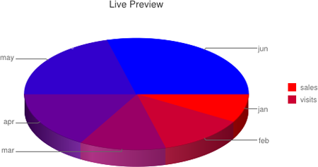
Let’s start with the most common form of infographic: graphs and charts. Naturally Adobe Illustrator is the very best tool for creating engaging graphs and charts (see here), but if you’re Illustrator challenged, you don’t have to resort to using Microsoft Excel. Instead, check out ChartPart, which uses the extraordinarily fast and responsive Google Chart API. With ChartPart you can quickly and easily generate charts and graphs in any of the following popular styles: pie, 3D pie, line, stacked bar, side-stacked bar, grouped bar, side-grouped bar, scatter plot, and Venn diagram. It doesn’t do the last one as well as dedicated tools, though; below there’s a much better one to use for Venn diagrams than ChartPart.
Using ChartPart is simple. After choosing the type of chart you want and titling it, paste comma-separated values and/or row and column headings into the Data field. Comma-separated data can be typed by hand or exported from Excel, Numbers, and other spreadsheet software. Each line in the Data field is a row and each comma separates two columns, just like a spreadsheet or table. After entering the data, add HTML hex color codes at the end of each row to color the chart’s pie piece, bar, or other data segment. After that, voila! instant chart! Charts can be downloaded as PNG images or embedded live into any Website.
One of the advantages to embedding the chart HTML code is that all the chart data is right there in the document; if you need to adjust values or colors in the chart, edit them in the URL itself, and the Google Chart API, via ChartPart, will update the chart to match the new data. The fact that the visualization is created by the data within the URL means you can alter that data in real time on a Website via JavaScript, PHP (the foundation for WordPress), or any other programming language.
Venn Diagram
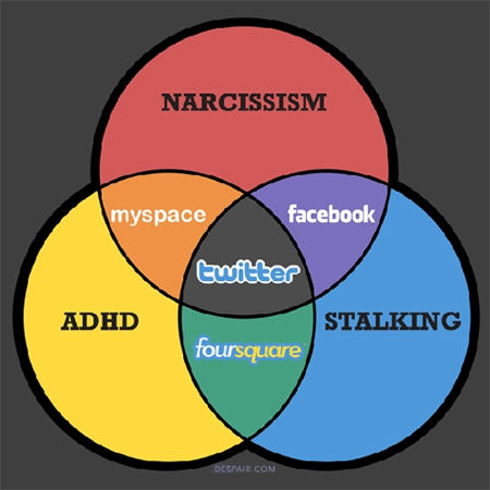
Venn diagrams use overlapping circles to communicate the relationships between topics, their characteristics, or other bits of data. The rather nihilistic social media Venn diagram above is one viral example. Although often employed online to communicate humor, Venn diagrams are most often used in the real world less trivially, such as to communicate market share or community-analysis data, geographic distribution information, and just about anything other type of data in which some areas overlap but others don’t. The purpose of using Venn diagrams to present data is to highlight the differences or similarities between two, three, or more groups, processes, markets, statistics, and so on. It’s a brilliant solution because of its simplicity — anyone can instantly see topics of exclusion and commonality among different groups or subjects. Even very complex 10-, 20-, and 50-circle Venn diagrams make digestion of information easy.
Once you have an idea in mind, build your Venn diagram with these 2-circle and 3-circle free online generators. Both will let you download the resulting image, which can then be further refined in Photoshop. Also note that Venn diagrams don’t have to include circles of equal diameter; the generators noted above let you increase or decrease the size of the constituent circles with the plus or minus signs near the edges of each circle. You can also change the circle colors, add labels, and add data.
Lovely Charts
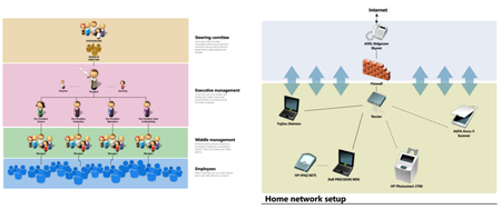
Flowcharts, org charts, and process charts, oh my! For progressive and structural information, something that involves multiple components and assets connected in various ways, it’s tough to beat flowcharts and organizational charts as the visualization method. Shapes, colors, iconography, and imagery can all be used to identify the various components, tasks, or assets under discussion, and then a limitless array of connective devices — solid, dashed, dotted, double, and triple lines, squiggly lines and straight, arrows and dots, elongated text and stretched imagery — can be employed to communicate the relationship between each pair of components, tasks, or assets.
You can, of course, create flowcharts, organization charts, methodology and process charts, and sitemaps in Adobe Illustrator. Illustrator comes with symbol libraries of objects and connective devices, but to be frank (instead of Pariah), those symbols are yawn-eliciting bland. If you want your charts to pop, to use client parlance, you’d need to draw all the pieces yourself In Illustrator (and make them each symbols to ease the chart creation and editing process). Or you can turn to another free online resource I’ve found.
Lovely Charts lets you build highly creative flowcharts, sitemaps, organization charts, methodology and process charts, and even wireframes all for free in a Web-based user interface that is as polished, professional, and user-friendly as any desktop application. It offers a large chart production space and a cornucopia of professional chart design tools with which you can use to create and modify vector object-based charts at any time. That’s right, vector. Lovely Charts isn’t one of those apps you use only once and then download a rasterized image of the chart. After signing up for a free account you can save your flowchart for later editing, and each object is always live, just like it would be in Illustrator.
If Web-based tools aren’t your thing, or you’d like to be able to edit charts from 30,000 feet without paying for hit-or-miss inflight WiFi, you can buy standalone versions of Lovely Charts for Windows, Mac, and even for iPad, too.
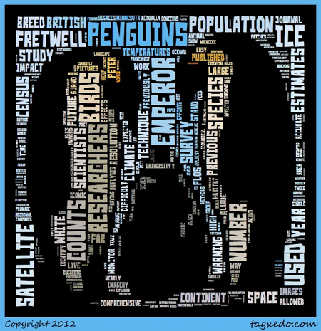
Word Cloud Generator
Word clouds are not a new invention. Blogs have had them for many years, but they’ve always been used as a weighted map of keywords or tags that link to different places within the blog itself. In that way they’re highly useful — they move readers from one place on the Website directly to the target (or multiple targets) of the keyword. Given the icon use for Word clouds, they really haven’t made their way outside of blogs — until now.
Tagxedo is a free online word cloud generator that allows you to create word clouds. The source for the word clouds can be a Website or pasted-in text. Word clouds don’t have be random arrangements of words; the clouds can be produced in shapes such as hearts, triangles, signs, and what-not. You can even upload a company logo or photograph and have Tagxedo arrange and color the words to conform to the logo or photograph! Most importantly, Tagxedo lets you print or download the resulting cloud, opening it up for use far beyond blogs and into actual marketing and branding media of all types.
Media Rich, Interactive Timelines
There’s no better tool for presenting chronological information and events than the timeline. A well-designed timeline includes color and imagery, and clear labels presented linearly against dates and often color-coded sections. If you’re presenting the timeline in a digital format such as on the Web or embedded in tablet-based digital publications, you can even include embedded audio and video elements and hyperlinks to in-depth or related information.
Timelines, however, are not easy to create. If you want to build one for digital distribution you’ll mostly likely have to build it in Flash Professional, then convert the Flash SWF into HTML5 because Flash formats don’t run on iPad and other iOS devices. Even if you’re a Flash or HTML5 wiz, creating a timeline by hand is an involved, complicated, tedious process. Fortunately, I’ve found you a tool — and a free one at that — that makes timeline creation easy and, dare I say it, even fun.
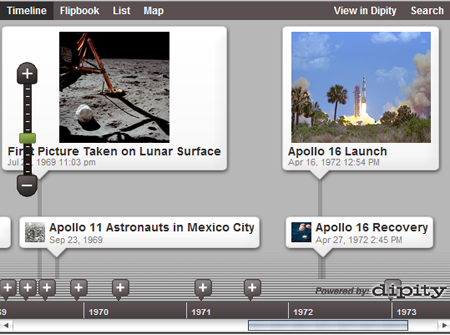
Dipity is a free and easy to use browser-based timeline creator. With it you can create a range of events spanning any time frame — from 5 billion years in the past to that same distance in the future, when the Sun is predicted to explode. For each event on the timeline Dipity lets you enter a title and date and time, which display in all views, as well as a description and a “more information” URL. Each event may also display an image or a video or audio clip.
Even better, not only does Dipity create side-scrolling, linear timelines, but it also allows you to also present your information in different views. Events that have geographic significance can be shown on a map. Image- and video-heavy timelines can be presented to users in a coverflow-like slideshow of images Dipity calls Flipbook view. And, for all types of timelines, the List view presents all the data of your timeline in a vertical scrolling list of events, each with the full data you’ve entered for the event — title, description, URL, and so on. In short, Dipity’s system offers the best possible way to visualize chronological data I’ve ever seen — in fact, with Timeline, Map, Flipbook, and List view it offers four of the best possible ways to visualize chronological data.
Although Dipity’s timelines may look like they’re built in Flash, they aren’t; they’re pure HTML5, which means they will work on any modern Web browser, including Safari on iPad and iPhone, and even embedded inside interactive magazines. You did know you could embed any Web content into iPad (and Android) digital magazines, didn’t you? If not, you can learn more about that here.
The free Dipity account provides generous limits of three timelines per account, up to 150 events per timeline, 5,000 views per month, and 50 MB of media upload storage. If those prove to be not enough for your needs, the $4.95, $49.95, and $99.95 monthly premium plans are highly competitive when compared to similar services like Time Rime, whose pricing begins at $980 and doesn’t offer half as many features.
Customized Google Maps
Clients with offices or brick-and-mortar stores know that their address is an important part of their Websites and printed marketing materials. The savvy ones even have maps to their locations. Where do those maps come from? From Google Maps, of course. But those are just street, satellite, or hybrid maps with a generic marker pinned to them identifying your client’s place of business. Maps can be so much more informative and engaging. With just a little bit of effort in Photoshop or Illustrator, you could easily add text labels, shapes, and objects of all kinds — even a street-level photo of the client’s business — to a map captured from Google Maps. Now, thanks to a free tool called ScribbleMaps, you can do all that and a heck of a lot more.
Like the other tools discussed above, ScribbleMaps is free and works directly in your Web browser. One way to look at it is to think of it and the maps it generates as a layer running atop Google Maps. In the ScribbleMaps interface, you provide an address or business name for a location or two addresses for a route, just as you would if you were using Google Maps directly. The map or route created by GoogleMaps is seamlessly and instantly delivered to ScribbleMaps’ map-creation workspace. From there, you mark up and customize the map on top of what Google Maps provided.
Using Scribble Maps tools you can draw shapes, lines of various styles, labels galore, as well as highlight routes or landmarks. Then you can insert all sorts of additional details and objects, such as location markers in a few dozen styles, photographs (such as the one of the Adobe building on the map I created above), and external files like Excel documents, 3D virtual walkthrough KML files, and layered cartographic map data in SHP file format. You can even colorize the entire map, substituting the colors of your client’s brand for the standard palette used by Google Maps.
After you’ve built the perfect map, you can export it to JPG, KML, or GPX formats. You can also print it, shared it on social media, and even embed it into a client’s Website as a widget or chunk of
This article was last modified on August 2, 2021
This article was first published on April 30, 2012
Commenting is easier and faster when you're logged in!

Recommended for you

How To Create Sharp Digital Type Images
Images that contain type make frequent appearances on websites and blogs, ebooks...

Grace Under Fire: Tips for Responding to Negative Feedback via Social Media
If you were anywhere near the Internet last week, chances are good that you read...

Advice for In-House Graphic Designers
Often In-House Graphic Designers are overlooked when it comes to advice and cont...