
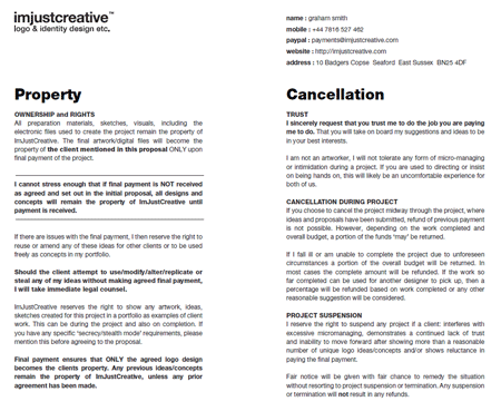
Logo Design Proposal Template
U.K. logo designer Graham Smith knows the business of logo design. His work includes logos for the Smashing Network, Skiplex, Feedly, Foehn & Hirsch, and GAP. Graham also speaks out on his various blogs and social media streams about the business of logo design, decrying the cookie-cutter logo farms, and helping logo designers hold fast to fair, professional design rates and ethics. Continuing his crusade, Graham has created and makes available for download his logo design proposal template in PDF and InDesign document formats.
The template sets forth the deposit and payments expected from the client and what the client will receive after final payment. It then goes on to detail intellectual property rights ownership—the designer owns all rights until the final payment is received, whereupon rights transfer to the client—when and how project cancellation or suspension may become options, and the proposal approval contract itself. Graham is offering the template as open source, non-attribution, meaning you can change anything you like about it or use it freely as is.
The template, which arose from a round-table discussion between Graham and other designers, is an excellent example of a document every freelance designer—logo or otherwise—must have in place prior to the inception of a project. Many designers’ proposals and contracts are often more detailed, but even if you don’t want to use Graham’s as-is, it makes for an excellent starting point in revising a more comprehensive document.
Fonts
Free fonts are like peanut M&Ms. You can’t have just one, and they’re fun to share. Here, open your hand…
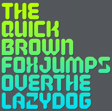
Code (2 Weights)
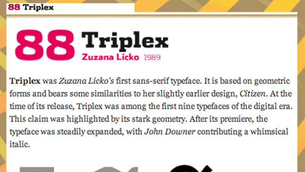
Dan
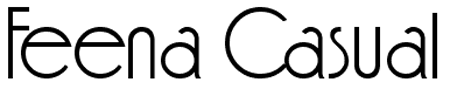
Feena Casual
Filefont
Hero (2 Weights)
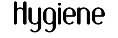
Hygiene
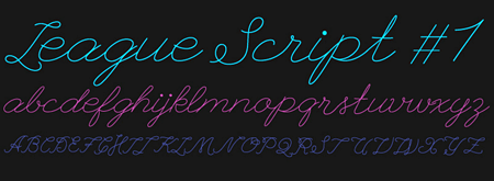
League Script
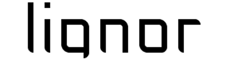
Lignor
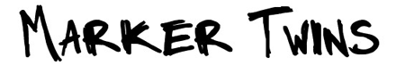
Marker Twins
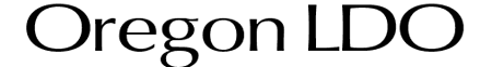
Oregon LDO
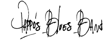
Pappo’s Blues Band
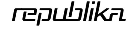
Republika
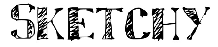
Sketchy
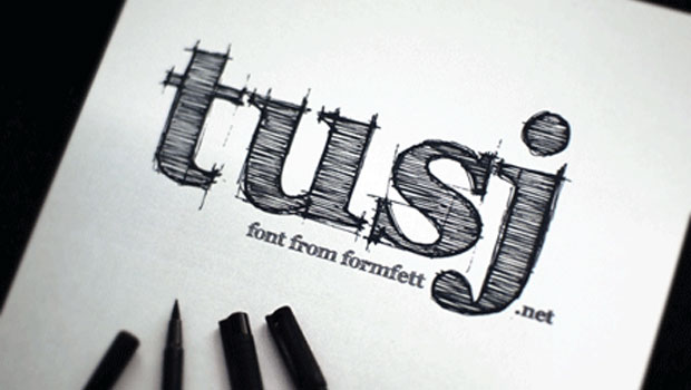
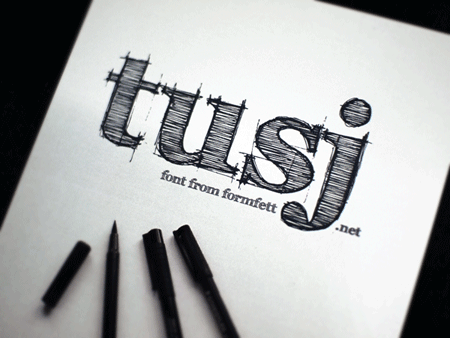
Tusj
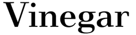
Vinegar
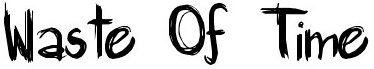
Waste of Time
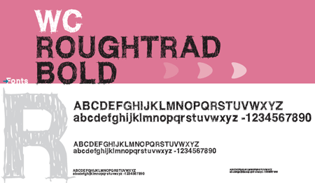
WC Roughtrad (2 Weights)
Textures
Not a fan of M&M Peanut? The same rules apply for Skittles, er, I mean, textures. Texturize the rainbow!
Metal Surface (9 Textures)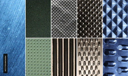
Fabric Texture Pack #2 (9 Textures)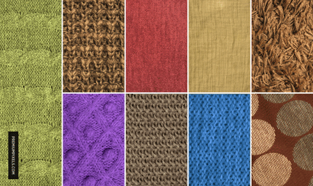
Watercolor (27 Textures)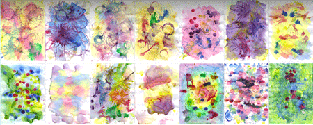
Grunge Bokeh (12 Textures)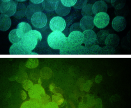
Foam Dot (30 Textures)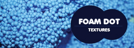
Paper & Canvas (14 Textures)
Holographic Bokeh Pack #2 (6 Textures)
Coloured Whirlpool (14 Textures)
Shimmer Bokeh (7 Textures)![]()
Rainbow Sparkles (8 Textures)
Rolled Paint Grunge Set 1 (10 Textures)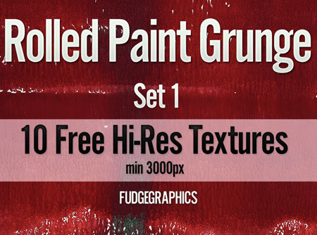
Old Magazine (10 Textures)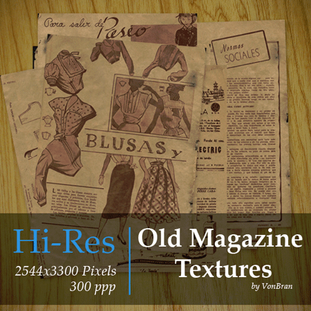
Urban Texture Pack (25 Textures)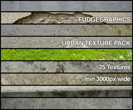
Old Books (8 Textures)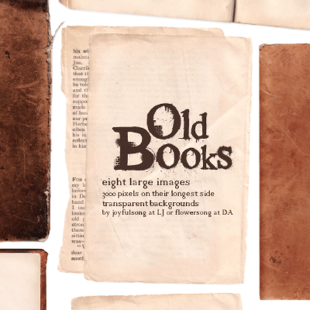
Grunge Paper (6 Textures)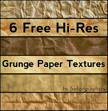
Lens Flare Pack (15 Textures)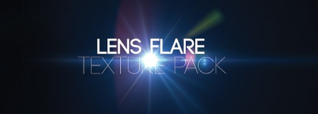
100+ Textures (100+ Textures)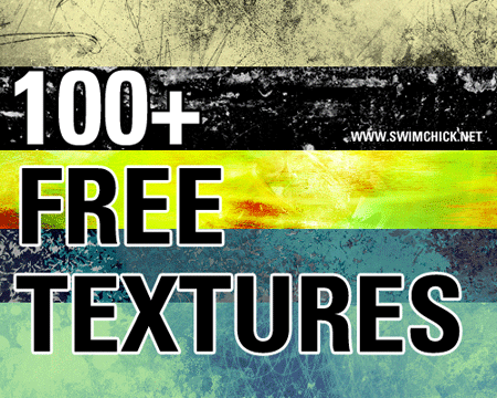
Go to page 2 for an entire toolbox full of great resources for type on the Web.
This article was last modified on December 13, 2022
This article was first published on March 23, 2011
Commenting is easier and faster when you're logged in!

Recommended for you
Four Techniques for Combining Fonts from H&FJ
The email newsletter from the Hoefler & Frere-Jones type foundry is a real g...
100 Best Fonts of All Time, now on Pinterest
Fonts are a source of endless debate for designers. Some we love, some we hate,...

Creating a Pop Out Effect with Photoshop and InDesign
At the 2016 InDesign Conference in Washington, D.C., Nigel French reminded me of...