
Press Release
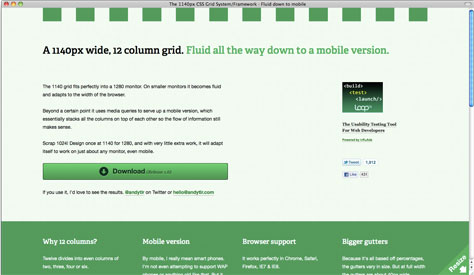
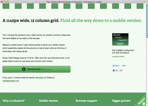
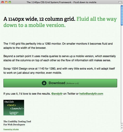
Andy Taylor’s 1140 grid fits perfectly into a 1280 monitor. On smaller monitors it becomes fluid and adapts to the width of the browser.
Beyond a certain point it uses media queries to serve up a mobile version, which essentially stacks all the columns on top of each other so the flow of information still makes sense.
Scrap 1024! Design once at 1140 for 1280, and with very little extra work, it will adapt itself to work on just about any monitor, even mobile.
Download the HTML and CSS files for the grid here.
Why 12 columns?
Twelve divides into even columns of two, three, four or six. Or into numerous uneven combinations like seven and five or five, four, three. The last example is as simple as three divs with the classes .fivecol, .fourcol and .threecol
Photoshop Template
Download a Photoshop template of the grid at 1140px here. It’s based on how it’s displayed in WebKit, so it’s actually 1133px, as all browsers round sub-pixels slightly differently.
Mobile version
By mobile, I really mean smart phones. I’m not even attempting to support WAP phones or anything old like that. But it does work on devices that recognise ‘handheld’ in the style sheet media and/or media queries. With media queries you can even include x2 images for the iPhone 4 Retina Display.
New computers, old computers, netbooks, tablets, smartphones, some feature phones.
So far I’ve tested it on a couple of MacBooks, an iMac, a PC laptop, an old PC, an Eee PC, an iPad, an iPhone 3G, an iPhone 4, a few Android phones, a Samsung Galaxy Tab, a BlackBerry and an older Nokia.
Browser support
It works perfectly in Chrome, Safari, Firefox, IE7 & IE8.
It works alright in IE6. IE6 doesn’t support max-width, so the grid doesn’t fix to 1140px. It spans the full width of the browser. Most people using IE6 probably don’t have monitors with a resolution higher than 1280×1024 though. Images are also not restrained to the width of the column because of max-width. But the extra image is hidden, rather than breaking the layout.
Note: IE6 accounts for less than 1% of total traffic to my blog. Check your analytics.
Bigger gutters
Because it’s all based off percentages, the gutters vary in size. But at full width the gutters are about 40px wide.
Images
If an image is smaller than the column it is contained in, it will be displayed at its original size. If it is larger then it will be shrunk to the width of the column. Don’t define height and width of images inline, it’ll break the proportions if they’re scaled down.
The grid in action:
This article was last modified on January 18, 2023
This article was first published on December 28, 2010
Commenting is easier and faster when you're logged in!

Recommended for you

Using Quick Apply for Menu Commands
Did you know that InDesign has exactly 714 menu commands? OK, I totally made tha...

Mystery of the Perplexing Preview Contest Answer and Winner!
It’s time to reveal the solution—and the winner—for this month’s InD...

For Better Photos, Learn How to Recognize Good Light
A few years ago, I went to an exhibit of Impressionist paintings at the Palace o...