

Part 1: Selecting a photo printer.
Part 2: Color management, soft proofing, making your first print.
Part 3: Rendering intents, out-of-gamut colors, best viewing conditions.
Part 4: Driver-controlled color, custom paper profiling, third-party RIPs
Capturing a good image can take a lot of time and study, and learning to manipulate and enhance that picture in an image editor can be a full-time job. No matter how good your shooting and editing skills are, though, if your final goal is a printed image, your understanding of printing is as important as all of your shooting and post-production skill. A mishandled printer can easily turn a well-shot, nicely edited image into a boring, no-frills picture.
Fortunately, printing is much easier than it used to be, thanks to the great improvements in photo printers over the last few years. In the first part of this series, I discussed how to choose a photo printer. In this installment, I’ll explain the basics of color management and the fundamental steps required to get a good print.
While some of the information presented here can apply to pre-press work, I’m going to be speaking specifically about getting good photographic prints on a desktop photo printer of the type I discussed in part 1.
Get Real. And Get Your Checkbook.
There’s a fairly simple way to spot digital photographers who’ve never worked in a darkroom: They’re the ones complaining about how many prints they have to make until they get the final output that they want. They make this complaint, of course, because each one of those tests prints uses up expensive ink and paper.
Experienced darkroom photographers are accustomed to making exposure tests and lots of prints -– using expensive photographic paper and chemicals -– to get the print they want. Digital printing is no different. However, if you do some rudimentary color management, and wisely configure your print dialog, you’ll be able to get away with far fewer test prints than a typical darkroom photographer must suffer through.
The automatic settings on your printer should do a good job of producing nice-looking snapshots. When used this way, you can think of your printer as an alternative to a photo lab or an online photo service.
But for fine-art printing, you’ll have more work to get the best results, and so you should think of your printer as a darkroom substitute, not a photo lab substitute. Darkrooms are expensive to stock and operate and, depending on the printer you have and the media you choose, digital printing is not significantly different. This attitude won’t necessarily save you any money, but it will help you relax about the amount of media you’re churning through. In the long run, digital printing is often far less expensive than chemical printing.
Prepare Your Image
Before you can print, you need to deal with basic image-editing tasks: correcting contrast, exposure; color; retouching, compositing, or applying special effects; and finally sizing and sharpening.
As you edit, it’s important to understand that your camera and monitor are capable of capturing and displaying far more colors that your printer is capable of printing. For example, your camera may be able to capture shades of red that are much brighter than the reds that your printer can output. These shades are said to be “out of gamut” meaning they lie outside the range of printable colors of your chosen device.
When you try to print an out of gamut color, your printer will have to use its closest match, which might be very different from what you’re expecting. In addition, the transition areas leading into and out of that color might end up printing strangely, making for tone breaks and posterization in your print.
Also, note that if you zoom in to 100% on an 8MP image, you’re looking at a level of detail that you probably can’t see on a final print, unless you’re outputting poster size. Before you spend hours correcting fine detail, do a test print and see if the problem that you’re trying to correct is even visible in your final output.
As you become more familiar with your printer and what it’s capable of, you’ll have a better understanding of what needs to be corrected, and how far you can push and pull the color in your images. While you might be in the habit of spending hours making very subtle corrections, after you learn more about what is actually printable, you may find that your edits can be a little more broad.
Color Management for People Who Really Aren’t Interested
If you take advantage of color management technology, and if your image editor can soft proof (more on that later), your entire editing process will be much easier, since you’ll be able to see a more accurate on-screen representation of your final printed output.
Color management begins with your monitor.
Every printing process works by mixing a few primary ink colors to create every other color. As you learned while finger painting as a kid, when you mix inks the results get darker. This is called subtractive color because as you mix the primaries you subtract brightness until you eventually hit black.
However, when cameras and computers create images, they mix the primary colors of light (red, green, and blue) to create every other color. As the primary colors of light mix together, the results get brighter. This is called additive color because as you mix the primaries of light you increase brightness until you get white.
When you print, your computer has to calculate how to translate a mix of additive primaries (the ones shown on your monitor) into a mix of subtractive primaries (the kind your printer can print). You can greatly improve the accuracy of this translation by using a color-management system (CMS).
Both the Mac and Windows have a built-in CMS, and almost all major image-editing programs now know how to integrate themselves into a color-managed workflow.
A color-management system works by trying to understand how far each of your input and output devices deviate from an accepted standard. Once this deviation is understood, each device can be adjusted for its discrepancies. When every input and output device has been “corrected” then they should all yield similar output.
For all of this to work, your color-management system must have a profile for every input and output device that you want to use. These profiles describe particular characteristics of each device. Once the color-management system understands these characteristics, it can adjust the color of your image so that it outputs correctly on each device. Note that the actual pixel values in your document are not altered. Instead, the color is skewed on-the-fly so that it appears closer to correct on your target device.
Most photo printers ship with an assortment of profiles, and your operating system probably has some default profiles for stock monitors. Note that in the case of monitor profiles, the stock profiles will never be good enough to run an accurate color-management system. If you’ve ever walked through the TV section of an electronics store, you’ve seen how much one monitor can vary from another. This is true whether you’re using a CRT or LCD monitor, so you really need to profile your monitor if you want to use a color managed workflow.
What To Expect From A Color-Managed Workflow
To embark on a life of color-managed printing you’re going to have to –- surprise! –- spend some money. Before you head off to the store, it’s important to know what you can expect from a color-managed workflow.
First, understand that a printed image will never look exactly like the image you see on your screen, simply because there’s a big difference between looking at an image made by a self-illuminated radiant display and one made by a reflective print. If you’re willing to spend thousands of dollars on a CRT, and do a careful job of preparing it, you can get a very close match between your printer and your screen.
But for most of us, there will always be some difference between our monitors and our printed output. In most cases, switching to a color-managed system greatly reduces the number of test prints you need to make. That’s usually the best you can hope for.
How well your monitor matches your printer will depend on how good your profiles are, but it will also be dependent on how good your monitor and printer are. In general, it’s safe to say that a decent, moderately priced CRT will usually outperform a more expensive LCD in terms of color accuracy. CRTs typically do a better job of generating a true black, which makes for better, more accurate contrast throughout your image. (I edit most of my images on a 30″ Apple CinemaDisplay, and while the screen is fantastic overall, I would probably have a more color accurate proofing system if I switched to a CRT, even one that cost substantially less.)
The quality of your printer will also affect the color accuracy of your system. A higher quality printer has different kinds of sensors that help the printer driver understand exactly how the printer performs. This makes for greater consistency from print to print, which means the printer is more easily profiled. The more accurate your profiles are, the more color accurate your system will be.
Profiling and Calibrating Your Monitor
As I’ve been stressing, color management is dependent on precise profiles of your input and output devices. The most accurate profiles are ones you create yourself with a measuring device called a colorimeter and special software, which uses the colorimeter to measure particular characteristics of your screen. The software then creates a profile and installs it for you.
A monitor profile changes the output quality of your monitor by adjusting the color lookup tables that live in your video card so that your screen displays more neutral grays and smoother color gradations. In this way, a monitor profile serves both to describe the qualities of your display system, and to calibrate the system to a known standard. (When I speak of display system I’m referring to both the monitor itself and the video card that drives it.)
There are several popular profiling packages. The $249 GretagMacbeth Eye-One Display 2 can do a very good job of profiling and calibrating your monitor. If you’re serious about color management, you may be frustrated by the lack of more advanced controls in the Eye-One software.
If you have a lot of systems to profile, then you might want to consider the $379 Monaco OptixXR Pro, which offers speedy operation and the ability to match profiles from different monitors.
The $299 Spyder2Pro Studio offers a good balance of price and performance. It offers slightly more control than the Eye-One Display. However, the Spyder is also the slowest of the three products discussed here.
The Eye-One, OptixXR Pro, and the Spyder2Pro come in several different configurations and price points. All three incude good documentation that explains how to use the devices and how to install and manage profiles on Mac or Windows system.
Any of the packages should serve you well, though I prefer the Monaco Optix for its speedy performance and very good results. No matter which system you’re using, the following information will help you get the best results:
- If you’re calibrating a CRT, follow the instructions carefully to set your monitor’s white and black points. This is a critically important step to getting a good profile. If you’re not sure how to use your CRTs adjustment controls, consult the manual that came with your monitor. (Lost your manual? You can often find them on the manufacturer’s Web site.)
- If you’re calibrating an LCD, you probably won’t have access to white or black point controls, so you can ignore these steps in your calibration software and documentation.
- Some CRTs save presets for different configurations. This can be handy when you work in a room with changing light conditions. Your monitor’s white point looks different under tungsten, fluorescent, and daylight. You may want to define different white points for each of these ambient lighting situations and save each one as a preset. You can then build separate profiles for each preset. As the light in the room changes, you can change presets on your monitor and then switch to the appropriate, accompanying profile.
- For LCDs, tell your calibration software that you want to use the monitor’s native white point.
- Calibrate CRTs and LCDs to a gamma of 2.2.
If none of this makes sense right now, don’t worry. Your calibration software will walk you through all of these options.
Printer Profiles
Color management is no good without printer profiles. Most photo printers ship with pre-built profiles, which are installed automatically when you install the printer driver. Check the vendor’s Web site to see if there are additional or updated printer profiles. Newer is usually better.
The best printer profiles are built for a specific type of paper printed on a specific printer, with an eye toward viewing under particular lighting. Many printer vendors provide profiles for all of these different combinations.
I’ll discuss paper choice and printer profiles in more detail in part 3. For now, simply choose a type of paper for which you have a profile installed. If you’re using a paper type made by your printer vendor, you probably have a corresponding profile already installed.
Soft Proofing
Some image-editing programs let you view a photo in a special soft-proofing mode, which uses a color-management system and installed profiles to simulate on-screen what a print will look like when output to a specified printer.
I’ll use Photoshop for my examples, but other possibilities include Apple’s Aperture and Adobe’s Lightroom. If your editor provides soft proofing, its controls and options should be similar to Photoshop.
To generate a printer profile, have your most recent monitor profile active. Your profiling package should have installed it for you. If it’s been more than a month since you profiled the monitor, do it again. I recommend profiling your monitor at least once a month -– more often if it’s an older monitor.
Before your editor can generate a soft proof, it must know what printer profile to use. In Photoshop, you configure your soft-proof settings by choosing View > Proof Setup > Custom (Figure 1).
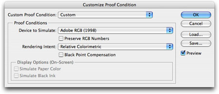
Figure 1. Photoshop’s Custom Proof Condition dialog box.
The Custom Proof Condition dialog box is pretty straightforward. From the Device to Simulate menu, select the paper profile that corresponds to the type of paper you’ll print on. If your printer uses different types of ink for different paper types, select the appropriate profile. For example, the Epson R2400 can use one of two different kinds of black ink, Photo Black and Matte Black. When printing on Enhanced Matte paper, you can choose to use either the Enhanced Matte profile for Photo Black (labeled “PK”) or Matte Black (labeled “MK”).
Sometimes, paper profiles are intended for specific driver settings. For example, an HP printer driver might have an option called Maximum Detail. If the profile name includes “MaxDetail,” the assumption is that you’ll choose the Maximum Detail setting when you print. If you don’t, then your print may not match your screen as closely.
Your image most likely contains far more colors than your printer can print. There are several algorithms an image editor can use to cram all those colors into the small gamut of your printer. The Rendering Intent menu lets you specify which method to use. I’ll discuss rendering intent in more detail in part 3. For now, choose Relative Colorimetric. (If you’re working with Aperture, you won’t find a control for Rendering Intent. Aperture defaults to a Relative Colorimetric rendering intent.)
Don’t check the Preserve Color Numbers checkbox. This tells Photoshop to use the color data in the image, but you want the color data altered according to the needs of your color-management system. This control is useful only for simulation of certain types of CMYK output.
Black Point Compensation re-maps the black in your image so that it matches the black point of your chosen paper. With Black Point Compensation set, you’ll get better shadow detail and use your printer’s full dynamic range.
Next, check Simulate Paper Color. While your monitor displays the whites of your image as true white, on a piece of paper white is actually the color of the paper. By activating Simulate Paper Color, you tell Photoshop to more accurately display the white (and lighter tones) in your image.
At this point, your onscreen image should look a bit different than before you began. Uncheck the Preview checkbox to see your un-proofed image, then re-check the box to see the soft proof. Leave Preview checked and click OK to dismiss the dialog box.
You can now generates the proof using the parameters you just defined by pressing Command-Y or choosing View > Proof Colors.
In Part 3, I’ll discuss how to edit your image once you’ve proofed. For now, I just want you to make a quick test print to see how well the soft proof matches the printed output.
At Last, Printing
Finally, 3,000 words later, you’re ready to print. In Photoshop, select File > Print with Preview. Photoshop will show you a thumbnail view of your chosen paper size, with your image positioned as it will appear when printed (Figure 2).

Figure 2. Don’t look so hang dog. You’re almost printing!
You can use the Page Setup button to change the current paper size and orientation, then use the Position and Scaling controls to change how your image will be positioned and sized on the page.
Before you can print, though, you need to tell Photoshop that you’re intending to print using a particular profile. Press the More Options button, then change the resulting Output pop-up menu to Color Management if it’s not already set to that (Figure 3).

Figure 3. Once you press the More Options button, you can configure the settings for a more accurate print.
You should now see some controls similar to those in the Custom Proof Setup dialog box. Configure these to match what you specified for your soft proof.
Set Color Handling to Let Photoshop Determine Colors. This tells Photoshop to do all necessary color calculations. In part 3, I’ll cover the other options in this menu.
Set Printer Profile to the same profile you specified in the Custom Proof dialog box. Then do the same for Rendering Intent and Black Point Compensation.
Finally, press Print. You will then be taken to your normal Print dialog. You’ll need to perform a few configurations here. First, select the appropriate paper type. Next, configure any other special settings that might have been specified in your printer profile.
Finally, find the control in the printer driver that turns OFF color management. This may sound counter-intuitive, but it’s really quite simple. Most printer drivers have their own color-management routines that try to correct an image’s color for printing. However, you’re asking Photoshop to take care of managing color, so you don’t want the printer driver to be involved as well. If both systems mess with the color in your image, things get very unpredictable.
The method for turning off color management varies from printer to printer. For example, in most Epson printers, you’ll find an option that looks like Figure 4:
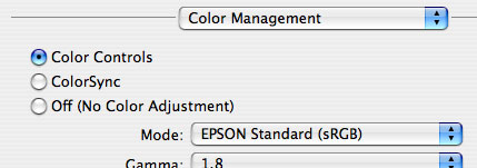
Figure 4. Your dialog box may not look like this example for an Epson printer.
Canon printers usually have something like Figure 5:
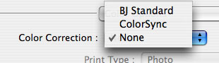
Figure 5. Canon printers have their own method of turning off the printer driver’s color management.
If you can’t find any such option, consult your printer manual for details.
Press the Print button and compare the printed page to the soft proof on your screen. If you have a good-quality monitor, printer, and profiles, the print should match the screen fairly well. You’ll probably see that the blacks and overall contrast range are a little different. The monitor image is probably a little more saturated because of the nature of a self-illuminated display, but the overall hues should be fairly close.
In the next installment, I’ll show you how to fine-tune the results with more printing options and by delving deeper into printer profiles.
This article was last modified on December 14, 2022
This article was first published on August 18, 2006
Commenting is easier and faster when you're logged in!

Recommended for you
Scanning Around With Gene: The Photographic Moment of Truth
For several years in high school I worked part time at a small pharmacy that sol...

Scanning Around With Gene: The Horse and Buggy Printer
Type designers and graphic artists tend to fall into two categories. You either...

Damn You, Art School
It takes more than a good education to succeed in a any field. It takes real-wor...