


Part 1: Selecting a photo printer.
Part 2: Color management, soft proofing, making your first print.
Part 3: Rendering intents, out-of-gamut colors, best viewing conditions.
Part 4: Driver-controlled color, custom paper profiling, third-party RIPs
If you followed the first two parts of this series, you have the information you need to buy an inkjet printer capable of high-quality output (if you didn’t already have a good one), and you can profile it and your monitor and use those profiles for soft proofing. At the end of part 2, you should have been able to produce a good print.
But you want the best prints. If you have particular color, tone, or contrast goals, your image may need more work. What’s more, some parts of your image might need more work than others. In a landscape shot, for example, your printer might render the hue of the sky well but undersaturate the greens in the trees.
However, before you start editing your image, it’s worth making a few tweaks to your printer settings.
Change Your Intent
When you soft-proof and print, you must select a rendering intent; that is, you tell the printer how to map “illegal” (out-of-gamut) colors to the color space of your printer — and, more specifically, to the color space of your paper.
In part 2, I recommended that you select Relative Colorimetric as your rendering intent because it’s a general-purpose intent. It maps the white in your image to the white of your paper profile, so the whites in the print are represented by the white of the paper, not by ink. The Relative Colorimetric rendering intent doesn’t touch any other color that falls within the gamut of your ink and paper. Illegal colors are mapped to the nearest in-gamut color. If you’re a stickler for color accuracy, you’ll probably prefer Relative Colorimetric.
While your digital camera must be white-balanced to accurately reproduce color, your eyes have the amazing ability to automatically adjust so that white tones always look truly white (or nearly so). Your eyes are also far more sensitive to contrast and the relationships between colors than to absolute hues. With this in mind, the Perceptual intent tries to compress all of the colors in your image to fit within the color gamut of your paper, while preserving the relationships between those colors. If your image has lots of out-of-gamut colors, Perceptual intent creates a nice-looking image, though your colors may not be especially accurate.
You’ll use the Relative Colorimetric and Perceptual rendering intents the most. If your image doesn’t have out-of-gamut colors, you probably won’t find much difference between the two. On a few images, you may find that one intent yields more “pop” than another — your images will look brighter and punchier. You can usually see this difference when soft proofing, so let it be your guide. In Photoshop’s Customize Proof Condition dialog box (Figure 1), you can select the rendering intent you’ll ultimately print with, and see on-screen how it will affect your image.
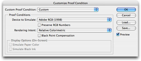
Figure 1. Photoshop’s Customize Proof Condition dialog box.
Photoshop has two more rendering intents. Saturation produces as much saturation as possible and is for illustrations and business graphics. Absolute Colorimetric is similar to Relative Colorimetric in that it clips illegal colors. However, it doesn’t remap the whites in an image. If the whites in a picture have a slight cast, a printer will print the whites with that cast, rather than leave them as paper white. In other words, Absolute Colorimetric never alters any legal colors in your image.
Many people say you should never use Absolute Colorimetric for photo printing. However, I find that on a few images with a large dynamic range, Absolute Colorimetric is actually the best choice. It gives me a brightness missing with any other intent. But I do admit that when Absolute Colorimetric is wrong for your image, it tends to be wrong in a very ugly way. You’ll blow out a image’s highlights or cause dark shadows to turn splotchy and weird. Just pay close attention to these areas when soft proofing to determine if it’s the right intent.
Perceptual and Relative Colorimetric also include the option of Black Point Compensation. In most cases, activating this feature is good, but again you should preview it in your soft proofs to be sure. Take note of your final choice, as you’ll need to select this as your intent in the Print with Preview dialog.
What Have I Done?!?
When you close Photoshop’s Customize Proof Condition dialog box, soft proofing is automatically enabled. You can toggle it at any time by pressing Command/CTRL-Y. Go ahead, try toggling it on and off a few times.
I’ll pause for a moment to allow the cursing to die down, because as you’ve just discovered, your image looks worse with soft proofing enabled.
Remember when I said in part 2 that printing is difficult and color management is complicated because monitors and cameras have much larger gamuts than printers? When you first activate soft proofing, your image most likely loses a lot of saturation and contrast, especially when you’re using the Simulate Paper Color option (which you should). It’s easy to become discouraged when you see this change.
However, the Soft Proof view is a far more accurate representation of your final image, so it’s important to get over the initial disappointment and view the image objectively.
Some people recommend looking away when you activate Soft Proofing, so that you don’t see the shift. This can be helpful, but remember that your eye automatically adjusts its perception of white based on what it sees on your monitor. If you’re viewing your soft-proof (which probably has paper-colored whites) next to onscreen interface elements (which probably have bright, luminous whites), your image can’t help but look dingy.
To quickly turn off Photoshop’s interface elements, click on the Full Screen Mode icon on the main toolbar to enter full-screen mode, then press Tab to hide any open toolbars and palettes. You can also toggle in and out of Photoshop’s full-screen mode by repeatedly pressing F.

Figure 2. These icons near the bottom of Photoshop’s Tools bar take you in and out of the Full Screen Modes.
Without other whites on-screen, you should be able to see your soft proof with a little more objectivity.
Correct Your Images
With your ideal rendering intent selected and soft proofing turned on, you can now think about correcting your image to fix any tone or color problems you found in your initial test print.
In Photoshop, the easiest way to make corrections is via Adjustment Layers. Since your corrections will be specific to the type of paper you’re printing on, you can create separate Adjustment Layers for each paper type and activate them as needed. Also, with the masks built into Photoshop’s Adjustment Layers, you can easily constrain adjustments to particular areas in an image.
Many color problems will be the result of your image editor re-mapping out-of-gamut colors to fit them into the target color space. You can solve some color problems simply by bringing these colors back to legal. Choose View > Gamut Warning and Photoshop will display out-of-gamut colors as gray pixels. (You can use this feature with Soft Proofing on or off.)
In most cases, you can bring illegal colors back into gamut by using a Hue/Saturation Adjustment Layer. Simply lower the Saturation level and the gray gamut warning pixels disappear.
Tweak Viewing Conditions
For soft proofing onscreen, evaluate the lighting at your workstation. The ideal room has a fairly low level of ambient light, with no bright lights or colors in your field of view.
To make the most accurate assessment of your printer’s output, view images under the ambient lighting conditions specified by your paper profile. For most paper profiles, this means daylight or artificial lighting that has the same color temperature as daylight. (Some vendors create multiple profiles for each paper, each tuned for different viewing conditions.)
If your print-viewing lighting is less than ideal, I recommend D50 lighting. D50 lights shine at 5000°K and so are a good match for daylight.
If you happen to have a lot of cash laying around, and you don’t feel like mailing some of it to me (a surprising lapse in judgment), you might want to spend it on a viewing station, such as a GTI Graphic Technology Professional Desktop Viewer. GTI makes all types of well-constructed viewing stations, from large stand-up units to collapsible, portable stations.
A less expensive option is the Ott-Lite, a 5300°K lamp that sits easily on your desk. You can order one for about $60 from Lumenet.
The cheapest D50 lighting option is to build your own. SoLux manufactures D50 lamps that start at $6.95 each. You’ll need your own fixture, which are easy to find at any hardware store. Check out https://www.usalight.com for a full assortment of SoLux lamps.
In next week’s final installment of this series, I’ll cover two more options that can help improve your printed output: custom paper profiles and RIPs.
This article was last modified on December 14, 2022
This article was first published on August 26, 2006
Commenting is easier and faster when you're logged in!

Recommended for you
Design How-to: Endless Pattern Possibilities
This story is taken from “Before & After” Magazine. You can subs...
How to Turn a Photo into Graffiti with Photoshop
You can turn any photograph into a piece of graffiti artwork in Photoshop, witho...
Meet the Neo SmartPen: A New Way to Draw
As an artist who specializes in combining traditional and digital tools, I’m alw...