


Like most people, I come back from vacations with photos of monuments, natural wonders, cute kids, and colorful events. But I also bring back many pictures of type, and I’d like to share some of these with you. Not only are they cool to look at, but they have interesting stories to tell and lessons to teach.
Many of these typographic wonders are hand-painted. If you’re interested in vernacular style and personal expression, you’d better look quick because these things are disappearing.
Commercial signage for shops and businesses large and small around the world are increasingly being churned out using computers and large-format inkjet printers, with type ranging from Helvetica to Helvetica Oblique and the occasional dose of Times Roman. In my experience, anyway, hand lettering is disappearing, and with it goes a warm and human typographic tradition.
But no matter how type is arranged, certain guidelines still apply. Take, for example, the following charming admonition from Thika, in Kenya:

Click on all of these images to see larger versions.
The combination of sans serif and seriffed type — especially the post-modern shaven-serif lettering in the last line — works well, especially with the contrasting colors. But dividing the message to “mind falling trees” between two typefaces creates a hiccup in the message, as the typography connects “mind” to “polite notice.” The color-coding helps make the logical connection and unify the message, but the typography is working against an important and welcome warning.
Still, it’s a great sign.
We’ve all agonized over choosing the right typeface for a particular job, but the tea shop in the following snapshot, perched perilously over a cliff in Darjeeling, India, says to me that maybe we sometimes sweat this issue too much.

Why the Hot Stimulating Cafe should choose a blackletter typeface for its signage is a mystery. I should have asked the proprietor, but he was deep in a tea-making reverie, whistling Jimi Hendrix’s “Purple Haze” to himself.
Travel has taught me that baselines are not held in equally high esteem in all parts of the world. As art director William Golden said, “Type is to read,” and at some level, if you can read it, it passes muster. So while I am by no means advocating what’s going on in the following photo (taken in Pokhara, Nepal), I must admit that it stopped me in my tracks, which is the mark of effective signage.
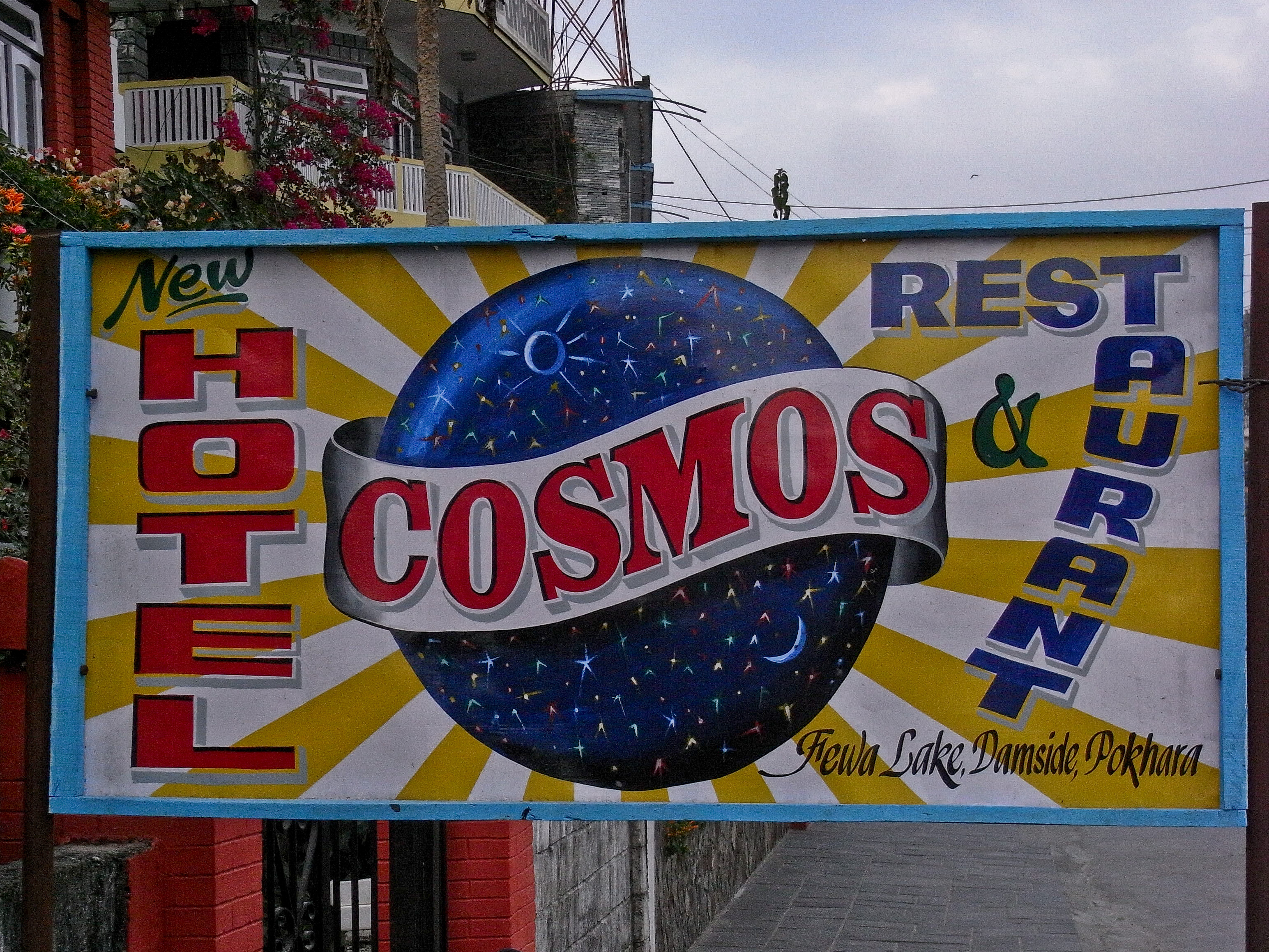
You can almost hear the clang of “restaurant” ricocheting off the right-hand margin. I think you’ll agree that — all aspects of its design considered — it’s a work of great eccentricity and a shot across the bow in the war against slickness.
The lure of variety is a siren call beckoning us to wander off the humdrum horizontal baseline, functional though it may be. Stacking type vertically is a common alternative, although it’s hard to do well without compromising legibility. In the following snap taken in Janakpur, Nepal, this urge to be untraditional has, I think, run amok:

Apparently intoxicated with the success of mixing baselines with “ice cream,” the sign painter here has veered off the road with “birthday cake,” whose baseline is hard to find to begin with, and whose word division is apt to get his lexicographical license revoked.
Nevertheless, the argument that “rules are meant to be broken” is powerful, and independent thinking can yield amazing results. To wit, the following sign offering fish sales and boating services in Senegal’s Casamance region.

Alternating backslanted and obliqued lines of type creates an accordion-fold effect that’s enough to make you lose your balance. My suspicion is that if this effect were attempted on a computer it would be a total flop, but as it is, the variations in the angles and weights of the letters gives the thing a motion that, intentionally or not, recalls the tipsy rocking of the area’s long, narrow canoes. This is bravura work.
When you leave the English-speaking world, it’s easy to forget that there’s more to translating than getting the meanings of the words right. But the eye-catching translations often teach lessons that are easy to overlook in our own mother tongue. Take this example from Baoshan, China:
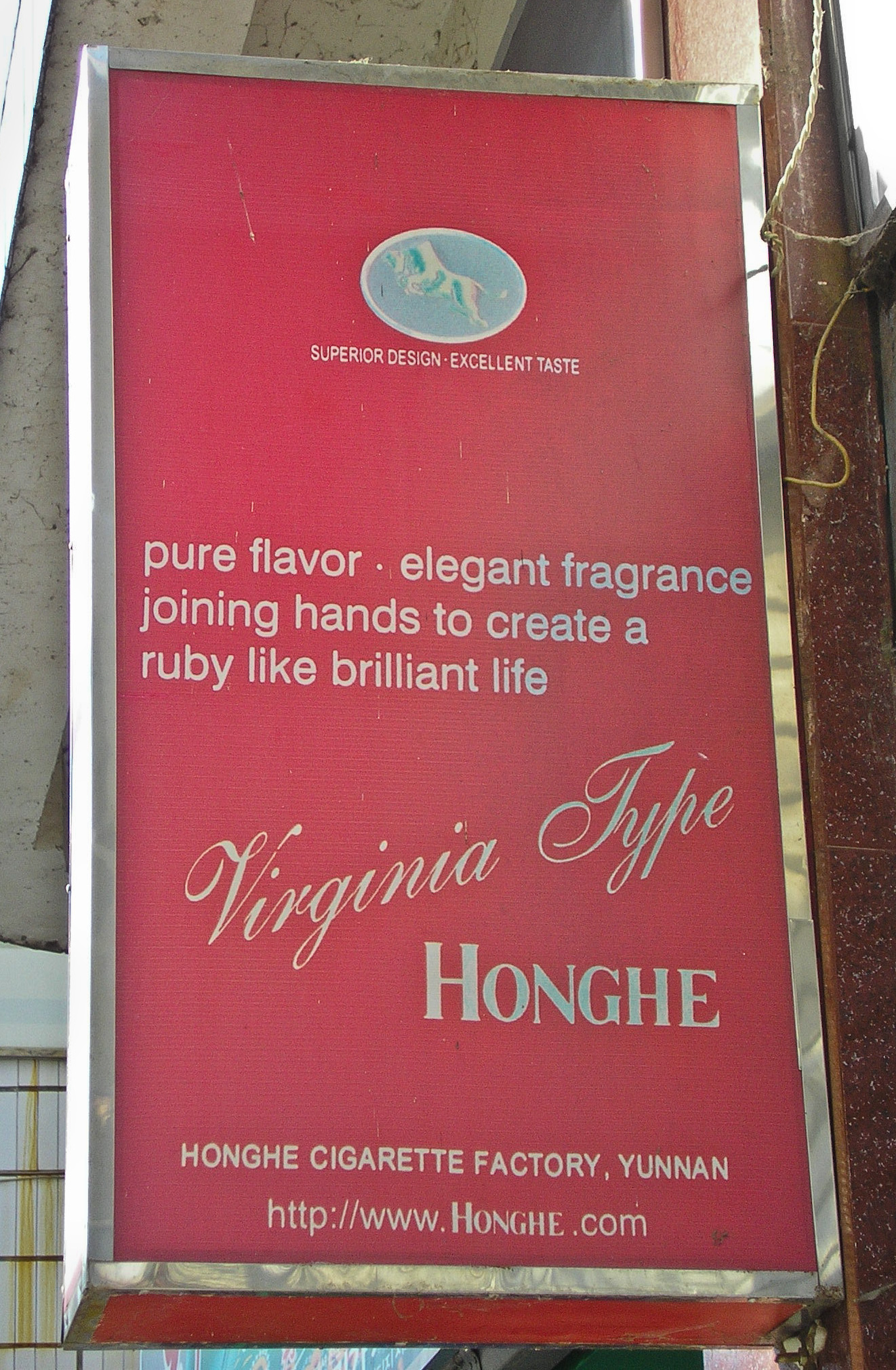
This sign’s dreamy message is clouded because the typography doesn’t make apparent at first glance that these smokes offer two key qualities, flavor and fragrance, and these will lead us directly to the ruby-like brilliant life we all aspire to. A little extra leading to separate the first line from the rest would offer a minimal fix. Centering it all and putting each sacred quality on its own line would have given the whole thing the more poetic aspect such deathless copywriting deserves.
But no matter where you are, certain truisms hold. Two are evident in this museum placard from Zanzibar:

Namely, long passages of all-caps matter are hard to read for modern eyes (those lowercase letters are habit-forming), and tight leading makes reading a struggle. Nevertheless, when confronted with it, I felt strangely compelled to read every word. I’m not sure, though, whether the power of that compulsion could have gotten me through a second panel. Or that if it were set in Univers I would have even given it a second glance.
An important lesson to learn from looking at type such as this is that perfection can be boring. To my eye, a lot of today’s typefaces are clinically perfect but cold and stolid on the page. The irregularities that once arose from hand-cutting type have been ironed out in the digital era, resulting in type that’s less animated, less energetic on the page, than type set by hand. The following sign, from Xian, China, while fun to read, is interesting mainly for the choreography of the type, which is made up of raised, stick-on letters, some of which have fallen off.

Among its most noticeable attributes is its informal approach to adhering to the baseline, which takes on the quality of a suggestion rather than a rule. Second, the sizes and orientations of the individual characters vary, and the designs of the characters themselves are inconsistent, although still identifiably cleaving to the personality of some specific typeface. Third, the right-hand margin displays a “near-justified” setting that was common in the early days of letterpress printing and that blends well with the type’s general approach to geometry.
Add it all together and the sum is a lovely, quirky, and refreshing bit of typography. I wouldn’t want to read “War and Peace” set like this, but in general I’d welcome more animation from typeface designs and margin treatments to create pages with a little dynamism.
The following photo proves (to me at least) that there is such a thing as typographical humor. Whether intentional or not, this sign from India’s Chennai airport is a real hoot (even though the photo is crummy).
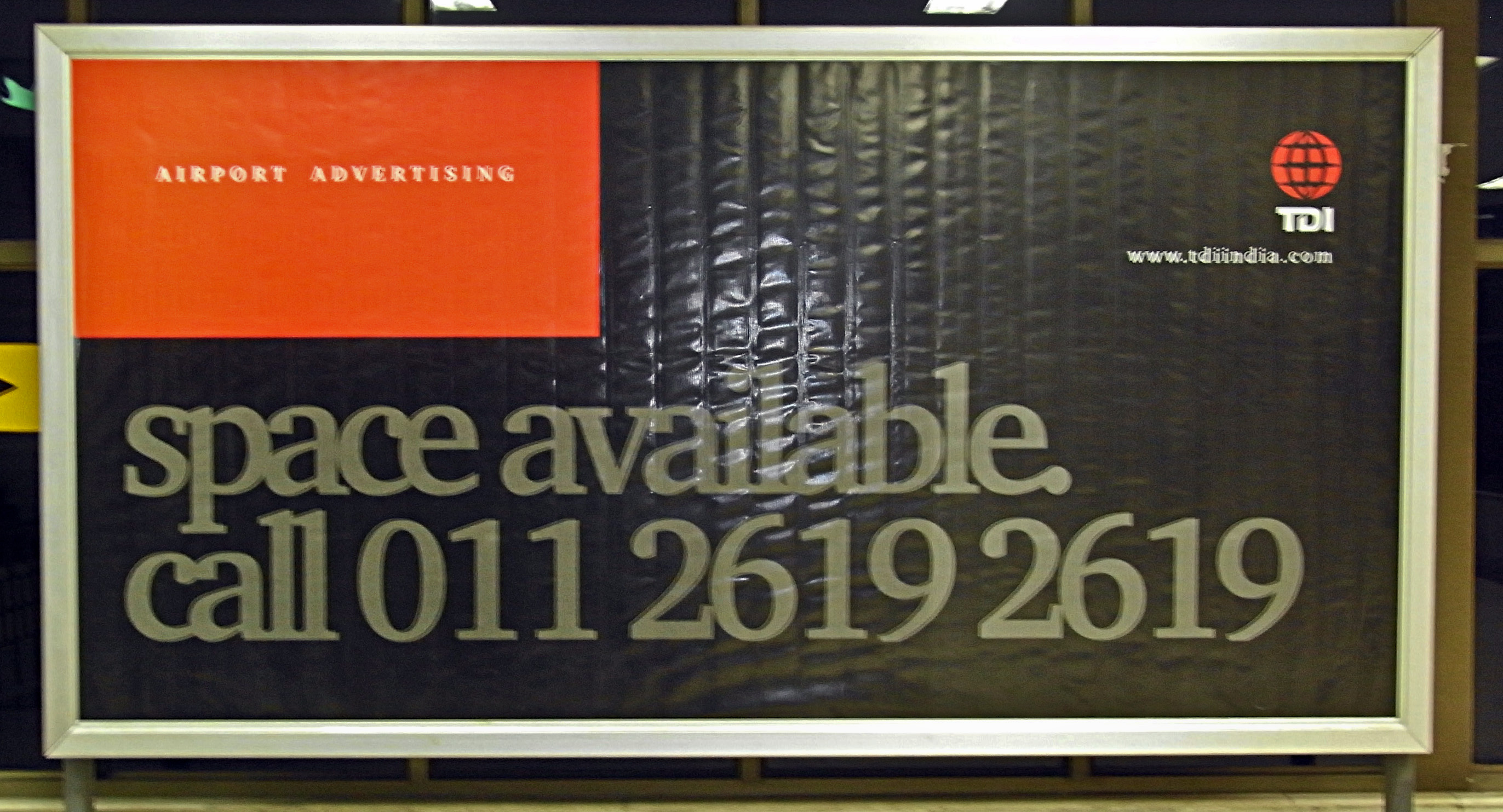
Space available indeed! This sign’s designer has squeezed enough space out of these words to build a cricket pitch. Note that the deed has been done solely by narrowing the type’s tracking, not by kerning, because the numeral 1s are still loosely spaced.
Clearly, there’s a lot of room for fun in the world of typography, and a lot of leeway in what can pass for “correct.” But that’s no excuse for a lack of rigor when in comes to the important things, so I’ll conclude with one last smiler, a photo I entitle, “Blessed be the Proofreader.”

This article was last modified on December 17, 2022
This article was first published on April 1, 2010
Commenting is easier and faster when you're logged in!

Recommended for you
Redefining Letterpress in the Digital Age
Erik Spiekermann is on a quest to make letterpress a viable and meaningful proce...

Willoughby Design and the Evolution of a Typographic Paper Promo
Nothing makes a designer happier than paper and type. So when Neenah Paper asked...

Adobe's New Open Source Font: Source Code Pro
This past summer, Adobe released their first open source type family, Source San...