

Small capital letters—small caps, as we say in the trade—are a typesetting mainstay, even though they aren’t available for most typefaces. The larger character sets (or more accurately, glyph sets) made possible by the TrueType and OpenType font formats have never translated into universal access to small caps, even though they should be commonplace.
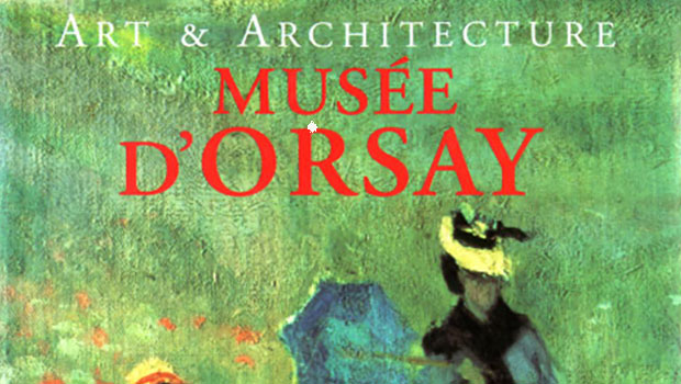
As a part of standard print design vocabulary, small caps appear everywhere, especially in display type, as seen in Figure 1.
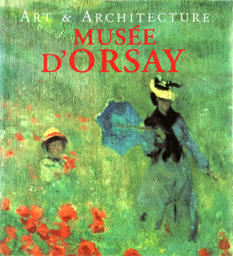
Figure 1: Book titles such as this one are a classic application for small capitals. They retain an air of formality without the blockiness that would come full-size capitals.
In text, small-cap usage is mainly dictated by house style. In only a few cases is there something approaching unanimity about when they should be used. These cases include the abbreviations A.M. and P.M. (set in lowercase in British use) and A.D. and B.C. (as well as their updated equivalents, B.C.E. and C.E.) and other less commonly seen abbreviations used for dating: A.H., A.S., A.U.C., B.P, and M.Y.B.P. By tradition, speakers’ names in plays are also set in small caps.
They’re also often used in text for all-caps material that looks too bulky when set in full-size caps; for example, the acronyms NATO, UNICEF, and UNESCO (Figure 2). This is strictly a design consideration, though, and there’s no copy-editing prohibition against full-size caps. The same goes for substituting old-style numerals for lining numerals: the proportions of oldstyle numerals are better matched to surrounding lowercase text than lining numerals. In fact, oldstyle numerals are sometime called lowercase numerals.
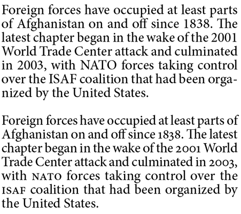
Figure 2: In the sample immediately below, the dates and acronyms seem to jump out of the text by virtue of their size. In the bottom of these two samples, I substituted oldstyle numerals and small caps to create a much smoother texture and type color over all.
It’s popularly alleged that small caps should be the same height as lowercase characters, but this isn’t true. The size relationship between caps and small caps and small caps and lowercase characters is not fixed. Small caps commonly range from 10% to 15% larger than the x-height of a face’s lowercase characters (Figure 3). Small caps that are much smaller than this tend to look puny and ill-proportioned.
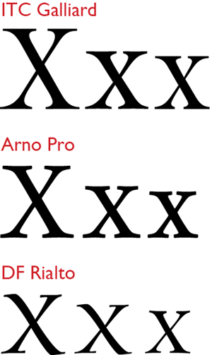
Figure 3: In each of these three samples, a full-size capital X is followed by a small cap version, which is in turn followed by a lowercase x. In the case of Galliard and Arno, the small-cap is slightly more than 10% taller than x-height. In the Rialto sample, it’s more than 15% taller.
Some older PostScript font families include small caps in alternate, expert-set fonts. These days, small caps are more commonly found—when available—in extended OpenType character sets. Since you want to substitute small caps for full-size caps only here and there, select the capitalized matter you want to convert and choose the All Small Caps option from the OpenType pop-up in either InDesign’s Character palette menu or QuarkXPress’s Measurements palette.
In all cases, you should avoid creating your own small caps by reducing the size of full-size capital letters. The results of such scaling are, well, puny and ill-proportioned. If you’re not using a font that contains real small caps, you’ll get the faux version when you select the Small Caps option from InDesign’s Character palette menu or from QuarkXPress’s Style/Type Style menu. Small caps that have been designed for use alongside full-size caps and lowercase text are created to match the color and spacing of the type around them. Small caps should have the same stem weights and same feel of openness as surrounding text, and this is not possible in small caps that have been scaled to size. Figure 4 includes several cases in point.
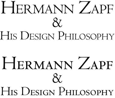
Figure 4: In the upper sample, I allowed InDesign to create synthesized real caps by scaling full-size caps down to size. They’re more spindly than the full-size caps they appear next to. The small caps in the lower sample come from an expert-set font, and their color is in perfect harmony with that of their companion full-size caps.
When small caps are used in small sizes (as they commonly are in legends and caption text) this effect is exaggerated because the capital letters designed for most text faces already look weak when scaled to these sizes; when reduced further to simulate small caps, they become very faint and hard to read.
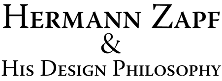
Figure 5: In this example, using regular-weight full-size caps alongside scaled-down semibold capitals in place of true small caps creates a harmonious type color throughout.
This is not to say that you can never get away with using fake small caps. Figure 5 is an example in which it’s difficult to tell whether the small caps were designed as such or created electronically. Their proportions and color balance look pretty good.
The trick—which won’t work with every typeface family—is to use a slightly heavier weight for the small caps than for the full size caps. For example, some typeface families contain both regular and book weights, or regular and semibold. When the contrast between these neighboring weights is not too great, small caps created from the heavier weight can blend harmoniously with caps set in the lighter. This is simply because scaling down the heavier-weight face brings its stem weights into accord with those of their lighter-weight neighbors.
The easiest (perhaps not the best word) way to find an installed OpenType that font contains small caps is to open either InDesign’s or QuarkXPress’s Glyphs palette and use the pop-up menu to display subsets of the font’s character set. If small caps are in the font, they’ll be listed as a category in this pop-up, as shown in Figure 6.
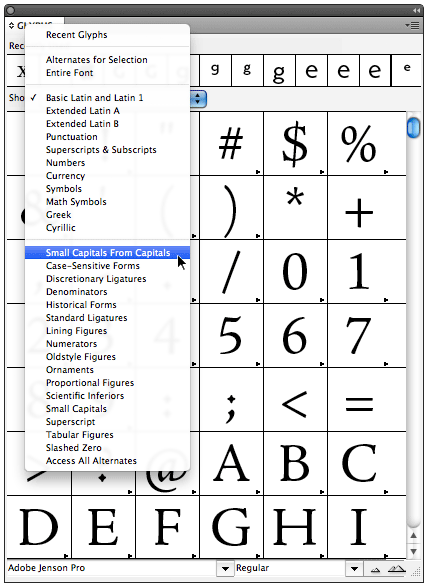
Figure 6: The Show pop-up menu in InDesign’s Glyphs palette (XPress’s version has no label) reveals the various glyph subsets an OpenType font contains, including the elusive small caps.
Wading through a host of fonts to find one that offers small caps is tedious, but there are no search tools that locate fonts with small caps because small caps don’t have unique Unicode numbers (the I.D. numbers used by operating systems and applications to identify type characters). As far as Unicode is concerned, a small-cap A is the same as a full-size capital A—it’s merely an alternative form. It’s a safe bet that your OpenType “pro” fonts contain small caps, but otherwise you’ll have to resort to a little spade work.
Having found them, though, you’ll see that the effort was worth your while. Using true small caps is one of the myriad little things that elevate type from merely readable to a pleasure to behold.
This article was last modified on July 31, 2021
This article was first published on February 16, 2011
Commenting is easier and faster when you're logged in!

Recommended for you

Centering Lines of Type? Don't Trust Page-Layout Software
It’s easy to have too much faith that our page-layout programs will do the right...
Photoshop Quick Tip: Applying OpenType Alternates
As Ilene Strizver wrote in a recent TypeTalk, you can use alternate characters i...

Can You Read Me Now? Testing the Limits of Readability in Design
I’ve long been obsessed with how things work. Sometimes I think maybe desi...