Hot Stuff

Weekly Contest - Fanurio Software
1 Winners Selected
The Big Picture Magazine - FREE
Real-world solutions to design challenges
Get Creative Videocast
New every week. Watch what's important to you.
Great Sites: A Curiously Strong Argument for Using Frames in Web Design
Contributing editor Clay Andres flips the top on the Altoids Web site to demonstrate the utility of frames.
Written by Clay Andres on October 18, 2000
Categories: Web/Mobile, Features
Related Articles
Related Reading
Do you revere or revile frames? You wouldn't think that the addition of a single tag to the HTML definition could cause so much controversy. And yet there's little agreement over the usefulness of this now relatively well-established construct.
The implementation of frames in HTML had a rocky start, largely because the browsers of the day handled frames differently if at all. A movement arose in the the design community to abolish the use of frames in Web design altogether. As both the Web design community and Web browsers matured, frames became better understood by all parties, and it is now possible to design captivating, efficient pages built on frames. The Altoids Web site is a good example of the potential of frames.
A Brief History of Frames
The <frame> tag was first available with the release of Netscape 2. Suddenly, Web designers had a way to create persistent navigational elements to go along with changing content, and just as suddenly a two-class browsing society was created -- the frames-enabled and the frameless.
While some designers rushed to frame their pages, others bemoaned the limitations that using frames created, chief among them the fact that the browser Back button no longer worked as users expected. Even today, when nearly all browsers support the <frame> tag and the Back button is smart enough to recognize framed content, many people still hate frames.
In his design manifesto, Designing Web Usability, Web usability guru Jakob Nielsen says, "My main recommendation with respect to frames is: Frames: just say no." But he does go on in the next sentence to admit, "People who really know what they are doing can sometimes use frames to good effect."
This is like warning designers not to use animated GIFs unless they really know what they are doing. Frames are a useful construct for dividing the information on a page into separate documents. This allows for content to change without the context changing. Indeed, many compelling sites use frames to separate the navigation and content.
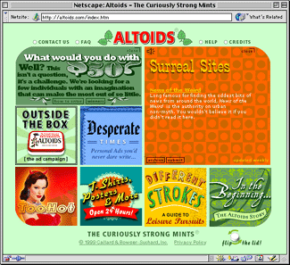
Nice Altoids!
I'm sure you're familiar with Altoids, "The Curiously Strong Mint." Even if you haven't tried the mints packaged in the pocket-sized tin, you've probably seen the humorous ad campaign for "The Original Celebrated Curiously Strong Peppermints." Humor, packaging, and the product itself are the three elements that have given Altoids such great brand recognition.
The question is this: How do you add depth to these immediately recognizable elements to create a great Web site? Answer: Use the tin.
The Altoids Web site is funny, presents all its content within a tin-shaped frame, and even sells mints. Actually, the frame, although it at first looks like it might be an HTML table, is a complex arrangement of nested frames. Here's how it works:

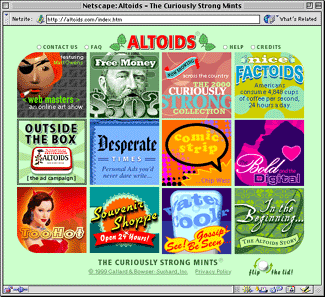
The mint green background of this site is an arrangement of four empty border frames around the top, bottom, left, and right of three content frames. Content is divided into top and bottom navigation frames with a frame for the virtual tin sandwiched in between.

The frame fun is concentrated on this middle tin frame. You can see that the face of the tin is divided into 12 squares, which represent 12 content links. Limiting a site to a specific number of hierarchical divisions seems like a big mistake. But through clever frame manipulation, the designers have expanded beyond this artificial limitation.
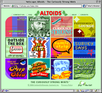
Several of the squares, each of which is a frame, contain documents with JavaScripts that change the content after a given amount of time. You can see this effect immediately by clicking the Flip the Lid link in the bottom navigation bar. The Nice Factoids frame in the upper left corner becomes the Peppermint Lounge frame, and so on. In fact, there are 18 content frames when all the changes are counted.

This system works, because important frames, such as Souvenir Shoppe (the e-commerce link) and Outside the Box (a gallery of Altoids humorous print ads), never change. Only the purely frivolous, brand-building links are swapped in and out.
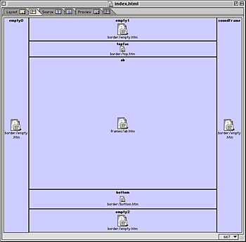
You might have jumped to the conclusion that this centered frame is simply divided into 12 equal subframes. Not so. This is a deep nest of frames that provides remarkable flexibility for displaying content. The main tin frame is divided into two side-by-side frames. Each of these is then divided into three horizontal frames, which are each divided in half vertically.
The purpose of this is to allow content to fill one, two, three, four, six, or all twelve frames. So when you click on the Free Money link, instead of filling the single frame, the content fills two frames. Clicking the Surreal Sites link fills four frames with content. This kind of rearrangement works only because the frames for these varying display sizes are already defined.

They Appear to be Dividing!
You can see that the number of frame permutations available for different kinds of information is quite large, and Altoids has done its best to fill every corner of this tin with suitably silly content. While this may be a site that only the seriously mint-addicted would visit regularly, it does a wonderful job of perpetuating the Altoids mystique. What is this curiously strong stuff? You'll have to flip the lid to find out.
From an architectural standpoint, the use of frames to build a multi-faceted virtual tin top is not only clever, but used with such inventiveness and consistency that this is a very strong little site. Would frames detractors excuse this site on the grounds that its designers "knew what they were doing?"
Granted, some designers have and do misuse frames. But to denigrate frames simply because the construct is often misused it to deny ourselves a valuable tool. It's high time we all recognize that frames are a powerful construct for presenting certain kinds of content -- specifically, content that requires a relationship to other elements of a page even as the content itself changes.
Read more by Clay Andres.
Login
Login to post a comment. Not a member? Sign up here
Forgot your password?


Frames Are Not All Rosy
This article seemed to take an approach of "Why in the world don't more people use frames?" Please read the first response all the way at the bottom of this page. I would like to add that if a user tries to print something, they only print the active frame which is really annoying. Although I found Altoids solution innovative from a design aesthetic, I do not agree that this is a strong case for real world usability.
Altoids-curiouswasteofbandwidth
Other than having the Altoids name in front of me, this website offers me nothing of interest. It's design, which interesting from a technical standpoing, is confusing, inconsistent, and loaded with bad combinations of text and background color, making much of the useless text unreadable.
Oh, wait, maybe that was the idea!
Disagree
"It's high time we all recognize that frames are a powerful construct for presenting certain kinds of content -- specifically, content that requires a relationship to other elements of a page even as the content itself changes."
While I agree with the desire, using Frame is not the correct answer. And the Altoids web site is nothing more than marketing flush, a CD ROM title on the web, so frames on its site proves very little.
Frames were a hack to avoid what designers and developers REALLY want: Full HTML documents contained inside a table cell. If you were able to fully compile a complete HMTL document inside a table cell, (and I'm not referring to using an <EMBED> tag, although that is close, but something more akin to what coders might call "flattening"), you'd get the desired behavior that people try and use <frame> for.
As it stands now, this article is barely useful. Another case of someone writing for form and not addressing function. Oh well.
Andrei
I agree
I agree. I never understood why so much people hate frames.
Frames useful for positioning.
While I do agree somewhat with one of the disagreeing responders, overall I felt this was a useful discussion. Search engines do get confused by frames, but it does not prevent the site from being listed. Many people seem to like having an entire page reload on every link, rather than having only part of the content change. This is like turning a page of a book. Often this is the prevailing cause of the animosity to frames; they feel unnatural. Frames create situations that are less like books, and really only similar to interactive CDs, and other purely digital material.
There are rare situations when frames work well. The use of border frames, with no content, can centre a page in a browser window. This can be a good viewing solution to account for various browser windows sizes. Using a table with % widths and heights seems to go wrong too often on different browsers and platforms.
Since the majority of people badly use frames, there use should be limited. The only other similar solution would be layers and floating box controllers, which are currently difficult for designers to easily create.
As a print designer, I want to have control over the position of elements when I do web layouts. Frames are just a tool that sometimes helps this process.
The problem is the programming, not the frames themselves
Most people get into trouble with frames because the designer didn't pay attention to stupid little things like targeting their links. All most users know when this happens is that the website sucks, and everybody blames the poor little frameset.
While I don't think the Altoid site is the single most aesthetically pleasing site I've ever seen in my life, it is a masterful use of frames and proof positive that the problem is not in the technology but in its implementation.
Good example
While the argument for frames is still a subjective, preferential one, I had to admit that I thoroughly enjoyed the Altoids site. The use of frames does work very well to entice the viewer to interact and delve deeper into the very complicated site.
Nice site, except for....
I enjoyed this article. It presented an unique way of using frames to archieve an interesting effect.
However, the Altoid site demonstrates a problem that you encounter whenever you add any design element that increases complexity (frames, flash, etc.). I couldn't get this site to run on IE 5 for the Mac. It loaded the external frame, but none of the internals, showing a dull grey square.
I don't think that any aethetic benefits from this frame-heavy design outweigh cutting off access to a good portion of their audience!
Function / Form!!
I agree with Clay on certain points. Frames are useful but many designers overuse or misuse them. I'm glad this topic surfaced once again. I also agree with one responder commenting on users liking the "pages from a book feel" rather than sections of content changing. However, I believe that user animosity comes from framed pages that don't flow like the information should. The (old) rainforestcafe.com and gallegoslighting.com are great examples of good frame design and excellent usability on multiple platforms.
This site does a great job of using frames as a design element and entices the user to browse the site. However, viewing it on a PC works great but on the Mac you get an empty box in the middle. How is this user-friendly design? In no other medium does function and form need to be married as these two players do (In this order).
The problem with most design on the web STILL today is lack of functionality. As a print designer this is hard to say but functionality (at least on the web) must be first in line then art. When you can achieve both, this is what great web designs are made of. Many make use of all the new toys available to build cutting edge sites when most users just want the content within and if using frames can help achieve that then so be it.
The other problem and I believe it was mentioned before is "Search Engines". There are tags to join pages but you don't always know what engine is not going to read those tags.
Like everything... Moderation and purpose then open the floodgates…
frames and search engines
I agree, to a certain extent, with the numerous points Clay Andres makes with regards to frames. However, there are two severe drawbacks that people/designers fail to realize. MAJOR oversights, if you will. This is why I must strongly disagree with Clay.
#1. Search engines. They do a great job with "flat pages", but when it comes to cataloging a site with frames, they tend to stop as far as the top page. Search engines RARELLY go much further. This is something that can really piss a client off!
#2. Site stats. This can become a total nightmare deciphering page hits, most often viewed, etc. Those IT guys will think you're an idiot. They might have 'you' give the stat reports to the client.
These are 2 areas designers seldom [if at all] think of. A designers thought process is about form, function, aesthetics, etc. My advice.... designers, get with IT people and talk together about a workable solution. If you are an independent, get some quality magazines discussing the issues of the web. This will help designers look more like the hero and less like a monkey to ALL involved with a project.