
Great Sites: A Novel Interface for the Smithsonian’s Everyday Things
Don’t you hate it when the first page of a site is nothing more than a long list of technical requirements for viewing the site? This is not a good way to begin a quality Web-browsing experience. Yet the appropriately titled “Revealing Things” prototype created for the Smithsonian Without Walls has no choice. What makes this online exhibit so interesting and exciting is the technology behind it, so there is no alternative low-bandwidth or feature-crippled version.
Revealing Things uses a proprietary data-animation engine called ThinkMap, which is a Java application developed by Plumb Design. The first prototype use of this technology can still be viewed at Plumb’s Visual Thesaurus site, which presents a fascinating free-association view of an online thesaurus.
The Revealing Things project was handled by the design firm Razorfish, which brought in Plumb specifically because it wanted to use ThinkMap to animate the interface. The efforts of these two firms — one handling the front end, the other the back — resulted in a powerful exploration tool that takes us to the edge of what’s possible on the Web.
Exploring the Site
Once you get past the “Revealing Things” requirements page, you’ll experience a delay while several files load. These are not Flash files, though Flash is required for one of the later animations. When the loading finishes, you’re left at the real introductory page, which reveals only a sampling of what lies ahead. Click to continue.
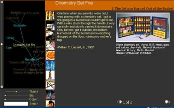
Finally, a small, 600-by-400 pixel window opens with a number of different information areas divided into frames. The main content frame includes a picture of the currently selected “thing,” in this case a Gilbert Chemistry set from the ’40s, with an accompanying narrative. Some of the narratives have additional pages or audio, and you click icons to load these.
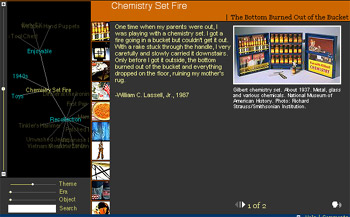
Figure 1: The “Revealing Things” site divides its 600-by-400 window into several frames.
All the site’s text is set as sans serif using CSS (Cascading Style Sheets). The dark gray background of the narrative frame provides good contrast to the yellow text and the images.
A stack of thumbnail images lives in a narrow middle column on the page. These look like basic links from thumbnail to content, but the stack is actually richer than this. When you move the cursor over a thumbnail, the image is highlighted to show that it’s selected. The frame in the lower left corner of the window identifies the image and includes a brief, scrolling description. At the same time, the name of the image is highlighted in the floating “Maplet” frame at the left of the window — the frame that holds the map of the various associations.
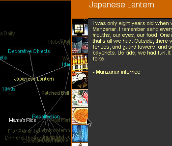
Figure 2: Moving the pointer over a thumbnail image highlights the associated title in white within the Maplet frame to the left.
Clicking on a thumbnail changes the content and title frames and reshuffles the stack of thumbnails so that the active one is on top. Simple enough so far. But don’t let the fact that there are only ten thumbnails fool you.
Take a closer look at the Maplet frame. This is where most of the navigation occurs, and it is an ever-changing map of associations rather than a direct correlation of fixed hierarchical links. In the center of the Maplet is the current content item in yellow — the color for titles that represent “things,” or objects. The concepts that relate similar objects appear in blue. These are associative links, and you can click on any blue item to bring it to the front and rearrange the map. As we saw in Figure 2, highlighting a thumbnail highlights its name in white in the Maplet.
What you’re seeing is a complex database schema come to life. Each “thing” fits into a number of concept categories, and as you click through the map, you can see the associations rearranging on the fly. When a blue concept comes to the front, the yellow “things” float around it, and the column of thumbnails updates. Clicking a yellow link brings that thing to the center, changes the content frame, and rearranges the thumbnail column. So if you click on Unwashed Jeans, for example, its yellow title comes to the center of the map, and three blue concept links float around it — Recollection, Jeans, and 1950s.
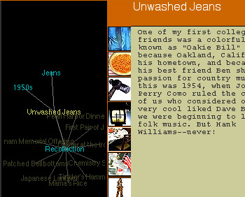
Figure 3: Clicking on an object title (yellow), such as Unwashed Jeans, brings it to the center of the map, surrounded by relevant concept links (blue).
If you click on the blue 1950s concept link, new associated concepts appear around it, and yellow “thing” links display in the background. The same “things” show up as images in the column of thumbnails.
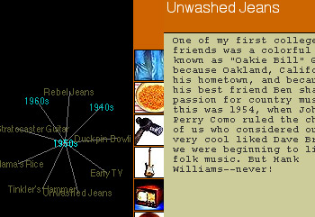
Figure 4: Clicking a concept link (blue) brings it to the center of the Maplet.
From a design and user-interface point-of-view, all the pieces — the frames and the elements they contain — make up a coherent whole, with navigation on the left and content on the right. The frames-based organization makes it possible to change the layout of elements in the large frame to suit the contents. So one content document might have a dark background and another a light one. One frame might be straightforward HTML and another use Flash animation. This flexibility also makes it easier to acquire content from outside sources, but it also means that some of the frames don’t fit as cleanly into the space as others.
Navigation is not as straightforward as one might hope, and I’m certain some visitors will find it confusing. But this results more from the novelty of the system than from a fault in the design. There is no navigation bar; everything is selected from the Maplet or column of thumbnails. This scheme works in this case, because the site is completely devoted to the collection of “things” and their revelations; there is no place else to go except the Help section, which may come in handy until you’ve acclimated yourself to this new way of navigating.
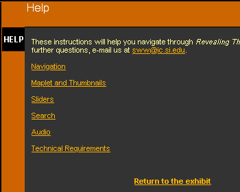
Figure 5: “Revealing Things” includes concise, well-organized help to get visitors up and running with its innovative interface.
Using the three sliders in the frame at the bottom-left corner of the window, you can also adjust what information is shown in the Maplet, to place more or less emphasis on Theme, Era, and Object.
Clicking on the little window icon in the blue bar across the bottom of the window opens a new, separate Maplet window. This gives you more room to see the concepts and their relationships to the objects of the exhibition. You can even drag the items around and watch them rearrange. It’s almost more fun to watch the relationships change than to read the object descriptions.
Having Things Your Way
You may have noticed that I’ve talked very little about the exhibition itself. The attraction of the content is based mostly on nostalgia. The featured “things” that are revealed in this exhibition are everyday objects of the not-too-distant past, and each has a story to tell. The stories are not profound, but they add a facet of human interest to these otherwise mundane artifacts of the ’40s, ’50s, and ’60s.
More interesting from the standpoint of information architecture is the way information is stored, selected, and presented. There’s a freeform nature to the Plumb Design ThinkMap that makes each visitor’s experience different and personal. It gives you the opportunity to make your own choices and follow your own interests. The unique tools facilitate this rich browsing experience, while the design of the site leads us to discover as much about ourselves as about the exhibited things.
Read more by Clay Andres.
This article was last modified on January 8, 2023
This article was first published on February 15, 2001
Commenting is easier and faster when you're logged in!

Recommended for you

Enfocus Software Announces "Enhancing Your PDF Workflow" Seminar Series for Designers, Printers & Publishers
Enfocus Software, the world leader in PDF quality management solutions for the g...
Arranging Numbered Lists in Separate Frames
Did you know you can have numbered lists run in a sequence that jumps across sep...
