
Great Sites: SFMOMA Showcases Modern Art in a Modern Medium

For some people art and technology will always be at odds with one another: Art is supposed to transcend the mundane concerns of technology. But to the San Francisco Museum of Modern Art (SFMOMA) the world we live in demands the marriage of art and technology. And what better way to express this than through the Web — the great technological gathering place that has attracted so many designers.
The current theme of the SFMOMA site‘s home page is art in technological times, in honor of the online exhibit “101010: Art in Technological Times,” and there’s a seriously digital feel to the home page. Actually, there are two home pages — two different home-page background images — that change randomly without altering the branding, navigation, or information. The SFMOMA site has been changing its background regularly since the site went up more than a year ago.
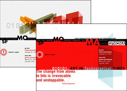
SFMOMA’s site alternates between two different home-page designs, though each uses the same navigational elements and provides the same information.
SFMOMA’s “101010: Art in Technological Times” is a fascinating Flash tour de force, with an interface and design all its own, and creativepro.com featured the exhibit shortly after the exhibit’s January 2001 opened. The exhibit works nicely with the main site but exists as a separate entity. For this discussion we’ll focus on the main site with its more traditional approach.
Primary Navigation
There is much to admire about the SFMOMA site. It is elegant, clean, consistent, very usable, and full of information — exactly what a Web site should be. But rather than discuss all these aspects, we will concentrate on the site’s navigational elements.
The primary navigational tool is used on every page within the traditional domain of the site. It is not immediately evident on the home page, but the strip of links interwoven with SFMOMA branding elements is really a straightforward navigation bar. There are three groups of three links each. Individually, these nine typographic elements are the smallest things on the page, but graphically they create a strongly unified element that clearly identifies them as links. They are also the only rollovers present, which confirms their navigational purpose.
A line of links woven into the SFMOMA branding elements serves as a navigation bar, both on the home page and throughout the site.
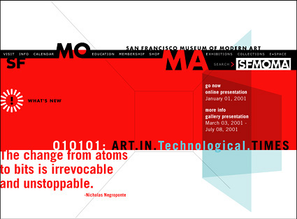
Both home-page designs are bold and inviting. The contrast of red and black and the geometric quality of the pages reinforce the theme of Art in Technological Times. The bright What’s New daisy is the link to the newer site divisions that we will discuss on a second visit. The daisy also serves on interior pages as a non-hierarchical link to these non-traditional sections.
Hierarchically, the site falls fairly neatly into nine divisions, each subdivided into multiple sections. The first three divisions — Visit, Info, and Calendar — are all administrative in nature, and they share the use of a green background on their divisional pages. The next three — Education, Membership, and Shop — are all public affairs-oriented and share the use of blue backgrounds. The three exhibit-oriented divisions — Exhibitions, Collections, and E*Space — use orange backgrounds. These groupings are not part of the site hierarchy; they differentiate the divisions thematically and logically.
The navigation bar from the home page stretches across all nine divisions. The consistent use of this element clearly identifies the site by name, acronym, and logo. The strip changes so that the active divisional group is differentiated by a white background while the two inactive group links share the page-background color. The current division title is highlighted in red type.
The navigation bar also includes a cleverly implemented search function that appears to be the SFMOMA logo but that becomes a text entry box when you click on it. The use of this Javascript function avoids the ugly form field we usually associate with a search link. The fact is, this ordinary navigation bar is doing a lot of work in a small amount of space.
The bar is implemented as a floating box, as are the other page elements (using the CSS <DIV> tag) so that they can be precisely positioned. It is in the middle of the home page, near the top of the first six divisions and under the content of the last three divisions. The elements within this box are laid out as sliced GIFs in a three-row table. In one small example of art and technology becoming one, this cut-up array of little pieces integrates transparently into the graphical composition of the page.
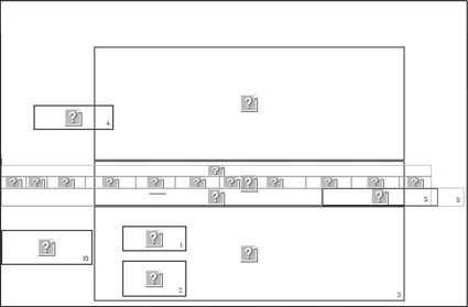
Here the home-pages’s floating boxes are numbered, the table cells are outlined, and the images show up as question marks.
Division Pages
The secondary navigational element is as straightforward, clean, and uncluttered as it can be — a simple box of typographical links that roll over to red when pointed to. Its position across divisional pages changes, but within divisions it stays fixed.
A simple box of text links serves as the navigation within most of the site’s nine divisions.
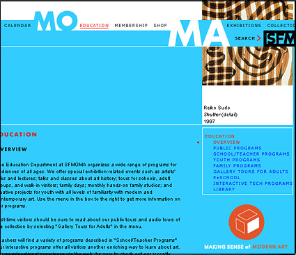
In the first six divisions, a wide, nicely typeset column of text fills the left side of the page. A column down the right contains an image on top with navigation underneath. The image is always taken from the Museum’s collections and is usually the main visual element on the page. The navigation box is headed by the current division name in red with the current section name bulleted and highlighted in red. Subsections are indented within the list. This scheme allows the hierarchy to grow both deeper and broader without any need to change the navigation.
A couple of the divisions have customized secondary navigation. For instance, the Calendar division uses the right-side column to highlight current exhibits and includes a bar with three months across the top of the content column. Click a month to move forward or back in the calendar.
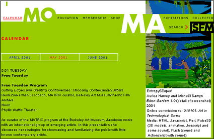
The site’s Calendar division lets you choose from three months across the top of the page. Exhibit information follows in the center column.
The Shop division page contains no content, instead comprising three rollover images that represent the three e-commerce areas of the site. Once you are inside the stores, the content is more e-commerce-like, but it remains completely consistent with the design of the site.
The three exhibit-oriented divisions — Exhibitions, Collections, and E*Space — use a more horizontal layout and place the secondary navigation box at the top-left corner of the page. Within each division, a timeline-like series of images strings across the page from left to right, usually extending off the right boundary of the display; you scroll right to see the remainder of the images. People aren’t accustomed to having to scroll horizontally and they tend to resist it; then again, I had no problem with this approach, though I use a large monitor set to a high resolution, which allows me to fit more content on a single screen than many viewers.
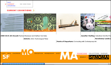
Images representing each exhibit or item line up across the screen within each Exhibit-oriented division. Viewers must scroll right to see the remainder of the images.
These images are themselves used as tertiary navigation. For instance, within the Exhibitions division there are three sections — Past, Current, and Upcoming — and each section offers up the scheduled exhibitions via a series of images with captions. Each of these images represents a link to a page with more information about the corresponding exhibit. The extra layer of hierarchy is indicative of the greater quantity of information in this area of the site. It also lends a gallery-like quality to these gallery-like sections, as if one were strolling from room to room within the museum.
Unifying Idea
As a visitor interested in Web design, don’t be surprised if you find yourself admiring this site at least as much as the art and exhibits it summarizes: The main navigation/branding bar, though it changes in color and position, is always present in some form. The secondary navigation is used consistently, and the introduction of tertiary navigational elements is graphically consistent with all that precedes them. Visually, the site is always clean and elegant.
The experience of navigating through and around the SFMOMA site allows not only the instant gratification of moving easily from subdivision to subdivision within a site, but also the pleasure that comes from an “architectural procession” — the path from one gallery to another — that is typical of museums. In design and execution this site shows the elegance of precision and attention to design details. And it has great content. It is a place worth visiting, lingering in, and returning to again and again.
Read more by Clay Andres.
This article was last modified on January 8, 2023
This article was first published on July 2, 2001
Commenting is easier and faster when you're logged in!

Recommended for you
Six Successful Creative Kickstarters
We’ve all had that great idea we were convinced would change the world. Mo...

The scope of InDesign styles
Having trouble making sense of how Paragraph, Character, Object, Table and Cell...

“Corrupt InDesign File” Horror Stories
Follow these steps to ensure that your file doesn't become the next InDesign hor...