
Even the purest attempts at education and guidance carry with them an agenda of some sort. The right wants creationism, the left wants pure Darwinism, and those in the middle are pushing free choice. Some promote abstinence, and others access to birth control. Thankfully we’ve come to a time when most public education is at least sensitive to, if not immune from, hidden religious, moral, or other messages. The books, films, and computer programs that make their way into our schools are more scrutinized than any time in the past.
Yet the one indirect way specific agendas can still get through is when the media is costly to produce, or difficult to access without some form of specialized equipment. Many school systems have sold out to soft-drink vendors or cable TV giants in exchange for a new basketball court or closed-circuit TV system.
That was often the case in the golden era of the educational filmstrip. In the quest for material to feed a new medium, schools would take almost anything they could get, and corporations, publishing companies, and religious groups stepped in to fill the pipeline. It’s funny what we will put up with when a medium is in its novelty stage. Does anyone remember the barking Blue Dog Website or the one where all you could do is pop bubble wrap? That was big stuff back then, just because it was new. [Editor’s note: I must be old-fashioned, because I still love virtual bubblewrap.]
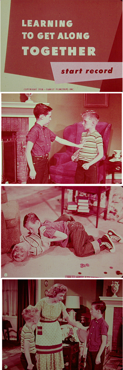
In 1958, Family Filmstrips, Inc., put out this gem to teach young hoodlums how to get along better. The key, it turns out, is to never let things escalate from the pushing stage to the down-on-the-floor stage. And listen to your mother, of course.
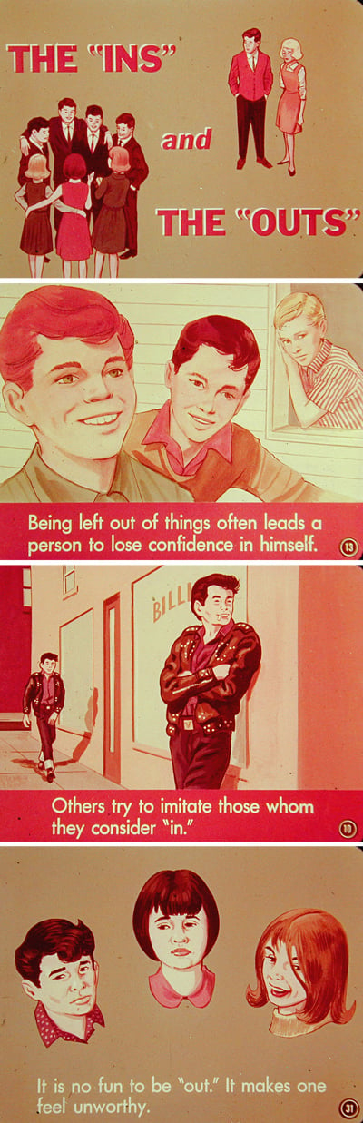
Things haven’t really changed for kids all that much since 1965 when this filmstrip explored the “Ins” and the “Outs.” The moral of the story: Being true to yourself and your community is really the only true way to be “in.”
Propaganda Takes Many Guises
Filmstrips were a medium ripe for propaganda, partly because they emerged at a time when education was becoming a national agenda, not just a local one. We had discovered as a nation that some communities left to their own devices would misrepresent or otherwise distort the truths of democracy. Books were expensive and not often replaced. Filmstrips became a relatively cheap way to get new ideas and perspectives into the educational channel.
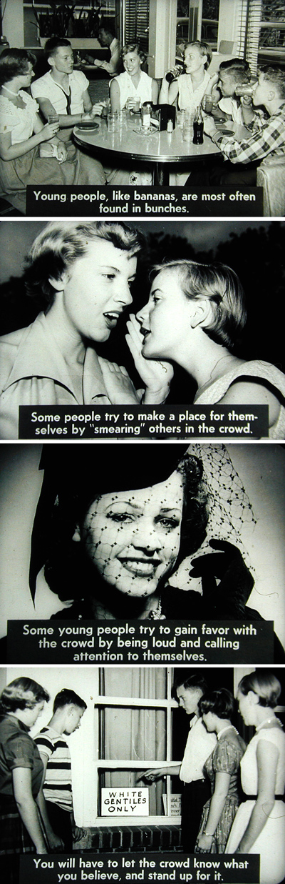
Every medium suffers from stereotyping, but filmstrips emerged during an era when some effort was made to show diversity, though certainly not to the point of actually showing ethnic teens.
And because they were a completely passive medium, it was much easier to tackle sensitive subjects that might be mangled by an even well meaning but incompetent teacher. If you stuck to the material as presented, you avoided embarrassment, interpretation, and confusion.
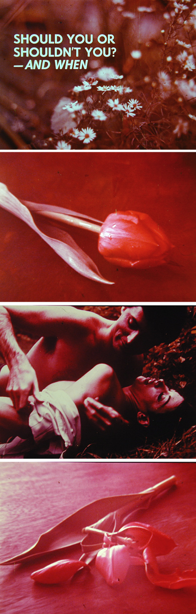
The filmstrip medium became a key vehicle for sex education. In this 1970 classic, Warren Schloat Productions attempts to explain the intricacies of biology and teen life. The not-so-subtle images seem to indicate that if you have sex, your tulips will get wrecked, but since I don’t have the soundtrack, it’s hard to tell what might be going on here.
So even though there were plenty of filmstrips covering history, science, and other academic disciplines, the most memorable ones tried to teach social skills, moral values, religious beliefs, tolerance, or sex. With titles like “Human Birth, Growth, and Development: Facts and Feelings,” a teacher could explore topics that would never get past a textbook committee.
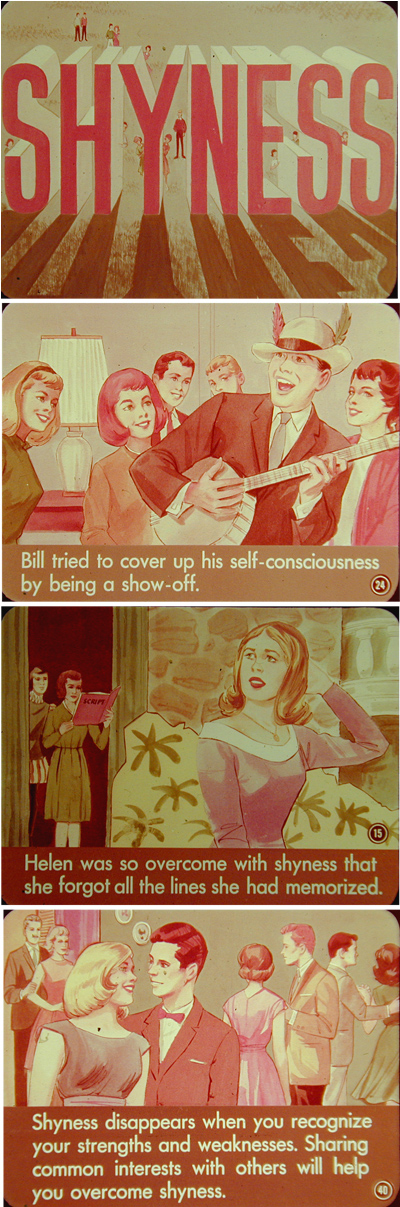
This 1960 filmstrip on shyness was part of the Filmstrip-of-the-Month Club, a division of Popular Science Publishing in New York. I have several from this series, and they all feature themes of fitting in and overcoming obstacles.
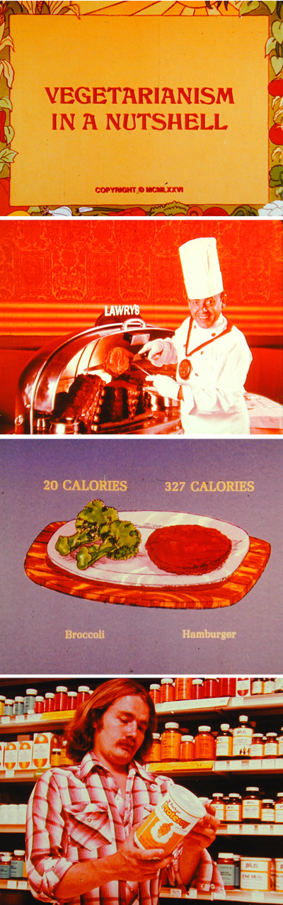
Some filmstrips were given to schools by companies hoping to influence impressionable minds. In this example on vegetarianism, the fine print informs us a protein-supplement company is behind the snazzy photos and oh-so-hip hairstyles.
In my own experience in Catholic schools, the filmstrips never faced the tough topics like sex, pregnancy or racism, but rather looked at “teen-light” subjects, such as avoiding jealousy and respecting authority figures. The format lent itself well to what I call the “Goofus and Gallant” method of teaching, named for the long-running feature in Highlights Magazine for Children. In this method, the behavior of the good kid is compared to that of the bad kid. And of course, the consequences for bad behavior are always the same — shame, punishment, regret, and rejection.
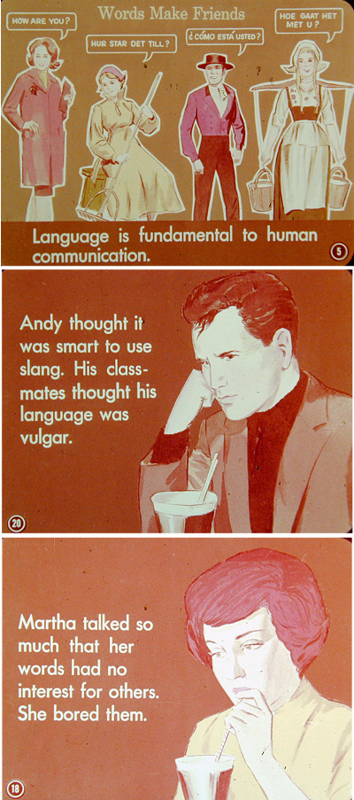
Another Filmstrip-of-the-Month selection, this insightful installment reveals that using the wrong sorts of language makes you lose friends.
Art that Befits the Medium
Filmstrips, which lay somewhere between books and movies, were an interesting artistic medium as well. The temptation was to educate in a linear, narrative film-like method that progressed more like a story than a lesson. Perhaps that’s why so many filmstrips, both religious and non-religious, follow a “parable” structure that looks at a subject indirectly. This also allows for more interesting visuals — a talking chipmunk or stuttering camel can capture attention that might be lost when the telling is more literal.
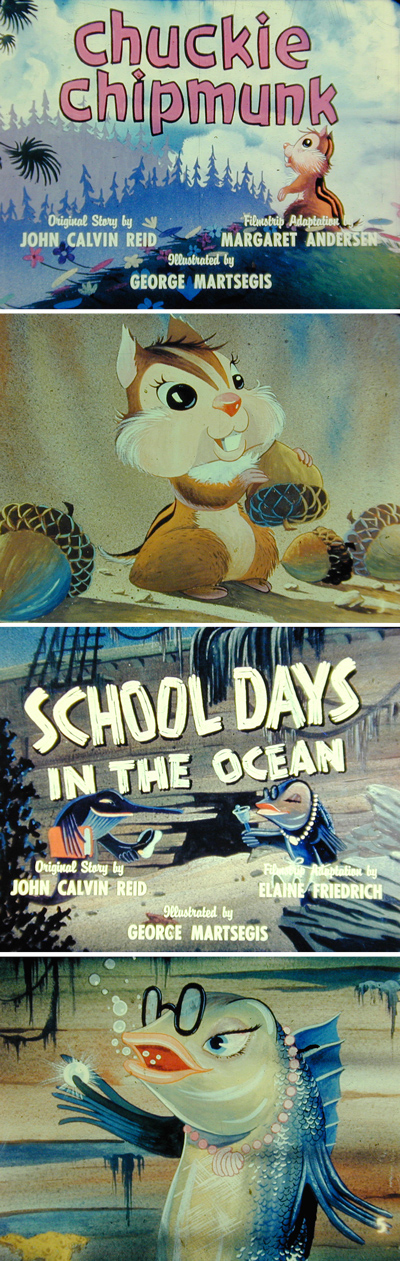
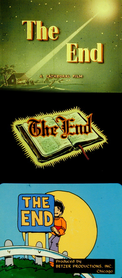
In the mid-fifties, Cathedral Films did a terrific cartoon series called “Parables From Nature.” Here, Chuckie Chipmunk helps an old man make his way home, and a cast of characters rivaling those in Finding Nemo teach that wealth can be measured in many different ways.
Narration was the key to making these visual presentations less like outlines and more like discussions. Most of the real information was presented in the narration — the image on the screen was the interpretation, not the message. That’s a big change from the PowerPoint presentations we see ad nauseum today.
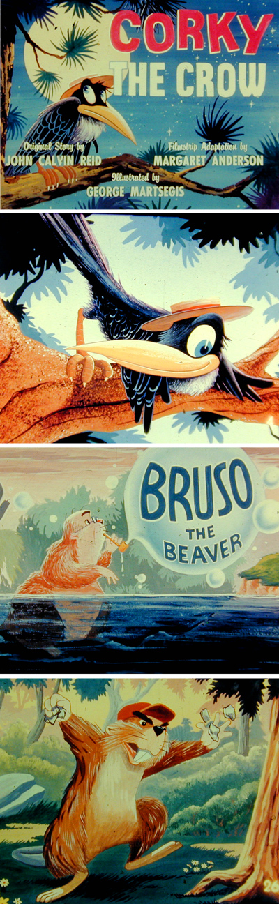
Since I don’t have the records that go with these great religious-animal characters, I can only imagine they included just-as-great voices and sound effects.
The De-Evolution of PowerPoint
By looking at these early attempts at marrying still visual images with information, there may be a clue on how to get out of the PowerPoint ghetto we’re in. Almost every presentation you sit through these days is structured so that the visual part relays the information, and the verbal part is simply there to supplement or, even worse, repeat what is on the screen.
Filmstrip editors always started with a script — like a filmmaker. The script conveys the literal information and provides transition and structure. Once you have that, then the visual images are added for emphasis, tone, drama, etc. Imagine what PowerPoint presentations could be like if they started with a true script and not simply an outline of data. Only when you free yourself from the burden of throwing all the information and messaging on the screen can you explore more interesting visual avenues.
Here again is an example of why technical limitations actually created better results. In the silver-halide-based world of educational filmstrips, it was easier and more practical to consider a drawing or photograph as the primary image than it was to set the multiple lines or even paragraphs of type typical on slides today. Showing lots of type against a colored background would have been considered a waste of the medium — it was capable of so much more.
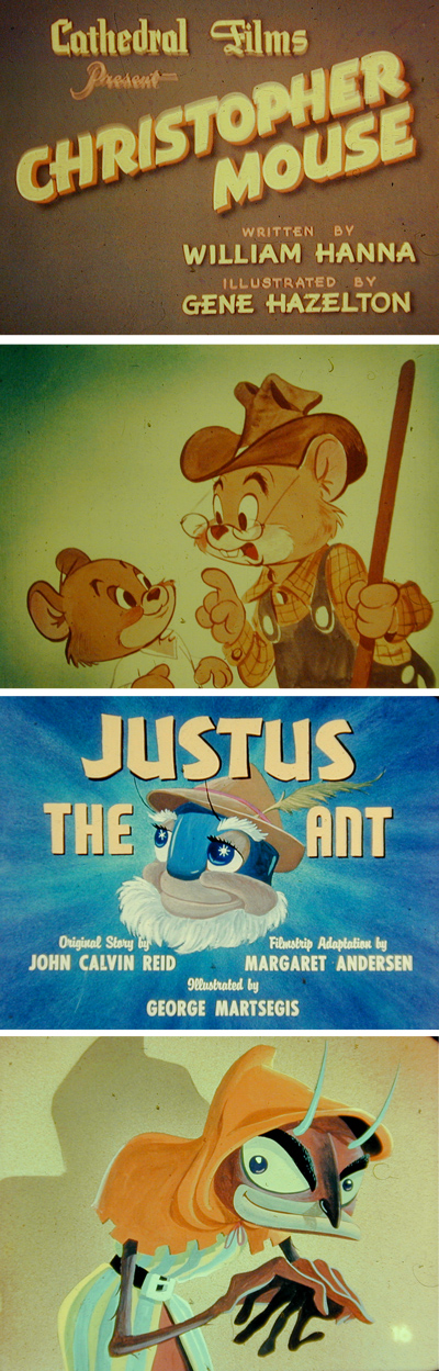
The Cathedral filmstrip series, “Parables from Nature” used drawings from a number of great animators, and included the Christopher Mouse episode written by William Hanna of Hanna-Barbera fame.
And of course so is the technology we use today. Yet we still communicate primarily with text in our presentations, partly because we think of them as a substitute for printed pages rather than a new medium. (That’s why some people consider a printout of a PowerPoint presentation to be a helpful take away.) Like the filmstrips shown here, though, a truly effective PowerPoint presentation should convey only the very simplest of messages in printed form — the dynamic of a presentation is in the combination of visual, verbal, and environmental elements. If your PowerPoint reads like a book, then it’s a failure. And if it reads like a book and your presentation consists of reading it to the audience, then it’s a double failure.
So even though the topics may seem outdated and quaint, I believe we have a lot to learn from the relatively brief art form of filmstrips. A lot can be communicated in an image, especially if it is accompanied by the right words. In most current presentations, we use words as a crutch, afraid that if we’re not literal we will not get through. I suspect the image of a beautiful tulip wrecked by careless behavior may say more about promiscuity to an impressionable teen than fifteen bullet points and a pie chart.
Read more by Gene Gable.
This article was last modified on May 19, 2023
This article was first published on March 3, 2005
Commenting is easier and faster when you're logged in!

Recommended for you

Free Photoshop and Lightroom Webinar
As part of their ongoing Create Now: Ask A Pro webinar series, Adobe is offering...

Create a Searchlight in Photoshop
Step 1 Begin with a new document. You can either use an existing photo, or creat...
Photoshop New Features Guide
For some time, InDesign users have enjoyed a great free resource that details wh...