

The humiliation and embarrassment of having yet to actually print anything in my home letterpress shop culminated in my nephew’s plea to “get rid of that stupid printing stuff” in order to make room for a pool table. Teenagers have a way of cutting to the chase and stating the obvious, and Marc was right, even if I wanted to Photoshop-out that sarcastic smirk on his face.
But instead, I took his comments as a rallying call and decided it was time to make my first real “work.” Thinking of it as a “work” was certainly a stretch, but it inspired me — you have to start with some sort of “work” in order to establish a “great body of work.” So far in my life I’ve only established “a great body of stuff,” but I haven’t given up hope that someday I’ll find my medium. I could easily wake up tomorrow as a happy and content graying Baby Boomer in the restored offices of some turn-of-the-century small-town newspaper where we still believe in truth and craftsmanship and we run our pictures in black-and-white, dammit, and I don’t need your stupid ties and Excel spreadsheets. Or, if Marc has his way, I’ll be Paul Newman in “The Color of Money,” and he’ll be Tom Cruise.
Subject Matters
My first printing effort had to meet a few criteria, most of which would cover for my complete lack of skill in constructing metal and wood pages. This also needed to be a good test, so I decided on a strategy of “throw everything you got at it.” I’ve discovered that clutter and chaos cover a multitude of sins. For proof, please come and visit our house.
I knew right away that I wanted to give the first successful print I made to my wife Patty — she’s endured way too much heavy equipment in life, and has been very generous with her share of space. Plus, I knew if I made a gift of it to her, she’d be the one who had to find a place to put it.
So my poster also needed to be meaningful to Patty, but not in a sappy Robert-Frost-set in-Caslon-Italic sort of way. And since I knew my first efforts would be bad, I chose a “fun” subject — people sometimes get past a lot of bad stuff to get to a little fun stuff. For proof, please come and visit our house.
One of the top three things I like best about Patty is that she turned me on to the Ramones (see Figure 1). She took me to see them, she made Ramones tapes for me, and we still laugh when we drop “ramonisms” into routine conversation. “Can you turn off that television, honey? Hurry, hurry, hurry, before I go insane.” Or when my mother calls on Sunday and Patty silently mouths the words “ma-ma-ma-ma-ma-ma-ma-ma-ma mamma’s boy!”
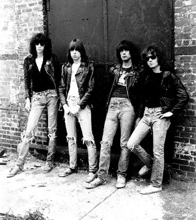
Figure 1: Joey, Johnny, Dee Dee and Tommy Ramone.
Plus, when it comes to the sort of short phrases and odd words I was looking for, nobody beats the Ramones. Not even the Japanese.
Puzzle Me This
As far as I can tell, metal page composition is just like every other method — all that matters is what shows on the paper — how it got there is immaterial, mostly. So I decided to do my first poster in manageable “chunks,” which would be assembled to create a complete work. These chunks would each have some sort of Ramones reference, depending entirely on what size type and ornaments I had at easy disposal and wanted to test.
The first thing I knew I had to get in was the official Ramones chant: “Hey, Ho, Let’s Go” from the song “Blitzkrieg Bop” (see Figure 2). This was pretty easy to set, since I chose large, all cap letters, and I wanted it in one line. The only problem was that I couldn’t kern anything, because my grinder and saw were not set up.
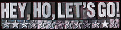
Figure 2: I set the Ramones’ rallying cry in the largest metal face I had — looks like about 96 point. I wanted to try all the different kinds of stars I had, so this combo worked out well. All of the pictures are reversed for right-reading.
When the Ramones played a live show, the pace was always frenetic — Johnny Ramone is surely the fastest guitar player in the world. Often the only way you could tell when one song ended and the other began, was by hearing the count down, “ONE, TWO, THREE, FOUR.” So of course that had to go in to my poster, and I surrounded it with a bunch of weird ornament parts and a metal cut of a pig, which is Patty’s favorite barnyard animal (see Figure 3).
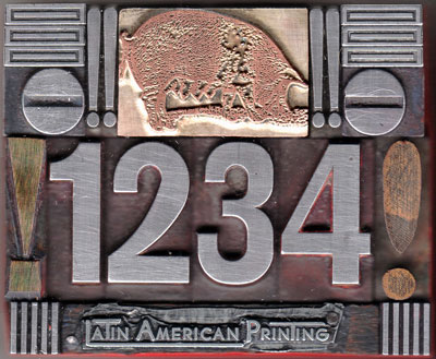
Figure 3: This block is a real hodge-podge of stuff — some border fonts, random exclamation marks, and a cut of a pig. I stuck in the shop logo from Latin American Printing, one of the previous owners of my printing stuff.
Patty and I had gone on a Ramones-themed URL buying spree a few years ago, and somehow she ended up with joeyramone.com. After Joey died from cancer, my wife transferred the URL to Joey’s mom so she could use it to posthumously promote his new album “Don’t Worry About Me.” As a result, we decided to attend Joey’s “would-have-been-50” birthday bash in New York. While there, we went on a nostalgic Ramone’s self-guided tour. In the song “I Just Want to Have Something to Do,” a reference is made to “hanging out on Second Avenue, eating chicken vindaloo.” So we did just that, and since it is such a great word, I decided to add vindaloo to my work (see Figure 4). I used a fairly condensed type, the name of which escapes me at the moment.
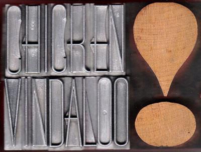
Figure 4: Only the Ramones could find a way to ryhme the word “vindaloo,” twice in the same song. I had to work it in, even though I prefer Chicken Tikka Masala.
When Dee Dee Ramone wrote about the corner of 53rd Street and 3rd Avenue in Midtown, it was a popular pick up place for male prostitutes.
“53rd and 3rd
Standing on the street.
53rd and 3rd,
I’m trying to turn a trick.”
Now it’s just another corner in New York, but we went by it in a cab anyway. So in went 53rd and 3rd, which gave me a chance to work with more numerals (see Figure 5), and the type was easily justified. I wanted just about everything justified, which is what I prefer, but it also worked well in my assemble-the-boxes strategy of typesetting.
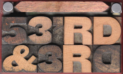
Figure 5: At the corner of 53rd and 3rd in Manhattan, you could once pick up the boy toy of your choice.
Poor Dee Dee Ramone had a monkey on his back, and it eventually did him in. But somehow because it’s the Ramones, I didn’t feel it at all disrespectful to include Dee Dee’s early reference to a Heroin addiction in the song “Chinese Rock.” Plus it gave me a good excuse to use my cut of a man being burdened by his sizable habit (see Figure 6).
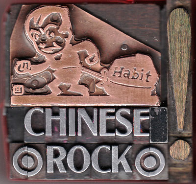
Figure 6: “I’m living on a Chinese rock. All my best things are in hock. I’m living on a Chinese rock. Everything is in the pawn shop.”
“Gimme, gimme, shock treatment” was a natural ramonism, and it was fun to figure out how to make shockwaves from a border font (see Figure 7). And even though I had to improvise quite a bit thanks to uneven line counts and a Cyrillic font with a backward “Rs,” I wanted to get in the line “Beat on the brat” (with a baseball bat, oh yeah) (see Figure 8).
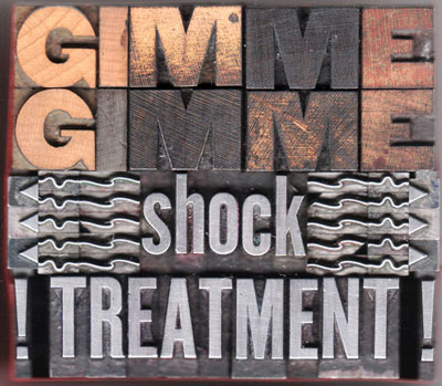
Figure 7: I made the shock waves from a Christmas holly border. They’re a little odd, but I thought the image came across okay.
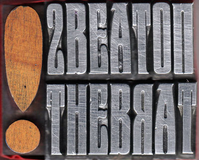
Figure 8: One of the problems I discovered halfway through this block was that the “Rs” are backward in Cyrillic.
Since the overall theme of the poster would be “I Wanna Be Sedated,” I thought a few graphics of pills would be appropriate. For these I used Bodoni Ultra capital “Os” turned on their sides (see Figure 9). And to make the name “Sheena (is a punk rocker)” seem a little more fun, I used an upside down lower case “U’ instead of an “N.” And thanks to all the great Russian type styles I have, there was no problem coming up with a convincing “KKK” in reference to the song “The KKK Took My Baby Away” (see Figure 10).
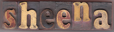
Figure 9: The pills are Bodoni Ultra “Os” turned on their side. Since “Sheena is a punk rocker,” I figured an upside down “U” was just as good as a real “N.”
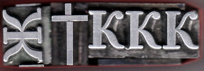
Figure 10: “The KKK took my baby away,” but not my terrific Russian typefaces.
The main block would clearly state the line “I Wanna Be Sedated,” but allow room for a few odds and ends (see Figure 11). Here’s where I dealt with “Gabba, Gabba, Hey,” a must-include on any Ramones tribute. I didn’t have enough “Bs” to do Gabba twice, so I threw in a “squared” symbol. Underneath it I stuck in a cut of a cocktail being poured and two words to reference the song Somebody Put Something in My Drink” (see Figure 12).
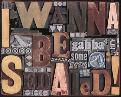
Figure 11: What I lack in matching wood type, I make up for in sheer clutter.
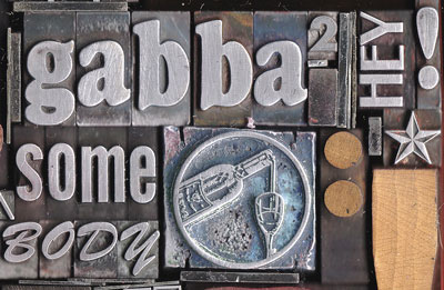
Figure 12: Since I didn’t have enough “Bs” to do “Gabba, Gabba, Hey!”, I settled on this shortened version. And did “somebody put something in my drink?”
The Proof is in the Proof
After blocking out each chunk, I had to piece things together, just like a puzzle. It’s tricky reading everything backwards, and my sense of alignment and precision has always been grim. “Sometimes it’s better to use your eye than a T-square,” I used to say when too hurried to do a job properly. I’m never going to be anything but a printing hack, I suspect, so don’t look to me for limited-edition, finely-set books on the variations of stroke weight in historical cuts of Caslon Oldstyle.
The Ramones theme turned out to be perfect. There’s nothing like the anarchy of Punk graphics to say “so what if it’s not straight and there’s lots of nicks in the type?” When it all came together in a metal frame (called a chase), I was quite pleased (see Figure 13).
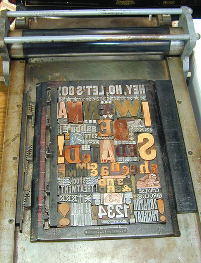
Figure 13: The completed page held in its chase on the bed of the proof printer.
The thing I’d been looking forward to the most about this printing thing was figuring out how to use these little metal tighteners called “quoins” (see Figure 14). You need a special key to crank them so they expand and lock all the type together. Quoins are one of those I-can’t-believe-they-actually-work kind of designs, but I’m here to tell you they do work, and you can really tighten those babies down.
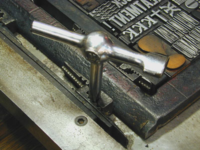
Figure 14: A quoin key tightening a quoin.
The only thing left was to ink the type, place the paper, and burnish with a rubber roller in the proofing press (see Figure 15). It took more make-ready than I had hoped, but I had lots of newsprint to test on. Once I switched to the “real” paper, I only had four chances to get one good copy, since I was printing on a very heavyweight watercolor paper.
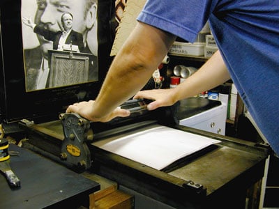
Figure 15: After rolling on ink, it’s all a matter of proper pressure.
Because my first print was to be a gift, I decided this would be a Limited Edition of 1. The woman at the art store assured me the “first” edition was whichever print I deemed best, as long as I destroyed the others. In total, I made about 8 prints, the final print on the last sheet of paper ended up being the best (see Figure 16).
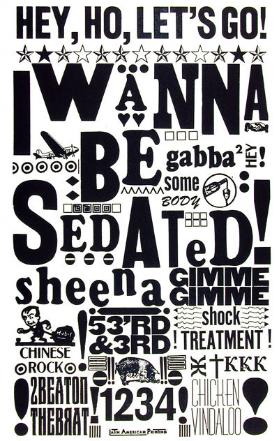
Figure 16: The finished edition, one of one. Next stop, eBay?
So I destroyed all the other copies and presented Patty with the results. Since Joey died, we don’t laugh as much about the Ramones, but it’s still a language we have in common, and our littlest dog is named Joey in memory of the best Ramone. I think Patty was surprised to see anything even resembling an actual print, and she declared me now a “real printer.” She’ll live to regret that statement when she sees what I did to all our best dish towels. I thought the ink label said “water soluble.”
On the whole, I’m happy with my first “work,” but I can see that this stuff is so time consuming I may have to shift my epithet to “he left behind a small body of work.”
Read more by Gene Gable.
This article was last modified on May 19, 2023
This article was first published on July 1, 2004
Commenting is easier and faster when you're logged in!

Recommended for you

Extensis Ships Suitcase for Windows Professional Font Management for Workgroups and Single-Users
Extensis, a division of Celartem, Inc., today shipped Suitcase™ for Windows®: Pr...
Seven Tips for a Perfect Printed Piece
As you may or may not know, there is no such thing as a “perfect” pr...
QuarkXPress Upgrade & Tech Support News
Quark Inc. has launched its new QuarkXPress® Maintenance Program that offers cus...