
I feel fortunate to have grown up at the tail end of the black and white era — a time that now seems less complicated and in the dewy mist of memory somehow more honest. When I rushed home from elementary school and turned on the TV, Mike Nelson’s underwater adventures on Sea Hunt were not in the deep blue, but the deep gray. My favorite magazines, “Boy’s Life” and “Popular Mechanics” still had mostly black and white signatures, and the letterpress printing they utilized suited itself to simple, hard illustrations of happy men and boys embarking on new adventures, hobbies, or careers.
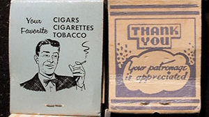
It was in this atmosphere of grayscale visuals and monaural recordings that I began my fascination with stock art — the cornier the better. In those days, your patronage was appreciated, satisfaction was guaranteed, merchants aimed to please, and broasted chicken was something to crow about. Matchbooks, business cards, napkins, yellow-page ads and store signage were produced with stock metal “cuts” that were surprisingly alike from coast to coast. These relatively simple illustrations and slogans were produced by a number of vendors and served the publishing marketplace as capably as today’s massive royalty-free image libraries. Because they were almost all hand drawn and many hand lettered, they had a unique cartoon style that I still love today (see Figure 1).

Figure 1: There’s no better example of the simplicity of good marketing than early matchbook covers. Once it was determined that people wouldn’t pay for matches, they became a popular give-away for every business.
Draw Sparky!
So when I began unpacking the various cigar boxes of metal I inherited with my eBay print shop, the first thing I looked for was the clip art. Throughout my career I’ve used fifties-style art whenever possible in my own work and when allowed, the work of others. My party invitations, résumés, personal stationery and other ephemera almost always center around some dippy piece of stock art acquired over the years as I collected the discarded clip art books from local newspapers, bought up every Dover reprint book I could find, shot Photostats of art from the back of old magazines and brochures, and when the world turned desktop, began buying and scanning whatever by-then retro art I could find. The best variety out there, by the way, is from the collection of my favorite designer, Charles S. Anderson in Minneapolis. I’ve lusted over his CSA Archives since I first discovered it (see Figure 2).

Figure 2: The stock-art collection from CSA Archives is one of the finest in the world, and includes many custom and refurbished works of early advertising art.
And even though until now I had no actual use for them, I’ve always had a box or two of metal cuts around, just to look at (see Figure 3). One time on a road trip from Monterey to Bend Oregon, I stopped at an antique store in Redding California and discovered a huge box of terrific art cuts from a matchbook-printing company. I bought all I could afford, which sadly wasn’t very many. Not long after that I used most of them as a tool to get my first job at “Publish” magazine, sending them to the editor, publisher, human-resource director, and various others mounted on cardboard, adorned with witty sayings and packed in fancy boxes. They did the trick and got my résumé to the top of the pile and landed me a job I wasn’t really qualified for. (Well, I thought I was, but I didn’t think they would think I was.)

Figure 3: My collection of ad cuts began before my current need for them, and includes wisdom ranging from how clothes reflect the man to the dangers of dragging around a heavy habit. And while I can’t image what it was used for, it’s good to see that iron lung patients can be just as happy as the rest of us.
Now my collection has expanded and because of the previous owners of my shop, a Russian Orthodox Priest and a San Francisco Mission Street printer, it now includes a number of religious images and Hispanic artwork (see Figure 4).

Figure 4: My shop came complete with a large collection of religious images and an assortment of cuts depicting various Mexican images, many of which would be inappropriate by today’s enlightened standards.
Mmm, That’s Tasty!
There were a variety of cut types in the letterpress world. Some were made of copper, some of zinc, some of magnesium, and some were cast lead and sold and as “sorts” — a kind of dingbat/image font. The non-lead variety was made from artwork through an etching process and could be ordered using customer artwork, logos or photographs. But this took time and cost a few bucks more, so many smaller businesses simply employed standard cuts expressing their commitment to service, pleasant attitude, good coffee, a specific service or possession of a television (see Figure 5).

Figure 5: There was a time when owning a television was as important as having air conditioning or offering phone-in service.
All cuts, of course, read backward in their metal form. Throughout this article I’ve flopped the photographs to make them right reading. Lettering occasionally became a real art form and somehow it seems appropriate that they ended up permanently etched in metal (see Figure 6).

Figure 6: Fancy type in the era of metal cuts was often hand drawn, which allowed for distinctive headings, regardless of the quality of food or type of business.
Simpler times were not always politically correct, of course, and many cuts play off of common racial and sexist stereotypes of the day. This was a time when clothes made the ladies and men wore hats instead of baseball caps. Animals were often shown grinning in delight at the prospect of being cooked and eaten for dinner, and chicken was served in a basket, or ‘n’ basket (see Figure 7).

Figure 7: Food has always been highly promoted, though some of the more racist images are long gone, and it seems most chicken these days is served on normal dinnerware. Many of the images shown in these pictures are from the Retro Ad Art Collection CD.
Of course language changes with the times, too. How often have you seen entertainment referred to as a “floor show” these days? And prior to the sixties, a gay time had entirely different connotations (see Figure 8).

Figure 8: Times were once very gay, and floor shows were the norm when you went out for a hot time on the town.
People danced more in the past, it seems, generally had more fun, and romance was often depicted by couples gazing into each others’ eyes. Cocktails, of course, have never lost their popularity, but are less likely to be depicted today in connection with scantily clad women. No wait, that’s still the case (see Figure 9).

Figure 9: Cocktails and dancing remain popular in any era, and then as now, they were associated with sex and a good time.
Sports have changed over the years, too, though they were always promoted for health purposes, except shuffleboard, which you don’t see much anymore (see Figure 10).

Figure 10: No wonder Americans are in such poor physical shape. We no longer play shuffleboard or exercise during our pocket-billiards workout.
I’m not sure how I’m going to use some of these cuts — I don’t dance, I don’t own a hat, and when we cook chicken we serve it on a plate. But if I had my way, merchants would still appreciate my patronage, and serving me better would mean something more than new choices in a company voicemail system.
Read more by Gene Gable.
This article was last modified on March 15, 2022
This article was first published on May 15, 2003
Commenting is easier and faster when you're logged in!

Recommended for you

How to Format URLs and Emails Automatically in InDesign
Learn how to find and format URLs and emails automatically in your InDesign docu...

Creating a Cookbook with InDesign
Chad Chelius reveals his recipe for efficiently producing distinctive cookbooks.

Add or Remove Columns Automatically As You Edit a Story
Learn the trick to make InDesign's Auto-Size feature automatically add or remove...