

An important step in the education of a designer is learning about those who came before. One influential designer not to be overlooked is Herb Lubalin (Loob-a-lin), who was one of the most prominent figures in typography and type-centric design in the 1960s and 1970s.
Herb Lubalin (1918–1981) was a brilliant, innovative, gutsy, New York designer whose groundbreaking and adventurous use of type influenced designers around the globe. His work incorporated tight letter-and-line spacing, extreme kerning with acute attention to every typographic detail, and the overall use of type in ways never before seen. Lubalin handled type in an illustrative, expressive way, often by employing type as graphic elements or by creating typographic puns. Why did he do this? In part because he could—these were typographic capabilities never before possible prior to the arrival of phototypesetting, the “revolutionary” typesetting technology that changed everything.
Phototypesetting
Phototypesetting came about in the mid-1950s as a new, photographic process of setting type. Typographers would turn the typeface into a negative and then focus light through it onto photosensitive paper, producing an image of the type. The improvements over hot metal typesetting were both qualitative and quantitative. Typesetting could now be done electronically rather than mechanically, setting over five hundred characters per second compared to perhaps five or six previously. The equipment took up much less space, and you could convert a typeface, whether a new design or a metal type classic, into a workable font much faster than before. Images became sharp and crisp, you could now make corrections electronically, and most importantly, there was now complete flexibility with regard to intermixing styles, weights and sizes; letter spacing and kerning; line spacing and word spacing; as well as hyphenation and justification.
The elimination of so many restrictions in the typesetting process had a major effect on typography and design. The typographic trends initiated by Herb Lubalin and imitated by countless others, particularly the emphasis on tight type at the occasional expense of readability, were a reaction to the absence of the restrictions of hot metal typesetting that preceded them.
U&lc Magazine
Herb Lubalin was the original editor and design director of U&lc (an acronym for upper and lowercase), the influential typographic journal published by International Typeface Corporation to both promote and demonstrate their typeface library. This quarterly journal was the perfect platform for Lubalin to present his innovative typographic ideas and experiment with complete freedom.
Herb Lubalin broke with tradition in every possible way. He created these three typographically daring pieces for U&lc. Look at them carefully and you will see many different ways in which the type “paints a picture” that reinforces what the words say.
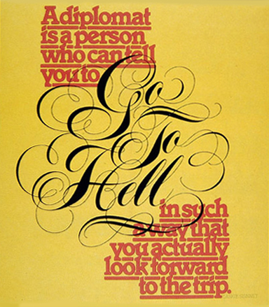
This piece combines a bold typeface set with tight letter and line spacing, with a very elegant hand-lettered script to illustrate a point expressively and typographically. “The impact of the message depends upon the beauty in the styling of the words, Go To Hell, unencumbered by competition with fanciful typography,” as Lubalin put it himself. Courtesy of International Typeface Corporation.
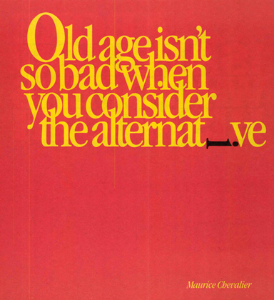
The overlapping ascenders and descenders of this piece take a back seat to the dramatic effect of the “i” lying on its side in the margin. The message is visual as well as editorial. Courtesy of International Typeface Corporation.
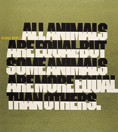
The message expressed here with the use of very tightly set caps is made even stronger by the placement of black-and-white color breaks, particularly the word “equal” which also breaks the grid. Notice the size and placement of the comma, tucked away so as not to disturb the overall color and texture of the rest of the type. Courtesy of International Typeface Corporation.
Whether or not tight type and expressive typography is your “cup of tea,” so to speak, it is important to understand how and why it came about in order to appreciate its tremendous impact on the evolution of type and design. Herb Lubalin was a revolutionary designer, and it was his experimentation and risk-taking that laid the way for (and inspired) the typographic freedom of expression we all have today.
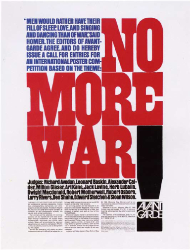
In this announcement of an antiwar poster contest by Avant Garde magazine. Herb Lubalin’s use of color, tight type, and a very deliberate type alignment (including hung punctuation) fits together like a jigsaw puzzle. What imagery do you see here? (spoiler alert) Some see an American flag, as well as a bomb or a casket. Courtesy of Rhoda S. Lubalin (estate of Herb Lubalin).
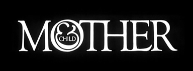
This award-winning logo designed for a never-published magazine not only states the name but illustrates it as well. Herb Lubalin considered the suggestion of a fetus inside the logo one of his finest typographic designs. Courtesy of Rhoda S. Lubalin (estate of Herb Lubalin).
FURTHER READING:
Herb Lubalin: Art director, graphic designer, and typographer, Gertrude Snyder and Alan Peckolick. American Showcase (1985). This book is out of print and hard to find, but well worth it if you can find (and afford) it.
This article was last modified on January 11, 2023
This article was first published on March 19, 2013
Commenting is easier and faster when you're logged in!

Recommended for you

Saul Bass, Master of the Movie Title Sequence
Mention movie titles to any designer in the know, and undoubtedly the name Saul...

Before&After Design Tip: Use This Quarter-Pie Format to Easily Design Your CD or DVD Label
An easy and effective approach for designing a disc label

Fresh Fonts: Introducing DIN Next Slab
With scores of new typeface designs being released all the time, it is difficult...