How to Choose Colors Everyone Likes

This article is courtesy ColourLovers.com.

More than half a century ago, Aemelius Müller, professor at the academy of Winterthur, Switzerland, came up with a formula that could predict the appreciation of a color-combination. In other words: Müller was able to predict which combination of colors most people would probably like.
Müller’s formula predicts that these color combinations will be considered ugly by most people:

While these will be liked. How is this possible?

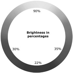
First we need to consider the “natural” brightness of the colors of the color circle, as discussed in this post about Brightness vs. Whiteness. You will notice that yellow, for instance, is a lot brighter than blue in the image below.

On a scale from 1 to 100, bright yellow has a brightness value of 90, while bright blue has a value as low as 35. Likewise, every hue in the color circle has its own “natural” brightness.

Take the combination below. All three colors have the exact same hue of blue. The only difference between the colors is their brightness.

Now pair the last combination with the “ugly” combination on the left and the “nice” combination on the right:

See what happened? Toward the “ugly” (left) side the dark blue shifted to a greener hue, while the bright blue shifted to a more purple hue. This is contrary to the “natural” brightness of the colors. After all, if you check the color circles you will see that green is much brighter than purple. Toward the “nice” (right) side the dark color shifted to purple while the bright color shifted to green. This shift is in accordance with the “natural” brightness of the colors.
The same goes for the red combinations. Toward the “ugly” side the colors shift contrary to the “natural” brightness, while on the “nice” side they shift in accordance with the natural brightness:

So here’s the simple formula: If a combination follows the natural brightness of colors, most people will like it. If a combination contradicts the natural brightness of colors, most people won’t like it.
There is some dispute in academia whether or not to interpret the “nice” color combinations as good taste; the obvious implication being that the “ugly” combinations are of bad taste. I myself tested the formula on many occasions when lecturing a group of people. It never fails and it’s always fun to confront people with the predictability of their taste. But I also noticed that people in creative professions, such as artists or designers, often tend to like the “ugly” combinations. Because people in this group often lay claim to good taste, in my opinion the taste hypothesis doesn’t hold. As far as I’m concerned no one can lay claim to good taste. People like it or they don’t. Good or bad taste is a non-issue.
However, while Müller’s formula may not determine the difference between good or bad taste, it sure does predict common taste. And that makes the formula quite useful for any designer.
Igor Asselbergs is a color professional and currently CEO of Colorjinn. He writes his own color blog at Livelygrey.com.
 

  • Anonymous says:

    Are there any design tools that implement this guideline and provide a place to test color combinations against it?

  • Anonymous says:

    fascinating! Now I understand my color intuition.

  • Anonymous says:

    I wonder if the artists who lean towards the “ugly” side of the spectrum are those who have already used the “nice” spectrum until they are sick of it. There is something in the artist that is always going to strive to be different, moving forward, etc., and it would seem to make sense that they may have lost touch (just a bit) with the difference between “ugly” and “cool and different/edgy”.
    I have been listening to a couple of 20th century composers (i.e. John Cage) who haven’t done much that the general public would call “nice” work. However, they have created new sounds that no one has ever heard. I wonder if the visual arts work in a similar way.
    Great article. Thanks!
    -david

  • Anonymous says:

    Well, this is very interesting but I’m not sure how to apply it. Does this mean that I start with a base color and then choose a darker color by going to the darker side of the brightness circle? And a brighter color by going to the brighter side?

  • Anonymous says:

    thank you!

  • Paul Keane says:

    Why not try it out over on Pantone Color Lovers site and see if real people vote for the ugly or ‘good looking’ palettes – https://www.pantone.co.uk/pages/MYP_myPantone/mypMemberProfileView.aspx?uID=488612

    Graphics IT – Engaging design for the web, print and digital presentations
    web: http://www.graphics-it.com | email: [email protected] | tel: +353 1 443 4828

    Linked in profile -https://www.linkedin.com/in/graphicsit

  • Anonymous says:

    I’ve read this article many times over. I believe you’ve left out what was actually done to the colors to make them shift. You say the colors shifted but you haven’t said what was done to them to make them shift or how much. I would really like to know.

  • Anonymous says:

    Do you have de RGB number for the blue-be-liked color?
    Thank you.

  • Anonymous says:

    I enjoyed your article, and posted it on Hacker News (https://news.ycombinator.com/item?id=618881) which generated some heated discussion, but as a “color newbie” as one commenter put it, I don’t feel qualified to weigh in. Do you have any thoughts?

  • Anonymous says:

    Interesting article but what is missing is the formula of HOW to pick colors everyone will like. Yes, I see the difference in these colors. Yes, I agree that the nice ones are nice and the ugly ones are ugly. NO I don’t see a formula on how to do this.

  • d brugge says:

    My major client just finished up a store inter redesign with a high dollar commercial design group. I got to work closely with them through many phases of the design process. The part about color was most interesting. The designer made an initial proposal which was then passed around to many department heads for comments. No one liked the colors.
    When it came time to meet again, the designer quickly pointed out (politely) that he wasn’t interested in what the different department heads thought were “nice” colors. He pointed out that the reason he was hired was because of his skills with colors. The reason that they were paying so much for his services is because he was very good at what he did.
    Long story short – the stores looked fabulous. Had they picked colors by common consensus, it would have been a disaster.
    While I’m interested in the theory of how to select popular colors, I’m not all that interested. If they wanted design work by committee, they don’t need me.

  • Anonymous says:

    It can be so simply to submit the best article referring to this good topic with support of submit article service, but very often different people opt for best article submission. And I don’t get know what suppose to be best of all.

  • Anonymous says:

    There is some dispute in academia whether or not to interpret the “nice” color combinations as good taste; the obvious implication being that the “ugly” combinations are of bad taste. I myself tested the formula on many occasions when lecturing a group of people. It never fails and it’s always fun to confront people with the predictability of their taste. But I also noticed that people in creative professions, such as artists or designers, often tend to like the “ugly” combinations. Because people in this group often lay claim to good taste, in my opinion the taste hypothesis doesn’t hold. As far as I’m concerned no one can lay claim to good taste. People like it or they don’t. Good or bad taste is a non-issue. Calories in hamburger meat

  • Anonymous says:

    This is definitely a nice site. I would definitely be coming back to it again.
    Molarity Calculator

  • Anonymous says:

    Thats really nice info

  • Anonymous says:

    I really like all this colors,and love the combination that i made from them.
    Kids Books

  • PassbeeMedia says:

    I’ve got submitted a snail mail with regards to my own doubts on the provided snail mail identity, however, not nevertheless bought just about any respond from <a href=”https://www.passbeemedia.com/create-digital-tickets/”>PassbeeMedia</a> a aspect, consequently remember to check the item and also allow me to be familiar with the item.

  • PassbeeMedia says:

    I’ve got submitted a snail mail with regards to my own doubts on the provided snail mail identity PassbeeMedia

  • awarenesslife products says:

    how do you have yours up over your right sidebar? it that a gadget in the right sidebar or is it part of your nav bar?<a href=”https://www.ken.awarenesslife.com/”>awarenesslife products</a>

  • >