


Discussions of typographic widows and orphans normally start with an argument about definitions and what these terms precisely mean. But for the sake of this discussion — and because I’m writing it — let’s use my definitions for the time being. At the end, you can use whatever terms you like for these conditions, as long as we all agree on solutions to the problems they raise.
Most everyone agrees that a widow is a short last line of a paragraph. According to what I learned as a lad, a widow becomes a problem when it’s so short that it creates the visual impression of a blank line between paragraphs. The wider the line length (also called measure), the more impact a very short widow can have. A hyphenated widow — in which the last line of a paragraph is a morsel of a hyphenated word — is a particularly egregious subspecies.
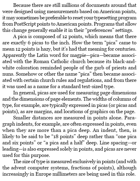
In the following text (set in 11/14 Georgia over 25 picas), a rash of widows appears. The first paragraph has a hyphenated widow; bad in itself, it is also so short that it barely covers the 2-em paragraph indent below it. A second widow appears at the end of the third paragraph. These need to be fixed. The short line at the end of the fourth paragraph might be considered a problem if all the other last lines on the page nearly filled the measure. In this context, though, it’s marginally acceptable.
Many typographic manuals don’t even recognize the existence of an entity called an orphan, but it’s a useful term to describe a short portion of a paragraph — either a beginning or an end — that’s badly positioned within a column, again at either beginning or end. The problem with orphans is that they mar the geometry of the page, creating the appearance of a bit of text that seems to be flaking off the rest of the column. When the first line of a paragraph appears as the last line of a column, or the last line of a paragraph — especially a short one (a widow) — appears at the top of a column, the column’s corner appears to be dented, especially if the margins are justified.
Although a one-line orphan is certainly bad, just how many lines of type should by definition constitute an orphan is another arguing point. In most layouts, I’d say two, with the possible exception of newspaper type, where very narrow measures and very shallow paragraph indents mitigate the damage. A three-line sliver of a paragraph has enough bulk to hold its own at the top or bottom of a column and maintain the rectangular geometry of the whole column.
In the page below, the first column ends with an orphan, and the short remainder of that paragraph forms another orphan at the top of the second column (ending with a widow, for good measure). While the first two lines of a paragraph might not constitute an orphan in this layout, a subhead and a single text line, as at the bottom of the second column, certainly does.
Now we come to the clash of definitions. In the middle of a column, if the last line of a paragraph fills only half the measure, that’s no problem typographically. But when that half line appears at the top a column, it is a problem. Why? I would say, because it’s an orphan — a piece of paragraph stranded in a bad position. The problem is not its length but its position.
This is the way I was trained to think about type, and it works for me, and I see the widows and orphans as two distinct problems. The venerated type and style guide, Words into Type — which does not recognize a thing called an orphan — defines a widow as “a line of less than full measure occurring as the first line of a page.”
Lending Widows a Hand
But whatever you call them, text-processing and page-layout programs don’t deal well with these things. In some programs you can eliminate hyphenated widows by telling your program not to hyphenate the last word of a paragraph. In Adobe InDesign, for example, you do this in Hyphenation Settings, found in the Paragraph panel menu. To prevent the last word of a paragraph from hyphenating in QuarkXPress, you have to manually put a discretionary hyphen (Ctrl- or Command-hyphen) before the last word in every paragraph.
There is no way to prevent widows — very short last lines of paragraphs — because no program allows you to specify a minimum tolerable last-line length. If there were (say, as a percentage of the measure), the program could adjust its composition of that paragraph to stretch or pinch word and character spaces to either lengthen the widow or draw it up into the previous line.
What I call widows need to be fixed manually.
Your only tool — short of editing the text — is to tweak tracking slightly. This will sometimes cause a paragraph to re-rag, creating new line endings to either add to the widow (by loosening tracking) or draw it up into the previous line (by tightening it).
Here’s a second look at the earlier sample that was beset by widows, all of which are fixed here with very minor tracking changes. Tightening tracking by 5/1000 em in the first paragraph not only drew up the widow, it also produced a color for the whole paragraph that better matches its neighbors. The third paragraph’s tracking was tightened by only 2/1000 em, enough to draw the widow up into the previous line. The fourth paragraph — the one with the borderline widow — had its tracking loosened by 6/1000 em, which added text to the last line.
If you see relatively loose lines in the problem paragraph, look to tighten the text and draw the widow up. If the paragraph’s spacing is already fairly tight, try opening up tracking a bit to force more text down onto the last line, filling out the widow. If your program balks at hyphenating in a way you think would help, try adding a discretionary hyphen.
Keep a close eye on how the color of your paragraph changes when you do this. Any tracking changes you make should be modest, because tracking changes run the risk of making the paragraph noticeably darker or lighter than surrounding paragraphs. When noticeable color changes are unavoidable, try altering the tracking of surrounding paragraphs to camouflage the spacing variation you’ve created.
There will be times when the only solution to a troublesome widow is to change the text.
Orphans and the Failure of “Keeps”
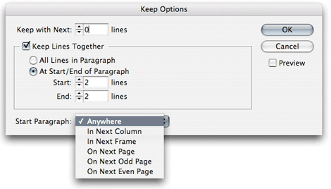
Word processors and page-layout programs attempt to eliminate what I call orphans — a line or two of a paragraph stranded at the top or bottom of a column — through a system of controls collectively known as “keeps.” Using these, you can specify that, for example, the last three lines of a paragraph must always be kept together and never be separated at a column break. You can do this to glue the first or last few lines of a paragraph together, or to bind a subhead to the first couple of lines of text that follow it, to keep the subhead from being orphaned. Keeps options are paragraph attributes, so they can be incorporated into paragraph styles.
Access InDesign’s keeps options through the Paragraph palette menu. The options shown below include the ability to tie a specific paragraph with a specified number of lines that follow it, or to apply global rules that prevent paragraph fragments of less than a minimum size from appearing at the top or bottom of a text frame.
These controls work well, but only in situations where you’re willing to have your columns end short of the bottom of the page. In single-column word-processed documents this may be fine. But it won’t work in a book, and it won’t work in a newspaper. It may work in some magazines and ads that have a “ragged bottom” layout, in which all columns don’t have to finish on the same baseline.
When uniform column depths is a must, using “keeps” to control orphans only works if you vertically justify your text. Vertical justification is a process that forces your text to fill columns by expanding the leading between lines and paragraphs. When vertical justification is turned on, your program will push an orphan from the bottom of one column to the top of the next and pad out the leading of the first column to make up the shortfall.
In InDesign, you turn on vertical justification for a text frame in the Object > Text Frame Options dialog box. You can apply this to any number of linked frames. You can do likewise in QuarkXPress in the Item > Modify > Text dialog. In both cases you can limit the amount that the program will stretch spaces between paragraphs before it will start to expand leading between the rest of the lines of text.
Vertical justification is a subject in itself, which I’ll address in a future column. It’s the key to a process called batch pagination, a technique that uses elaborate sets of controls and layout rules that allow for successful robotic page layout.
If you’re obliged to stick to a page grid, or diving into vertical justification is too daunting, you can eliminate orphans using the same techniques — primarily manipulating tracking — that you’d use to eliminate a widow. But to eliminate an orphan, you may have to readjust the tracking of pages of text to change the lengths of enough paragraphs to push the problem orphan into the next column or draw it back into the previous column.
Below is that orphan-beset page revisited. Tightening the tracking (-5/1000 em) of the second paragraph in the first column shortened it by one line, adding a line to the orphan at the bottom of the page. Tightening the tracking of that short paragraph (-7/1000 em) drew the widow “em” up one line, eliminating the remaining orphaned line at the top of the second column. With these line changes, the orphaned subhead at the bottom of the second column is now supported by two text lines that follow it.
Changing your hyphenation settings — perhaps only for a paragraph or two — may buy you the line-ending changes you need by allowing paragraphs to re-rag in ways that help your cause.
Depending on your layout — and your luck — you may be able to cause text to reflow by adjusting the tracking of picture captions, causing them to pick up or lose a line and the text above or below the illustration or photo to reflow accordingly.
The problem with reaching for solutions far beyond the afflicted paragraphs is the risk that you’ll provoke other widow and orphans problems elsewhere. Again, text changes may be the easiest solutions.
One last word: Because the appearance — and disappearance — of widows and orphans is contingent on how lines end, be aware that any change to the text in a laid-out page may create new problems. Whenever possible, do your charitable work on behalf of these poor dears after all text editing has been completed. A change to a single word on page 1 that lengthens or shortens a paragraph can ripple all the way through a long document.
This article was last modified on August 13, 2021
This article was first published on January 18, 2010
Commenting is easier and faster when you're logged in!

Recommended for you
TypeTalk: (Re)Introducing Tobias Frere-Jones and his latest typeface, Mallory
He’s back! Two years after launching his new foundry Frere-Jones Type, Tobias Fr...

Font Aid for the Philippines
Since 1999, The Society of Typographic Aficionados has organized series of chari...
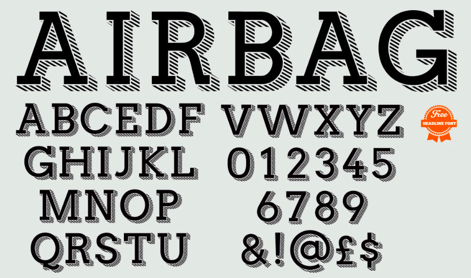
Airbag: A Free Headline Font
Airbag is free slab serif font created by Simon Stratford. Inspired by Trend by...