

One of the first concepts that print designers learn is “bleed.” If you want the final printed work to have artwork that appears to print right up to the edge of the paper — that “bleeds” off the edge — you need to place it so that its edges overlap the edges of the layout page, typically an overlap of at least 9 points (.125 inches) on each bleeding edge (Figure 1).

Figure 1. A close-up view of a document’s margin, page edge, and bleed. Click on the image for a larger version.
When the job is printed on oversized paper and cropped to the final page size (the page size specified in the layout program), the trimming lops off the overlapping artwork, resulting in a nice bleed in the finished piece.
Occasionally, though, no one tells the artist supplying a page-size image about the bleed thing. Or the artist is too new to the magical world of printing presses to understand the requirements. They were told the publication is 6″x9″ so they give the client a 6″x9″ piece of artwork for the cover. The client/boss gives it to the designer, who says, “Uh, this is too small. It’s supposed to bleed on three sides: top, bottom, and right.”
If the designer positions the artwork on the page so it perfectly fits — no overlap — there’s a good chance the final printed pieces will show slivers of the paper color at the edges of the page, because paper can shift slightly as it moves through the presses at lightning speed.
Recently, two different clients of mine encountered this exact situation, and someone else wrote about it in one of the prepress forums online. Must be something in the air. Interestingly, in all these cases, the simplest solution — tell the artist to make it bigger — was impossible, because they were dealing with legacy files and the original artist had dropped off the face of the planet.
The Fix
If you’re very lucky, the image will lend itself to scaling without pixellation or ruining its design. Just size it up in the layout program so you’ve got a bleed, and go on your way.
More often, though, the artwork contains other elements (such as a special type treatment or a fancy border) that would look too big if it was scaled up, or off-balance if only a couple sides needed to bleed. In that case, the solution is to roll up your sleeves and “make it bigger” yourself in a software program.
You don’t want to scale it up in the program, just increase its dimensions — its own page size — slightly. Then you’ll add art elements to the additional area. Your handiwork will likely never see the light of day because it’s going to end up outside of the live page area, in the bleed allowance. But now when the paper shifts slightly on press and some of this overlapping artwork lands in the “live” area, no one will see blank paper.
Adding Bleed to Vectors
If it’s a vector EPS, AI or PDF file, open it up in Adobe Illustrator and pray any fonts it uses were embedded or converted to outlines. (If it requires fonts you don’t have, you’ll have to rasterize it in Photoshop and correct it there. It’s a last resort.) In Illustrator, go to File > Document Setup, and increase the size of the artboard to account for the bleed. In the example of a 6″x9″ page that needs to bleed on three sides, you’d change the artboard width from 6″ to 6.125″, and the height from 9″ to 9.25″ (Figure 2).
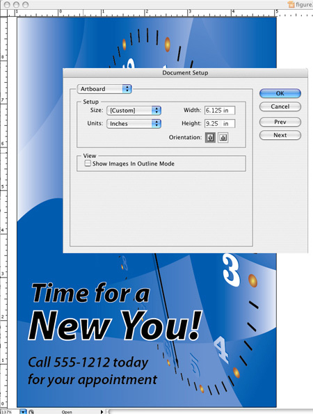
Figure 2. The first step in Illustrator is to change the size of the artboard. Vector image courtesy Andy Tuohy, iStockphoto.
After you click OK you’ll see that your artboard grew from the center and the artwork itself stayed in position. That’s exactly what you want for the Height, since there’s now .125″ of extra room above and below the artwork. But since you want the Width’s additional .125 to only appear on the right of the artwork, you’ll need to move all the artwork .0625″ to the left. (That’s .125 divided by 2.) Just choose Select > Select All, then Object > Transform > Move and enter “-.0625” in the Horizontal field, then click OK.
Now you need to fill in the empty artboard area you have on the top, bottom, and right sides of the artwork. Use your Direct Selection tool to extend edges of elements into the bleed area, or fill the empty space with 0-stroke rectangles filled with the same color as adjacent art elements. You don’t have to be perfect here. Remember, you’re just trying to avoid slivers of paper showing up. Consider that at least 95 percent of what you create will be lopped off during the trimming process, assuming your commercial printer maintains their presses.
Save your file with a different name so you know it’s the one you added the bleed to, place it in the layout program, and voila, it’s large enough to overlap the trim edge. Since you’re not scaling it, the important elements inside the live area are untouched, they’re exactly as the original artist intended.
Adding Bleed to Rasters
Use the same basic procedure when you need to add a bleed allowance to a raster image. Open up the artwork in Photoshop, then “make it bigger” in the Image > Canvas Size dialog box. If you turn on the Relative checkbox, you can enter the actual bleed amounts in the Width and Height fields instead of adding that measure to the existing dimensions (Figure 3). “Relative” means “add this amount to what’s already here.”

Figure 3. Expanding the canvas in Photoshop.
Unlike Illustrator, Photoshop lets you specify how the extra canvas area should be added to the image (instead of just adding it evenly on all sides). You do this by selecting one of the nine boxes in the little Anchor grid in the Canvas Size dialog box. If you want the additional measure added to the top, bottom and right sides of the existing image, click the middle box in the left-most column of the grid. The selected box stands for the existing image; so you’re telling Photoshop to “grow” the canvas above, below and to the right of it.
Click the OK button and you’ll see the empty canvas area for your bleed allowance appear above, below and to the right of the existing artwork. Don’t start painting in it willy-nilly at this point. It’s too easy to accidentally mess up the original art. Instead, add another layer in the Layers panel and do all your fill-in work on that layer. (Creating a slightly feathered layer mask here can also help keep your additions from impinging too much on the original artwork on the layer below.)
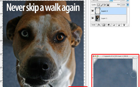
If the artwork’s edges are a flat color, you can pick up that color with the Eyedropper and then paint that color into the canvas area on Layer 2, or just fill selection rectangles with it, for that matter. If the edge is some sort of pattern or texture, you can use the Clone Stamp tool to pick up pixels near the edge of the art in Layer 1 and paint them into the empty canvas area in Layer 2 (Figure 4). You can even just copy and paste thin rectangular selections from the artwork to the empty canvas area, overlapping them slightly and blurring the edges so the transition from the real artwork to the fill-in you’re making in the bleed isn’t too harsh.

Figure 4. The edge of this ad has a pattern, so the Clone Stamp tool is a good way to extend the edges.
Again, remember most of what you’re adding is going to get lopped off anyway, so don’t get too obsessive about it. People will be focusing on the interesting middle parts of the art. You’re just trying to eliminate any distracting slivers of paper show-through at the extreme edges.
Finally, save your file under a different name, flatten it into a TIFF if necessary, and place it into your layout program. And there you go, a bleed allowance on the artwork without having to scale it.
This article was last modified on February 16, 2023
This article was first published on August 6, 2007
Commenting is easier and faster when you're logged in!

Recommended for you
Quick Solutions to 4 “Impossible” Adobe Problems
In my daily work (and as an Adobe Community Professional), I get asked a lot of...
How to Create Realistic Watercolor Effects in Photoshop
Learn how to use Photoshop to create hand-brushed watercolor effects that don’t...
Heavy Metal Madness: Men Live In a Vacuum… Tube
My last column, which addressed the gender gap in housework duties, drew a numbe...