


One day a buddy sent me a file he was working on for a client. In Photoshop, he had created a logo that had some pretty cool transparency effects in it. However, he was having trouble because he was trying to preserve the logo in spot colors, but because of the transparent effects in use, the colors were being converted to process.
The effect he was trying to simulate was a glass sphere, like a marble. There are tutorials all over the Web that will teach you how to create these kinds of cool objects, but most of them use Photoshop to achieve the desired effects. That means it’s more difficult to work with spot colors and, especially in the case of a logo, the ability to scale the art and maintain high quality is sacrificed.
The secret is to use Illustrator’s Opacity Mask. Besides the cool effects they can create, Opacity Masks also always preserve spot color information. That’s just what we need for this technique, and I was able to use them to create a cool-looking glass marble.
It’s always fun to create cool stuff, but getting it to print correctly can make people lose their marbles. (Sorry, couldn’t resist!) So it’s especially gratifying when you learn to create something that not only looks totally cool, but that will print correctly as well.
Start by creating a circle and fill it with a spot color (Figure 1).
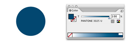
Figure 1.
Next, we’ll modify the fill so that it uses a gradient. Here I set the gradient to go from 55% of the spot color to 100% of the spot color, and I adjusted the color stops and midpoint slider to get the effect I was looking for. I used a Radial Gradient and I also used the Gradient tool to offset the center of the gradient so that the center point was closer towards the bottom of the circle (Figure 2).

Figure 2.
Now comes the important part. At this point, my Photoshop-using buddy created an oval shape (as a highlight for the reflection) and filled it with a black to white gradient. He then set the oval to use the Screen blend mode, which gave him a nice highlight. The only problem was the Screen blend mode forced the spot color to separate as a process color.
Instead, I took the same black to white gradient and drew a plain white-filled rectangle behind it. I also selected the oval and chose Effect > Stylize > Feather and gave it just the teeniest bit of a soft edge (because I liked it better that way). Then I chose the oval and the white rectangle behind it and opened my Transparency palette. From the flyout menu I chose Make Opacity Mask (Figure 3).
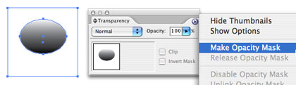
Figure 3.
What happened here? The gradient’s luminosity values became a mask for the white rectangle, and I achieved the desired effect of creating a light reflection on the underlying circle (Figure 4). Nice, right? And because I used an opacity mask, the spot color is preserved and will separate correctly. But we’re not done yet…
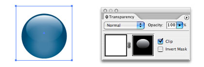
Figure 4.
I learned something valuable from another friend, Bert Monroy. He taught me that in real life, there’s always something in a reflection. While the light itself makes the marble look nice, there’s gotta be something that you can see in the reflection if you want the object to appear more life-like. So I took some random art and colored it 100% of the same spot color (Figure 5). You could also use a photograph here and colorize it with the spot color. I used a vector shape because I wanted to make the logo theoretically scalable to any size.

Figure 5.
Next, I created another circle and filled it with a black to white gradient. I then selected both the squiggly art and the gradient-filled circle (Figure 6) and again created another opacity mask.

Figure 6.
As a finishing touch, I set the squiggly art to the Multiply blend mode and dropped its opacity to 15%. This created the look that something is reflecting off the shiny glass marble. Finally, I added a soft shadow (Figure 7).
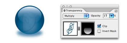
Figure 7.
In the end, we have a glass marble created entirely in Illustrator (I can’t remember the name of that other program — photo something — photostop? — eh, whatever), which can be scaled to print on an 80-foot billboard in Times Square, on the side of a blimp, and without ever having to convert to process colors.
Hmmm… All of this talk reminds of a great line from that cult classic, Animal House. “Can I have ten thousand marbles, please?” Time to go watch a DVD….
This article was last modified on December 14, 2022
This article was first published on January 19, 2007
Commenting is easier and faster when you're logged in!

Recommended for you

Adobe Reveals New Branding for InDesign and the Creative Cloud
Whoa! Adobe takes the Creative Cloud concept to the next level with new naming f...

RGB Workflow from Photoshop to Final PDF
Do you remember what your mom used to say when you’d insist, “all my other frien...

Got Creative Cloud? Use InCopy to Convert Notes to Acrobat Comments
One of the things I pushed for when Creative Cloud was announced was the inclusi...