
Illustrator How-to: Why the Appearance Panel Rocks

Before Adobe introduced Effects, here’s what you had to do to set a headline in Illustrator with a hard-edged drop shadow: Set the headline, copy the headline, paste in back, then with the back headline selected, use the arrow keys to move the line of type a couple of points to the right and a couple of points down, then change the color of the type to something like 30 percent black.
If you needed to edit the headline, you had to edit the primary headline in front, then lock that, then select the headline in back and edit that. Now, I know my clients never change the copy they scribbled on the back of a crumpled-up burrito wrapper and handed to me, but I understand from other designers that their clients change copy during the design process, sometimes more than once!
The process of editing text with drop shadows is much easier with Illustrator’s Effects. To create a drop shadow with the Effect menu, you simply choose Effect > Stylize > Drop Shadow, enter the X and Y offsets, and away you go. To edit the drop shadow, you open the Appearance panel, then double click on the Drop Shadow FX layer and edit the settings.
But as always with Adobe applications, there are several ways to perform one task, and sometimes the less-than-obvious method can have unexpected benefits. I’m going to show you another way of applying a hard-edged drop shadow to type using Illustrator’s Appearance panel.
The beauty of creating a drop shadow using Effects or from the ground up in the Appearance panel is that the type and its shadow act as one line of type, not two, so you need to use the type tool only once to make an edit. The type and its Effect are live and fully editable. Let’s take a look at using the Appearance panel for creating type effects. Then I’ll show you quick technique for building type with fills and strokes.
It’s All About Appearances
Note that this technique uses Illustrator Effects, not Filters. Effects are editable forever. That’s not the case with Filters.
1. Start by opening an Illustrator file. I’ll use a CMYK file, but you can use any color space you want. Because I’ll be using points as the unit of measure, go to the Illustrator Preferences > Units and Display Performance and change the General Units to Points via the pop-up menu.
2. If you don’t have the Appearance panel open, select it from the dock, or go to Window > Appearance, or hit Shift-F6. Then undock the Appearance panel so it’s visible at any time.
3. Using the Type tool, set a short headline. I’ll use Myriad Pro Semibold set at 36 points.
4. Using the Type tool, click the headline and Select All. After selecting all, look at the Appearance panel (Figure 1). Under Characters, the type has no stroke and a fill of black.
Figure 1.

5. Now it’s time to delete the fill color and start from zero. In the Appearance panel, select the Fill attribute and go to the Tools panel. At the bottom of the Tools panel, select None — that’s the small white square with a red diagonal bar — to remove the black fill (Figure 2).
Figure 2.

The fill will disappear from your headline and you should see a black bar where the type used to be. But not to worry, the type is still there; it just doesn’t have any attributes applied to it.
6. Next, go to the top of the Tools panel and select the Selection Tool, then note that the information in the Appearance panel has changed. The Type layer is now at the top of the panel. In the Appearance panel, click on the flyout menu near the upper right-hand corner and choose Add New Fill (Figure 3). Below the Type layer you will see two new attributes added: Stroke and Fill. The Stroke is set to none, and the Fill is set to black by default.
Figure 3.

7. With the line of type still selected and the new Fill selected in the Appearance panel, open the Swatches panel or the Color panel and select a new fill color. I’ll choose a blue CMYK mix of C=85%, M=50%. You’ll see that the Fill attribute in the Appearance panel has changed to the color you just selected or created.
8. Now let’s create an additional Fill for the drop shadow. In the Appearance panel, again use the flyout menu to choose Add New Fill. The new Fill takes on the same color as the previous fill and appears above the Stroke in the Appearance panel.
Like the Layers panel, the order of the layers in the Appearance panel from top to bottom reflects their order on the artboard. That is, the top item in the panel is the top item on the artboard, and the lowest item in the panel is the lowest item on the artboard. Since the new Fill attribute appears above the Stroke attribute in the panel, you need to drag it below the original blue Fill attribute to put it in the position of a shadow (Figure 4).
Figure 4.

9. With the new Fill still selected, open the Color panel to change the blue to a gray. In the Color panel, enter zero for each of the C, M, and Y values, and enter 30 for the K value. Note that the color swatch in the Appearance panel has changed to 30% gray.
10. Now let’s offset the gray shadow. With the headline still selected with the Selection Tool, and the gray Fill selected in the Appearance panel, go to Effect > Distort & Transform > Transform. That brings up the Transform Effect dialog box, which has three options: Scale, Move, and Rotate. In the Move Horizontal field enter 2 pts, and in the Move Vertical field enter -2 pts (negative two points). This will produce a classic drop shadow that’s shifted to the right and down from the headline (Figure 5). Click the Preview button to check the settings, leave the rest as is, and then click OK.
Figure 5.

11. In the Appearance panel, the bottom-most Fill attribute has changed, and there are two new layers. The Fill layer now has a toggling arrow on the left to hide or reveal two sub-layers, one for the 30% gray fill and one for the Transform effect. The Transform layer has an FX icon on the right, which indicates that you’ve applied an Effect (Figure 6).
Figure 6.

12. Sit back and behold the beauty of that hard-edged, 30% gray drop shadow… or sit back and say, “So what? What’s the big deal?”
Here’s the big deal — take your Type tool and highlight the word Sample in the headline and change it to Great. Voila! One click, five characters entered, and you have a revised headline and a corresponding drop shadow! Still not convinced? Jeez, you’re tough. Read on.
13. Create a box with ample room to contain the headline and with a contrasting fill. I’ve created an orange fill of M=50 Y=100. Move the orange box behind the headline. The gray drop shadow looks horrible against that orange background, so let’s change it.
Select the headline with the Selection Tool. Select the 30% gray fill attribute in the Appearance panel and change it to 100% black by going to the Color panel and entering 100 in the K field (Figure 7).
Figure 7.

14. Make certain the headline is selected with the Selection Tool. Select the black Color layer (that’s the shadow) in the Appearance panel. Open the Transparency panel from the dock or the Window menu. In the Transparency panel, enter a value of 30 in the Opacity field and choose Multiply from the pop-up menu. You’ll see that Illustrator has added an Opacity attribute to the Appearance panel below the Transform layer. You have a single line of type and a drop shadow attached with a blending mode applied, all of which is editable (Figure 8).
Figure 8.

Drop shadow too far away? In the Appearance panel, double-click on the Transform layer and change the values in the Move fields. Opacity too dark or too light? Double-click on the Opacity layer in the Appearance panel to open the Transparency panel and adjust the opacity or the Blend Mode.
Now that you know the basics of the Appearance panel, it’s a snap to do something like applying a stroke to type. Whenever you use a stroke with type, you always want to have the stroke as a separate object from the fill; otherwise, a stroked fill will do horrible things to the type that will drive typographers nuts.
15. Using the Type tool, create a headline as described in steps 1 thru 5, above, but this time make the type size 36 points and set the tracking at +50 (plus fifty).
16. With the Selection Tool, select your headline even though it appears that there’s nothing there. Using the Appearance panel flyout menu, choose Add New Fill. This will give you Stroke and Fill layers. Select the Fill layer and Apply a fill of M=30, Y=100, K=10. Select the Stroke layer and apply a stroke of M=100, Y=100. Select the Stroke layer and drag it below the Fill layer.
Figure 9.

17. In the Appearance panel, select the Stroke layer. In the Stroke panel, enter 3 pts in the Weight field and click on the icon to create round joins (lower row, middle icon).
18. In the Appearance panel, use the flyout menu to create another Stroke. In the panel select the new stroke and drag it below the red stroke. With the new stroke selected in the panel, apply a stroke weight of 4 pts and a color of white; with the stroke still selected in the panel, go to Effect > Distort & Transform > Transform, and in the Move fields enter .75 pts for Horizontal and -0.75 pts for Vertical, and click OK.
19. Again use the flyout menu to create another Stroke. With that layer selected give it a stroke Weight of 5 pts and apply a color or 100% black. Use the Transform Effect (as above) and in the Move fields enter 1.5 pts for Horizontal and –1.5 pts for Vertical, and click OK.
Figure 10.

Don’t like the fill or stroke color? Select it in the Appearance panel and change the color value in the Colors or Swatches panels. Is the stroke to thin or thick? Select it in the Appearance panel and modify the weight in the Stroke panel. Need to change the offsets? Select the Transform layer in the Appearance panel and modify the Move fields. Need to correct a typo in the head? Use the Type tool and make your correction to all three layers at once — not to three separate lines of type.
While I’ve limited this tutorial to type, you can, of course, use the Appearance panel with objects, too. Do you use the panel on elements other than type? If so, let me know what and how by clicking on the word “Comments” just below my byline toward the top of this article.
This article was last modified on March 7, 2008
This article was first published on March 7, 2008
Commenting is easier and faster when you're logged in!

Recommended for you
Converting Cross References to Text and Retaining the Information
Cross references were introduced to InDesign in 2008 in version CS4. A cross ref...

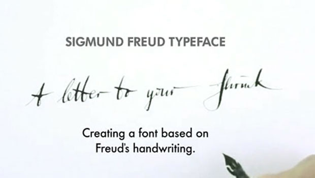
Freudian Glyphs: The Sigmund Freud Typeface
Let’s “kick” off the week with a cool new font-related Kickstarter project. This...