


When it comes to distorting type, I take a pretty hard line. Just say “no,” say I, to altering character widths to make fake expanded and compressed typefaces. Likewise, it’s a no-go for fake obliques. But having drawn that line in the sand, I’m about to merrily hop over it and tell you how to commit a variety of gross typographic abuses to your favorite typefaces. Why? Simply because these effects are sufficiently far-out that they could only be done with creative premeditation and malice aforethought. If anyone gives you a hard time over them, you can plead insanity.
Perhaps the best part of type tricks like these are that you can apply them to any typeface you already have on hand. Why pay good money for a special-effects font that you’ll never use more once (without risking giving yourself a reputation)? And doing them in Illustrator means that the results are vector-based: fully scalable, editable, and displayable at any resolution.
All of these tricks use tools from Adobe Illustrator CS2 that also work in Illustrator CS3. They’re meant for display type only; that is, type for headlines, titles, and the like — big type. If you use them for text, you’re likely to blind your readers, and that’s bad for business.
Just for symmetry, I’ve included four stylings: two antiquey, and two modern and edgy. I suppose you could combine antiquey and edgy, but I prefer not to go there.
While working on the following effects in Illustrator, zoom in close for a better look. Many lose their impact when filtered through the low resolution of a monitor. You can see what you’re doing better at a 300% or 400% magnification.
In all the dialog boxes mentioned below, always click to put a check in the Preview box so you can immediately see the effects of your settings. Well, maybe not immediately — to let Illustrator know you’ve finished typing in a value, click somewhere else in the dialog box to register the setting and cause its consequences to display on screen.
When you open those dialog boxes from the Effects menu, you’ll always find their values reset to the defaults. The step-by-step images below show the cumulative effects as you alter those default values one by one.
Pitted and Eroded
The effect in Figure 1 was inspired by Caslon Antique, from the American Typefounders library. By now itself an antique, the face was designed in the 1890s. It has that pitted, ravaged look of old and decrepit signage. It’s nice, but one can tire of Caslon. So why not create an effect that you can apply to whatever face you want.

Figure 1. Pitted, old, decrepit type. Click on the image for an enlarged view.
Well, maybe not any face. This gimmick works best with seriffed faces, especially Venetians (e.g., Jenson) and old-styles (Garamond, Bembo, etc.) I’d avoid loosing it on moderns (such as Bodoni) because the thin strokes will get too weird. Antiqued sans serifs are a bit of an anachronism, but hey, this is extreme typography. Just don’t tell anyone I suggested it to you.
How to do it:
- In Illustrator, set your text in the face point size you want: the bigger the better. The sample in Figure 1 is Adobe Caslon Pro at 110-point. Leave the tracking at 0 or even looser — tight spacing is not compatible with an old-timey look, even at large point sizes.
- Click on the selection tool in the Tools palette to select the whole text frame.
- Select Distort and Transform/ Roughen from the Effect menu.
- Under Options, make sure that the Relative button is selected. This does two things: First, it establishes the Size values in the rest of section as percentages, not finite measurements. Second, it makes the wobbles in the type outlines more extreme. (The variations off the straight and narrow are relative to each other. If you choose absolute, all variations are relative to the original paths of the character outlines.)
- Now move the Size slider to the left to a value of 1% (Figure 2). More than this and your antiqued type will look more like diseased type.
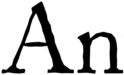
Figure 2. - Under Detail, move the slider up into the high 20s (Figure 3). This setting controls how close together the warts on the outline will be (measured in warts per inch).

Figure 3. - Under Points, click the Smooth button (Figure 4). Clicking the Corners button makes the outline too jagged.

Figure 4.
If you want to go back and edit these settings later, don’t go back to the Effect menu. This will only add another set of effects on top of the ones you’ve already defined. Instead, open the Appearance palette and double-click on Roughen to see your custom settings again (Figure 5).
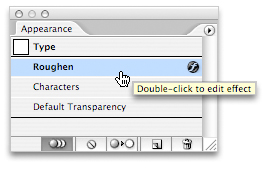
Figure 5. To edit any Illustrator Effect, open the Appearance palette from the Window menu and double-click its name.
Gracefully Rusted
Rusty iron lettering doesn’t just erode, it also bulges in places as the oxidized bits expand before disintegrating. The effect outlined here creates type that looks like it’s been dredged up out of a very soggy place. The sample in Figure 6 started life as 72-point ITC Galliard.

Figure 6. Gracefully rusted. Click on the image for an enlarged view.
The technique:
- Again, set your type and click on the selection tool to select the type frame.
- Go to Effect/Distort and Transform/Zig Zag. Zig Zag normally creates very frantic effects, so you have to use the soft pedal here. Illustrator inserts Zigs and Zags between control points on the characters outlines. Curved areas, which have more control points, are affected most. How many zigs you get depends on your setting in the Ridges per Segment field. A very low number works best here regardless of point size.
- As in the previous technique, clicking the Relative button amplifies the effect, but we don’t want that here. Click Absolute instead.
- Push the Size slider way to the left, to a value of 0p0.5 (Figure 7). If you can’t get it using the slider, type in the value by hand.
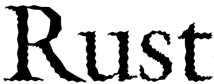
Figure 7. - Push the Ridges per Segment slider to the left, to a value of 1 (Figure 8). A wee value is plenty here.
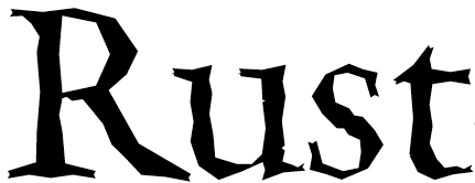
Figure 8. - Leave the Corners button selected. Clicking the Smooth button makes the outline far too wavy.
- Click OK to close the Zig Zag dialog box and open Effect/Stylize/Round Corners. Check that Preview box. Small values in the Round Corners dialog make the characters’ “elbows” more pointed. At fairly low values (less than 1p0, in this case) the effect maxes out, and boosting the value beyond that point does nothing.
- Try a value of 0p6 (Figure 9). Smaller values make the wobbles in the character outlines wilder.
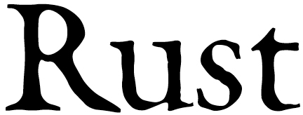
Figure 9.
Rubbed Type
You can look at the effect in Figure 10 below in several ways: as a rubbing, for example, as you’d do on a headstone in an old cemetery. Or as a sketchy fill using a stencil. Or as a manic and obsessive attempt to create yet another weird type effect. Suit yourself. The typeface here is our dearly beloved Times New Roman.

Figure 10. Somewhat sketchy. Click on the image for an enlarged view.
Do this:
- Again, set the type, click the selection tool, and head for the Effect menu. This time, choose Stylize/Scribble.
- Leave Angle and Path Overlap set to their default values, but set Variation to 0 (Figure 11). This effect is nuts enough without making it nutser.
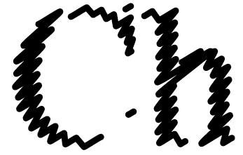
Figure 11. - Under Line Options, set Stroke Weight to 0p1 (Figure 12). If you’re making really big type (the sample here is 96-point) you can opt for a thicker scribble stroke. Remember that you can use fractional widths, such as 0p1.2.
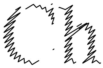
Figure 12. - Drop the Curviness value to 0, but boost the Curviness Variation percentage to its right to around 30 (Figure 13). The effect of this isn’t obvious until after the next step. At the end, you can go back and fiddle with these setting to see what I mean.

Figure 13. - For Spacing, try a value of 0p1.5, and for Spacing variation, set a value of 0p0.5 (Figure 14).
Figure 14.
You have a lot of slack here for creating various scribble fills for your characters, and it’s fun to see how extreme you can get before illegibility sets in. Me, I go for the more conservative approach.
High-Voltage Static, or Over-Caffeinated Type
This technique creates type that looks like it just stuck its finger in a lamp socket. As with the Rubbed Type effect above, tinkering slightly with the settings of this staticky type sends you off into areas of very poor reception, and even poorer perception. The victim in Figure 15 is once again Adobe Caslon Pro.

Figure 15. What did you say? Click on the image for an enlarged view.
Here’s the trick:
- One last time, set the type and click the selection tool. First stop is the Effect/Distort and Transform/Roughen dialog box.
- Click the Relative button and set the Size slider to 1% (Figure 16).

Figure 16. - Push the Detail slider to 50. We want lots of points along the character outlines so we can shake them back and forth later (Figure 17).
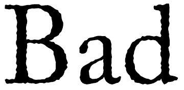
Figure 17. - To make sure that we get that good jangly effect, make sure the Corner button is selected. Click OK.
- Now it’s on to the Effect/Distort and Transform/Tweak dialog box. In the Amount section, click on the Absolute button, so you can set specific values instead of percentages (Figure 18).
Figure 18. - Don’t panic. Under Amount, set Horizontal to 0p7 (Figure 19). The horizontal Tweak control is what creates the effect of misaligned raster lines that typify bad TV reception. This setting could also be calibrated in café lattés.
Figure 19. - Now set Vertical to 0 (Figure 20). This assures that your static is only side-to-side and preserves some semblance of legibility.
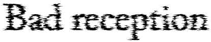
Figure 20. - Finally, leave all the Modify checkboxes in the default, checked condition, and click OK. Bzzzzzztttt.
This article was last modified on July 11, 2023
This article was first published on August 27, 2007
Commenting is easier and faster when you're logged in!

Recommended for you

How to Create Perfect Automated InDesign Captions
Confession: I am a fraud. I go around speaking about InDesign, telling everyone...

How to Quickly Place Many Images into Your InDesign Document
So you have 300 images to import quickly? Here are some quick ways to do it.
Marginal Notes in InDesign
Learn two easy ways to convert footnotes and endnotes to marginal notes in InDes...