
Billions of years ago, when dinosaurs ruled the earth, print production managers checked documents with something called “progressive proofs” or “color proofs”. These printed pieces of paper showed how each process color (cyan, magenta, yellow, and black) would print alone and in combination with the other colors. They were output as follows:
• The magenta plate alone
• The yellow plate alone
• A mixture of the yellow plate combined with the magenta plate
• The cyan plate alone
• A mixture of the cyan plate with the yellow and magenta plates
• The black plate alone
• A mixture of the black plate on the yellow, magenta, and cyan plates
The production manager used these paper proofs to see whether colors combined smoothly without abrupt drop-offs when one color blended into another. The proofs also revealed whether spot colors were set to knockout or overprint correctly.
While technology has moved on, and few places employ production managers any more, you still need to know whether your documents’ colors are correct. You could let your print shop discover any errors, but who has the time or money to re-do a job when you could have prevented mistakes before going to print? Instead, let InDesign’s Separations Preview panel show you any problems and how to fix them.
Opening InDesign’s Separations Preview Panel
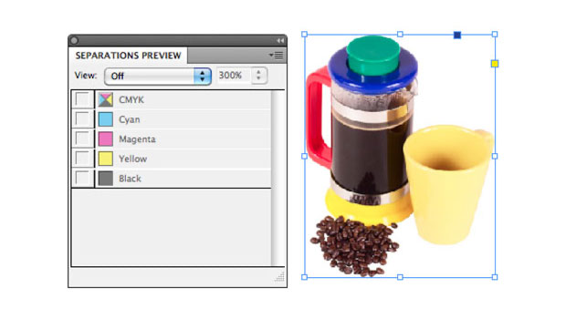
To see the Separations Preview panel, go to Window > Output > Separations Preview. The panel opens with the separations off.
Figure 1. The Separations Preview panel with the View set to off.

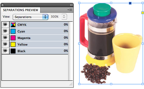
To turn on the separations for the document, choose Separations from the View menu in the panel. The eyeball to the left of each ink name indicates that you can choose to change the display for that specific plate.
Figure 2. The Separation Preview panel with the View set to Separations.
Displaying Each Process Color Plate
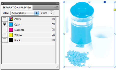
Looking at a CMYK document, click the eyeballs on or off to change the display for the inks. For instance, with only the eyeball for the cyan ink displayed, you see how cyan ink is applied during the printing process. With the eyeball visible for just the magenta ink, you can see how that ink is printed.
Figure 3. The four inks viewed individually in the Separation Preview panel.
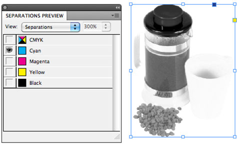

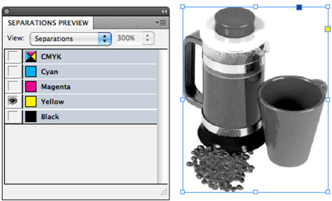

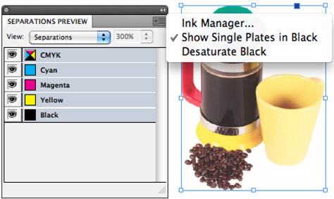
Viewing the plates in color. One thing that confuses some people is that individual process color plates are displayed in black. That’s because it’s easier to see the amount of ink that will be put on paper when the ink is shown as black.
To see the plates in the actual color they will be printed in, deselect Show Single Plates in Black from the panel menu. This displays each plate in its ink color.
Figure 4. Deselect Show Single Plates in Black to see each plate in the color that it will be printing with.
Combining Plates
When I was a kid, I had an encyclopedia with transparent acetate pages that had separate inks printed on each of the acetate pages. Those acetate pages allowed you to combine the inks to create full-color photographs. I used to spend hours flipping those pages back and forth to see how the colors would combine. I’d look at just the cyan ink and then add the magenta plate to see how those two colors would combine. Then I’d add the yellow plate, take away the cyan, add the black, take away the magenta, and so on.
Now we can do the same with the CMYK colors in the Separations Preview panel. Just click the eyeballs to display two plates. Click to add a third plate and then a fourth. This way you see how the inks will be applied.
Figure 5. The Separation Preview panel displaying the cyan and magenta inks. Notice there is very little cyan or magenta ink in the area for the cup.

Figure 6. The Separation Preview panel displaying the magenta and yellow inks. Notice there’s quite a bit of yellow ink in the area for the cup.

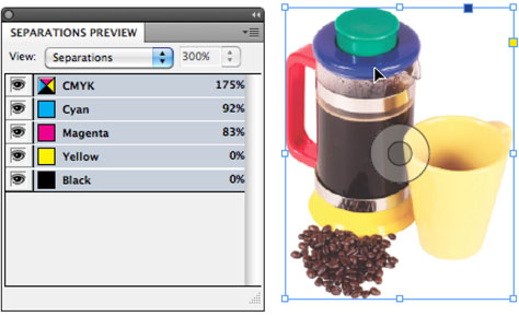
Viewing the Ink Percentages
The Separations Preview panel also lets you see the actual percentages of how much process ink is in each color of the document. With the separations turned on, move your cursor around each color. Notice that percentages appear next to the name of each color in the Separations Preview panel.
Figure 7. The percentage of ink that makes up the color blue is displayed as the cursor moves over that area of the image.
Overprint Preview
When you turn on the separations in the Separations Preview, you also automatically turn on the overprint preview. Overprint preview changes how InDesign displays the colors set to overprint.
When you place one color over another, you automatically create a knockout. This means that the top color punches a hole in the bottom color. The colors do not combine.
However, you can use the Attributes panel to set the fill or stroke of an object to overprint. An overprint means that instead of a knockout, the bottom color merges with the top one.
Most of the time you don’t have to worry about overprinting; you want one color to knockout another. But having the overprint preview gives you a better idea of how the colors will finally print.
Working with Spot Colors
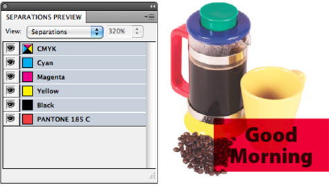
In addition to the four process colors, you can also have plates in your document for spot colors, which are created by using special ink with a specific color that can’t be reproduced accurately with process colors.
If you have a spot color in your document, it automatically appears in the Separations Preview panel. You can turn the display for that spot plate on or off using the eyeball next to the name of the color.
Figure 8. When the spot color Pantone 185 C is added to the document, its name automatically appears in the Separations Preview panel. Here the spot color has been applied to the fill around the words “Good Morning.”

Using Overprinting to Create Transparency
InDesign has very sophisticated transparency controls. However, if you use overprinting, you can create the Multiply effect for transparency. Select the object that you want to “see through” and select Overprint Fill or Overprint Stroke in the Attributes panel (Window > Output > Attributes). The benefit of using overprinting to simulate transparency is that the page doesn’t have to be flattened during the RIP. This makes processing the document faster and may even be more reliable, if your print shop has ancient RIPs.
While you won’t see the effects of setting the overprint as you work normally, you will see the overprint colors mix with the top as soon as you turn on Separations from the Separations Preview panel.
Figure 9. When an object is set to overprint, turning on Separations allows you to see how the top color mixes with the colors below.
Viewing the Ink Limit
Printing is a physical thing. One ink color hits the paper and combines with another to create a mixture of the two colors.
Think of how you used to combine blue and yellow paints during finger-painting. Remember what happened if you put all the paints on the same area? Not only did the result turn into a black mess, the paper itself became saturated.
It’s the same thing with process printing. With four process inks, you can have up to 400% of the process colors on the paper. That’s too much ink for a printing press to handle. The ink starts to clump up on the paper. The printer rolls become smudged. And pages start to stick together because the ink doesn’t dry properly.
That’s why it is important to make sure that the ink doesn’t exceed a certain amount called the ink limit. The ink limit amount changes depending on the type of paper you’re printing on, as well as the kind of press you’re using. Your print shop will let you know the ink limit for your job.
You can tell which areas of the image exceed the ink limit by choosing Ink Limit from the View menu of the Separations Preview panel. The image changes from color to gray scale. Then use the Ink Limit menu to set the ink limit amount. The areas of the image that exceed the ink limit will be displayed in red.
For images, use the tools in Photoshop to desaturate the ink in that area of the document. For graphic elements change the CMYK definition of the swatches in InDesign.
Figure 10. When Ink Limit is chosen from the Separations Preview view menu, the red areas show where there will be too much ink created during the printing process.

Using the Ink Manager
Strictly speaking, the Ink Manager is not part of Separations Preview. However, you can open the Ink Manager by choosing Ink Manager from the Separations Preview panel menu. Choose Ink Manager to see a list of all the colors in the document. This includes any spot colors.
Figure 11. The Ink Manager shows you the colors in the document. You can control how these colors print. Notice the spot color icon next to the Pantone 185 C ink. This indicates that the color will separate onto its own plate.

At the bottom of the Ink Manager is the All Spots to Process setting. It converts any spot colors in the document into process colors. The percentages of the process colors depend on the CMYK percentages used to create the spot color preview. For some colors the converted color is pretty close to the spot color. But for other colors, especially fluorescents and metallics, the process color won’t look the same as the spot color.
If you turn on All Spots to Process the spot color disappears from the Separations Preview panel. But it won’t disappear from the Swatches panel. In fact, turning on Separations is the most foolproof way to tell what colors will print from the document.
Figure 12. When All Spots to Process is turned on, the spot color in the document has a CMYK icon next to it. This indicates that the ink will be broken down into its process color percentages.
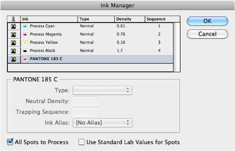
Figure 13. Even though the spot color is still applied to the fill, the spot color no longer appears in the Separations Preview panel because All Spots to Process was chosen in the Ink Manager.

Let the Separations Preview Panel Be Your Guide
I don’t recommend working with the Separations Preview panel set to display Separations because the overprint preview may slow your display. However, do turn on Separations before you send out the job out to see if there are any problems. It will save you time and money to fix them at this stage of the process.
This article was last modified on August 2, 2021
This article was first published on October 17, 2011
Commenting is easier and faster when you're logged in!

Recommended for you

Choosing a Font Manager
Nine font management solutions to tame even the largest font collection

Creative Cloud Assets Lose Features Without Prior Notification
Unannounced interface changes have removed some important features from Adobe Cr...

Going From Markdown to InDesign
How to use Markdown as an authoring tool in InDesign workflows