


Peachpit Press is offering this book to creativepro.com readers at a special discount. Click here to learn more.
One of InDesign’s most highly touted features is its control over type. The character palette is the command center for type in InDesign. But at first glance, the number of options available can be overwhelming, especially when delving into OpenType territory.
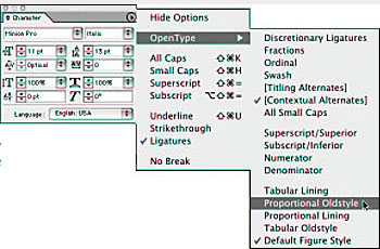
Now get the inside scoop on using InDesign’s character palette from the industry’s leading experts on page layout: David Blatner and Olav Martin Kvern, authors of this week’s featured book, “Real World InDesign 2.” You’ll learn about how InDesign groups font familes, applies leading and kerning, and adjusts baseline shift.
We’ve posted this excerpt as a PDF file. All you do is click this link “Character Formatting” to open the PDF file in your Web browser. You can also download the PDF to your machine for later viewing.
To open the PDF, you’ll need Adobe Acrobat Reader. Get it here:
 .
.
To learn how to configure your browser for viewing PDF files, try these tips from Adobe:
- Click here for Explorer on the Mac
- Click here for Explorer on Windows
- Click here for Navigator on Windows
- Click here for Navigator on Mac.
This article was last modified on March 10, 2025
This article was first published on May 28, 2003
Commenting is easier and faster when you're logged in!

Recommended for you

How to Be a Better Designer: Know Your Colors
To use color effectively, you have to be intentional, grasp the different color...

InDesigner: Showtime’s The Red Group
Terri Stone speaks with the designers behind this channel.
Scanning Around with Gene: Electric Blankets and the Cold War
Growing up during the tail end of the Cold War with Communism meant an always-pr...