


This article is excerpted from the February/March 2008 issue of InDesign Magazine (#22). Buy the issue or subscribe to the magazine at www.indesignmag.com.
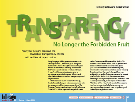
Long, long ago, Adobe gave us transparency in InDesign version 2, and it was good. Not great, but at least a step in the right direction. Designers reveled in the ability to add drop shadows and feathered edges to objects directly in InDesign. It wasn’t until those early adopters tried to print documents with those new effects—and often failed—that they realized transparency could be problematic.
In each subsequent version of InDesign,Adobe has added ways to enhance documents with transparency, making it even more enticing. The Flattener Preview panel debuted in the first Creative Suite. In CS2, Adobe improved compatibility with native Photoshop and Illustrator files. And in CS3, there are a host of new effects, such as gradient and directional feathers and inner and outer glows.
There’s one thing that hasn’t changed, however, and that’s the need to flatten transparency for output to a PostScript device. It’s essential for everyone to understand why flattening may be necessary and how it doesn’t have to spoil the good looks of your original documents.
In this article, you’ll learn everything you need to know to produce a successful printed layout. Click on the image below to download the article as a PDF.
To open the PDF, you’ll need Adobe Acrobat or Adobe Reader. We highly recommend Adobe Reader 7.0 and above to view this PDF. Download the latest Acrobat Reader here.
To learn how to configure your browser for viewing PDF files, see the Adobe Reader tech support page.
This article was last modified on December 14, 2022
This article was first published on April 28, 2008
Commenting is easier and faster when you're logged in!

Recommended for you

10 Best Apps to Improve Your iPhone Photos
The cameras and processing power in today’s smartphones have come a long way sin...

Simultaneous Contrast: How Your Environment Affects Color Perception
This article originally appeared on chromaqueen.com. Republished with permission...

Album Moxie: The Savvy Photographer’s Guide to Album Design and more—with InDesign
There’s an old saying that when all you have is a hammer, everything looks...