

When the first Creative Suite came out, the buzz was as much about the new application icons as it was about the apps themselves. The Photoshop eye: gone. The Illustrator Venus: gone. Changes to the GoLive and InDesign icons were less dramatic, but those programs weren’t long-time mainstays on a designer’s desktop.
A Seismic Shift: Creative Suite 1

MetaDesign was the firm responsible for these radical departures. In a recent interview, MetaDesign vice president and creative director Brett Wickens told me that this “seismic shift in imagery” grew out of a clear strategy: “The advent of the Creative Suite was a tipping point, with Adobe moving into a new, exciting space. We were tasked to create packaging that connected emotionally with the creative professional audience.”
“Any motif that lives long enough becomes familiar, and familiarity breeds lack of interest,” Wickens continues. “It was time to revamp the creative professional line to indicate that the suite was a new concept, with a lot of new features.”
The new icons were meant to convey precision, beauty, and inspiration. “A nature theme satisfied all those attributes,” says Wickens. Thus Photoshop was represented by a feather (an early drawing tool, after all) and Illustrator by a flower. GoLive stayed with a celestial theme (a star) and InDesign’s butterfly merely became more abstract.
“The nature motif was also a conceptual metaphor for the process of using design software,” says Wickens. “There are mathematical formulas that define everything that occurs in nature. The golden ratio defines how a nautilus shell grows, the Fibonacci sequence describe how leaves grow on trees. Yet out of these formulas, no two things are alike. It’s the same code base with different outcomes. And what is software other than a code base? But in individual hands you arrive at individual outcomes.”
Aftershock: Creative Suite 2

With Creative Suite 2, there was no need to make major alterations. Instead, Wickens says that MetaDesign wanted to “move the motifs forward in a new language.”
“Adobe creative products come out in an 18-month cycle, and during that time, the culture changes. Creative professionals look for and awaken to different things. Our goal was to put something in front of people that is beautiful and unexpected. We still wanted to adhere to precision, beauty, and inspiration — we just recast them. We came up with five ideas, but I knew from the minute we hit on the x-ray concept that it would be the one.”
The CS2 icons not only resemble x-ray imagery — they actually are x-rays, captured by radiography artist Nick Veasey.
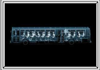
This image, which really is an x-ray of people on a normal-sized bus, is the work of photographer and filmmaker Nick Veasey.
His studio is in a facility outside of London that Wickens describes as “Chernobyl-like, with bunker-type rooms.” The facility’s equipment is normally used for uncovering structural faults underwater or in airplanes. “Nick’s studio is there because it can contain the radiation his work requires,” Wickens explains.

The x-ray equipment in Veasey’s studio is of the Russian black market variety. Small wonder that he wears a radiation tag every day.
For the CS2 icons, Veasey placed dried specimens of leaves, feathers, flowers, sea stars, butterflies, and shells in black boxes on the ends of long steel arms, then bombarded the boxes with massive amounts of radiation. The butterflies and feathers posed the most difficult challenge. “There’s not much depth to either butterflies or feathers,” Wickens says, “and x-rays use depth. We had to try composites and angles, and compositing with positive photos.”


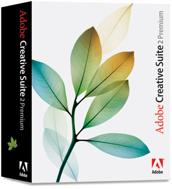
Raw x-rays of laurel leaves. Both the Standard and Premium editions of the Creative Suite are represented by laurel leaves.
The MetaDesign team then refined the images by compositing and coloring the x-rays. Next came the packaging.
Studying the Competition
Wickens says that MetaDesign is always studying competitive software packaging. “For the most part, it’s pretty boring,” he says. “It’s either so stripped down that I don’t understand the meaning of what I’m buying, or it over-represents what I’m buying.”
“Too literal a representation is like living in the late 1980s or early ’90s. Think of Adobe Illustrator 88 — its box had to show you what you could make with it, so you could understand why you should buy it. Nowadays, you do have to highlight new features on the back of the box and in marketing channels, but the main image can be more iconic. Using white space on the boxes helps the CS2 boxes look iconic. And the typography is progressive and unexpected.”
Wickens adds, “There’s a great David Bowie quote that’s something like, ‘There’s no point in being more than 15 minutes ahead of your time.’ You can create wild, esoteric stuff, but it will be meaningless because the market won’t have caught up to it. You can be so far out that people won’t get it, or so far in that it will be boring. The trick is to recreate yourself in commercially masterful ways.”
And that’s good advice for all creative pros, no matter what our resources.
This article was last modified on December 17, 2022
This article was first published on April 27, 2005
Commenting is easier and faster when you're logged in!

Recommended for you

Essential Tips for Cropping Images in Photoshop
Whether it’s done to make images fit a specific space, or to make them tell a ce...
I Didn’t Know Preview Could Do That!
Do you use Preview? It’s the bundled app that Mac OS X uses by default when you...

Design How-To: Using Ghosted Backgrounds
A beautiful technique that's unusually easy to design: ghost and repeat a foregr...