
Introduction to Illustrator: Part 2

Excerpted from Vector Basic Training: A Systematic Creative Process for Building Precision Vector Artwork by Von Glitschka. Copyright © 2011. Used with permission of Pearson Education, Inc. and New Riders.
In addition to the HTML version of the excerpt below, you can also download the excerpt as a PDF that retains the full design of the printed book.
In Part 1 of this series, we got back to basics with a grounding in Adobe Illustrator’s 12 core tools. Now it’s time to move on to making Illustrator fit well with your working style.
Customize Your Environment
Every vector drawing program comes with default settings. In general, the defaults are OK, but customizing your preferences will make creating your vector graphics a lot easier. The following customizations are geared for Adobe Illustrator. Look for equivalent controls and features in the drawing application of your choice.
My Preference for Preferences
You’ll want to customize these three areas.
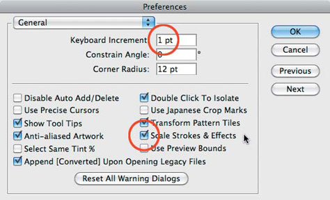
1. Preferences/general: The settings shown in Figure 17 will help you make adjustments to your art as you work and scale properly when resizing.
Figure 17. Preferences > General: Keep Keyboard Increment set at 1 point or lower. Make sure you have Scale Strokes & Effects checked.
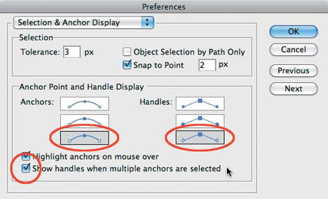
2. Preferences/Selection and Anchor Display: The settings shown in Figure 18 will make it easier for you to notice and isolate problem areas in your vector shapes. They will also assist you in editing and adjusting your anchor points, their handles, and Bézier curves as you build.
Figure 18. Preferences > Selection & Anchor Display: Select the largest display for your “Anchors” and “Handles” by choosing the last, largest box featuring the handles that have the hollow ends. Make sure you have Show handles when multiple anchors are selected checked.
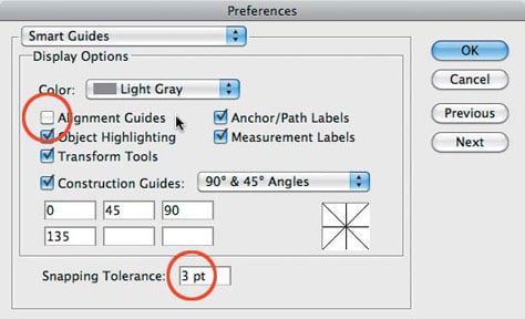
3. Preferences/Smart guides: The settings shown in Figure 19 will enable the assistance of Smart Guides as you build. This will help you know when you’re hovering over an anchor point in a path that isn’t selected, for example.
Figure 19. Preferences > Smart Guides: Make sure you have Alignment Guides unchecked. And set your Snapping Tolerance to 3 pt. or lower. I uncheck Alignment Guides because the program tries to associate everything you build with other elements in your file whether you want it to or not, and this can become highly annoying as you build vector shapes.
Keyboard Shortcuts and Actions
The ability to customize your own keyboard commands and create actions in Adobe Illustrator are, in my opinion, two of Illustrator’s most underrated features. Most people never even tap into them.
Keyboard shortcuts are just what they sound like: the ability to use a key command instead of hunting down the command in a pulldown menu. They allow you to be more efficient.
Not all functions in Illustrator allow you to add a shortcut command, though. In those cases, actions are your best bet. Actions allow you to record multiple keyboard commands. Once you are done recording, you can assign the recording to a specific key command. The end result is that with one push of a key, you can run a series of commands instantly, which obviously saves time. The best way to determine how you can best use actions is to simply experiment. Anything you do routinely is a good candidate for an action.
To create your own keyboard shortcuts, go to Edit > Keyboard Shortcuts > Select, and pick either Tools or Menu Command from the pulldown menu in the pop-up window. Select a specific tool or menu command, and then enter in the key you want the task to be assigned to. Illustrator will tell you if the key is already assigned, and you can decide to ignore or override it. Click Save, and your keyboard shortcut is ready to use. It’s that simple.
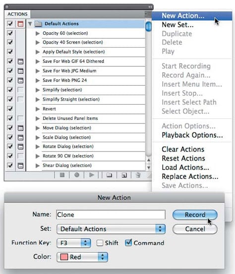
To create an action, go to Window > Actions. On the Actions panel, click the fly-out menu in the top-right corner. Then click New Action. In the pop-up window that opens, name your action, assign it to an action set, assign a key command to it, and click Record > Proceed to compile the series of commands you want to record (see Figure 20 below). (Remember that not all functions in Illustrator are recordable.) Once done, click Stop in the Actions palette. You now have a customized action at the ready.
How you ultimately use these features will depend greatly on what type of work you’ll be creating, but when it comes to building vector graphics, I have customized a handful of commands to make routine tasks easier. Here are six shortcuts and two actions that I use regularly via my F keys to save time.
1. F1 is Make Clipping Mask (Command-7 or Control-7).
2. F2 is Release Clipping Mask (Option-Command-7 or Alt-Control-7).
3. F3 is Clone. Adobe Illustrator has no clone command. To clone an object, you must copy a shape (Command-C or Control-C) and then paste it in front (Command-F or Control-F). That’s a total of four keys to hit. Keyboard shortcuts don’t allow multiple commands, so you’ll need to record an action and assign the action to the specific F key you want (Figure 20).
Figure 20. To create the Clone shortcut, from the Actions menu, choose New Action. Next, record yourself copying a shape (Command-C or Control-C) and then pasting it in front (Command-F or Control-F). Stop recording. You now have a Clone keyboard shortcut.
4. F4 is Send to Back (Shift-Command-[ or Shift-Control={).
5. F5 is Bring to Front Again (Shift-Command-] or Shift-Control-]).
6. F6 is Ungroup (Shift-Command-G or Shift-Control-G).
7. F7 is Unite. This allows me to take two selected shapes and unite them into one shape without having to move my cursor to the Pathfinder panel. In Adobe Illustrator CS5, the Shape Building tool (Shift-M) could be assigned to this F key, if you want.
Since the Pathfinder panel functions don’t have keyboard commands, I created an action for this function and assigned the action to the F7 key.
8. F8 is Deselect (Shift-Command-A or Shift-Control-A). Sometimes when you’re zoomed into your design, you can’t click on the artboard to deselect an object. Assigning the Deselect shortcut to the F8 key is like killing three keys with one click.
Stop Re-creating the Wheel
When you begin a new project, you should be able to start building immediately. Your creative process shouldn’t waste a bunch of time setting preferences, importing your styles and color swatches, creating new layer structures, and so on at the start of each and every project. I save myself a ton of time and frustration by creating a new document profile in Illustrator that saves many of my favorite settings and uses them as the default settings for each document.
In this section, I’ll show you how to set the foundation for a creative process that enables you to spend less time fussing with your computer and more time creating great designs.
Create a New Document Profile
Creating a new document profile in Illustrator is a simple three-step process.
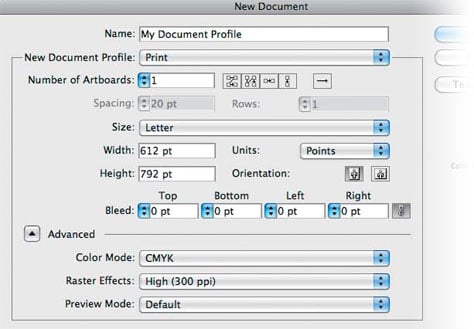
1. Create a new document (Command-N or Control-N). In the New Document dialog, select the general properties you want, name the file, and click OK (Figure 21).
Figure 21. Many of the settings in the New Document window will be determined by the specific project you’re working on. If you overlook something after you click OK, don’t worry. You can always go back and revise it as needed.
2. Customize your properties. In your new document, set up properties in the way you like to work. Maybe you prefer rules to always be visible, specific colors to be loaded in your swatches panel, and so on. It’s up to you. (We’ll go over three essential properties that you should include in your new document profile in “Set Graphic Styles for Building” later in this chapter.)
3. Save your startup profile (Command-S or Control-S). Once you have your file set up with all the properties you want it to contain, it’s time to save it. Go to file > Save (Command-S or Control-S) and save your startup profile in this location: User/Library/Application Support/Adobe/Adobe Illustrator Version/Language/New Document Profiles.
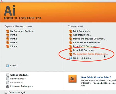
From this point forward, your new profile will appear in the New Document dialog (Figure 22). You can simply select it and get straight to work.
Figure 22. This is how your startup profile is listed in the New Document dialog.
A fringe benefit of working within a systematic creative process is that it removes a lot of guesswork. When you approach a new project using your customized new document profile, you can focus on the creative work rather than the tools needed to pull it off. Being consistent will help you be more efficient and allow you to spend more time on actual creative work rather than file management.
There are other ways to speed up your vector build times as well, and we’ll get to those next.
Set Graphic Styles for Building
Two primary tasks define the creative process described in this book: drawing and building. You’ll draw out your art, scan it in, and then build it within your vector drawing program. Drawing is the creative foundation upon which you build.
Prior to starting the building process, you’ll want to create two simple graphic styles and save them in your new document profile. These determine your working line weight and color during the build process. To create a graphic style, just create any shape with any fill or stroke color and width you want, and drag it into the Graphic Styles palette. Done.
When I scan in a drawing that will form the basis of a digital illustration, the scan shows up in black and white and then is grayed back for building. By setting my default line styles in magenta, the colored lines pop off the background and I can clearly see what I’m creating. The color you choose doesn’t have to be magenta—that’s just my personal preference. Use whatever color you want as long as it’s not black, which would be too hard to see (Figure 23).
Figure 23. My default graphic style is a .5 pt. magenta colored stroke. I also have a secondary graphic style that is a .25 magenta-colored stroke. These help me easily see what I am creating.
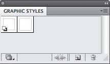
As you build your vector art, you’ll zoom in and out so you can see certain portions better. When I’m zoomed out, I use the .5 pt. stroke, and when I’m zoomed in I use the .25 pt. stroke (Figure 23 above). Using a .5 pt. stroke when zoomed in produces a line that’s too fat, which makes it hard to analyze contoured shapes as you build. Using a .25 pt. stroke when zoomed out does the opposite: The line is too thin and hard to see.
Enable Smart Guides for Building
I highly recommend that you enable Smart Guides (Command-U or Control-U) as you build your artwork. Smart Guides make snapping to points and paths more obvious, and without them, it’s easy to think something is snapped into the correct location, only to find out later that it’s slightly off.
Smart Guides will also help you select items with more precision and assist you with live pop-up information when you rotate items or hover over content in your document (Figure 24).
Figure 24. Left: With Smart Guides enabled, you can select a point or path, or rotate a selected object. Also, Smart Guides will give you immediate information. The information displayed by Smart Guides changes based on the tools you are using and what shapes you happen to mouse over as you work. Right: With Smart Guides turned off, a selected point, path, or rotated object displays no information.

Using smart guides is a balancing act, however. I find myself toggling them on and off throughout the creative process because sometimes they can get in the way or force a snap when you don’t want it.
If you’re not used to working with these guides turned on, I suggest you get used to it. The benefits outweigh the annoying GUI behavior.
Establish a Layer Structure for Building
For whatever reason, Adobe has decided that layer information isn’t worthy of being one of the properties you can add to a new document profile. This is highly annoying and should be added to a future version of the software, in my humble opinion.
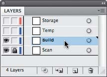
For now, we have to establish layers manually. Whether I’m working on a logo design, character illustration, or a pattern design, I follow the same hierarchy when it comes to layering during my building stage (Figure 25). I start with four layers: storage, temporary, build, and scan.
Figure 25. I begin every project with four layers: a storage layer, temporary layer, build layer, and scan layer.
From the top down, my layers are as follows:
1. Storage Layer: As I build artwork, I tend to experiment. So I make copies of elements and move them to my storage layer, which is not visible. I also make a copy of all of my paths before I start coloring and put those in the storage layer as well. Think of this approach as vector insurance in case you mess something up. It also allows me to more easily take elements I may have created for one project and reuse them in another.
2. Temp Layer: I use this layer to test things before I actually make them part of the build art. The more I build, the more a file can get cluttered visually, so this allows me the space to turn off the other layers and work on a clean surface. Once I have the specific vector art dialed in, I then move it to the build layer.
3. Build Layer: This is where most of my building takes place. It serves as my vector staging ground on which to construct the vector artwork and finesse my Bézier curves.
4. Scan Layer: This is where I place my refined drawing scan (either a .tif or .psd file with transparency set to around 20). I then lock the layer so it cannot move.
As a project progresses from building the core vector graphics, and I begin the process of coloring and detailing the artwork, I’ll add additional layers to make managing and editing the artwork easier. We’ll cover this in more detail in Chapter 9.
Deconstructing Design
All professional designers and illustrators practice good layer management, and you should, too. In fact, you’ll want to set up an established layer structure for each and every vector art file that you create.
Organize and group related content on its own layer as you build, and you’ll be able to isolate a specific group easily when edits are needed down the road. And, I assure you, edits will be needed. They always are. Grouping related content by layers allows you to make adjustments faster and refine details in your design without other vector shapes getting in your way.
Let’s deconstruct a design I call Señor Skully. By turning the layers on and off, you’ll be able to see how the vector content is organized.
This design was originally created for a sticker manufacturer, but the client changed directions. So, I turned it into a Day of the Dead poster (figures 26 to 30).
Figure 26. These two layers, part of a poster design, host the background content.
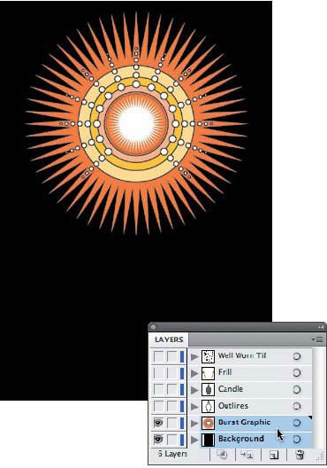
Figure 27. Keeping my outlines for this design on their own layer makes experimenting with the stroke thickness much easier.
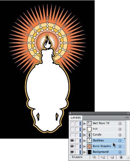
Figure 28. These layers contain most of the ornament and detail in this design.

Figure 29. This is the texture I used to sit on top of all of my elements.
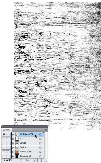
Figure 30. final Day of the Dead poster design.

This article was last modified on July 4, 2023
This article was first published on December 19, 2011
Commenting is easier and faster when you're logged in!

Recommended for you

Real World Tips for QuarkXPress 5: Ready for Output
Excerpted from “Real World QuarkXPress 5” (Peachpit Press). Peachpit...

Bunch of InDesign Articles
We love being your InDesign resource, but sometimes that means pointing you to g...
Global Graphics Releases Version 4 Of Jaws PDF Server For Cost- Effective Enterprise Wide PDF Creation
Today Global Graphics releases Version 4.0 of Jaws PDF Server, its powerful serv...