*** From the Archives ***

This article is from January 26, 2012, and is no longer current.

J.C. Penney Logo Changes Again

Eleven months ago, J.C. Penney rolled out a new logo created by third-year graphic design student Luke Langhus:

While some of you thrashed the redesign, I thought it was a serviceable attempt that at least didn’t throw out decades of brand equity. And it was certainly more successful than this short-lived redesign fiasco (created not by a student, but by a famous agency):

But I take back any kind words toward J.C. Penney, because yesterday the company introduced another logo tweak:

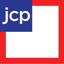
To which I can only say, “Whut??!!”
Please share my pain (or defend this new redesign) by posting in this article’s Comments.

  • Anonymous says:

    I’m speechless. No, I’m not–a good designer shouldn’t even show a client any branding option that makes them look bad, no matter what the client thinks they want.

  • Anonymous says:

    So, did some exec say “Wow, I love the Nationwide logo. Get me something like that!” Granted, no logo is going to be the sole factor in my decision to shop at JCP or not but this looks like someone got tire of trying and just through it together. Are we at a point in history where everything is formulaic?

  • Anonymous says:

    Interesting but lame mash-up of the logos for National Geographic and Gap. I would have expected better from former Apple retail guru Ron Johnson. But then, after all, it is JC Penney, never known as a leader in style. Another wasted opportunity. Pity.

  • Anonymous says:

    Well, it’s very errrm…. patriotic?

  • Anonymous says:

    jcp is leaning towards more “Made in the USA” – thus the “flag” looking logo… I for one am glad they at least centered the “jcp” in the small box now – the Aries in me was going crazy ;-)

  • Terri Stone says:

    Ah! I hadn’t heard that JCP was doing the “made in the USA” thing. That makes the color choice and flag evocation more understandable.

    But I STILL don’t like it.

    Terri Stone
    Editor in Chief, CreativePro.com

  • Anonymous says:

    The previous logo was much more inviting than the redesign, at least in my mind’s eye.

  • Anonymous says:

    The previous jcpenney logo by the 3rd year design student was a far better solution. Hope jcpenney corporate didn’t spend alot on such a poor design solution.

  • Anonymous says:

    If they were trying for the flag look then use a rectangle instead of a square. That being said, I think the square or rectangle could have been designed by an elementary student with only their innate sense of color and shape. jcp could do much better than this — what a disappointment..

  • Anonymous says:

    Like most logo changes there will be a lot of trash talking by designers, but overall it makes no difference to consumers. Even this one, which is very puzzling, will be eventually accepted. It will be very interesting to see the marketing strategy for it once they begin the transition – possibly justifying the changes.

    If I were in charge, I would be more apt to drop the “JC” than the “…enney” in the logo. I’ve never heard anyone call the store “J C P” – most people will drop the “JC” and say, “I’m going over to Penney’s to pick up some socks.” Will the ad campaign try to change their brand to “JCP”? People have been calling the store Penney’s for decades…it will be a tough sell. Just like McDonald’s attempt at a cooler, hipper image calling itself “Micky D’s” – I think the only people who call it that are the overly happy, young adult actors in their commercials.

    The other interesting question is whether or not they are planning a “made in the USA” strategy as the new logo seems to suggest. I don’t know how they could possibly do it. So many of their products, from clothes to shoes to electronics, are made overseas. Image-wise, JCPenney rests somewhere in the lower-middle of the department store world – below Macy’s & Nordstrom, above but much closer to Target, Kmart and Walmart.

  • Anonymous says:

    The patriotic logo makes me sure that Penney’s shoppers are traditional, conservatives who appreciate the Tea Party and makes me want to shop anywhere else but Penney’s.

  • Anonymous says:

    YUCK! YUCK! YUCK!
    Does not in any way reflect the quality of their products. Lets hope not anyway.

  • Anonymous says:

    I actually like the Luke Langhus logo for JCPenny. One of the things I felt was its strongest aspects was the fact that it didn’t step away from what was already recognizable to the brand. Instead gave it an update that could fall into place if only the lower case jcp were used. That would make it a good way to target a younger audience. That said, it looks as though they thought so too, and decided to “go with it” … but I have to tell you I really hate the logo I am seeing here on the bottom in red, white and blue. For the record… I also hate the new Gap logo. If it is the same agency… then I would suggest firing them. I’m just sayin’…

  • Anonymous says:

    Not a big fan of this logo redesign for many of the same reasons mentioned above. But what no one has failed to mention is all the applications of this logo. How will it look on the side of a building? Among other locations…

  • Anonymous says:

    … what the hell is THAT?

  • mrmtv says:

    I saw a TV ad last night that used the old(er) logo. Was there a backlash in places other than here?

  • Anonymous says:

    JCPenney has used a “box” in its logo for awhile. However, they now look at it as a frame – “Frame the things you love.” It does also work somewhat as a flag.

    Many stores will have the frame in LED lighting, allowing the store to change colors corresponding to the monthly values the company is moving towards. You’ll find colored frames all over the stores soon, and the sales will be color-coded. February is pink.

  • Anonymous says:

    … if it weren’t for the fact that they redesigned the logo already, only 11 months ago. I thought it was clever and worked well, because in this day, sticking with Helvetica has actually become kind of courageous, and you nailed it, it was a catchy new look that had one foot solidly in forty years of visual tradition.

    But with this new look … and it is clever … in its context (only 11 months since the last redesign and the near-lightspeed handwaving about the new JCP marketing approach, stores-within-stores, Apple Genius-Bar-style product centers, it all seems more-than-suspiciously desperate.

  • Anonymous says:

    Are they serious? This is hideous. I don’t mind the student-designed version of the logo…modernizing a long name with a logo that can be used with the full name or a shortened version.

    But, this….there are no words. Pass me the forks to gouge my eyes out!

  • photocrawf says:

    I’m concerned (also) about the scale. If the “jcp” large enough to be easily recognizable, then the square will be…how large? Large ugly=UGLY!

  • Anonymous says:

    This logo is a very bad example of a corporate design logo . They should have modified the logo they had with a simple adjustment. They could have rounded the corners to give it a more softer appeal. I hope they didn’t pay millions to have this done. This is what happens when things are not thought threw when going through the design process.

  • Anonymous says:

    This is a bad dream. Seriously.

  • edbook says:

    When the page opened, I thought for a moment that I had opened the jpg image posting website but then saw the letters jumbled… I didn’t recognize it as Penneys… It looks too generic and I didn’t associate it with the US flag . But, I did have the thought that their old old for many years logo was recognizable for me and I always associated it with quality clothing… and made in USA… but shifted to imports and lower quality, which lost my business – I went from buying almost all of my clothes from them to ‘can’t remember the last time I bought anything from them’. I guess generic and unrecognizable products equates to the same for a logo.

    Peace

    Ed Book
    [email protected]
    https://edbookphoto.com

  • Anonymous says:

    I’m still not over the Gap mishap.

  • Anonymous says:

    all i can say is — what the… the logo created by the student makes more sense — simple, a classy aftertaste, clean — just like what the old/original jcp company tries to deliver.

  • Anonymous says:

    I like it better after seeing it applied in marketing materials, but it’s still terrible. Anyone else sick of seeing Gotham absolutely everywhere?

  • Anonymous says:

    I guess Penney’s hired the graphic artist that got canned for the GAP redesign.

  • Anonymous says:

    well the logo is no where near harsh as their current ‘no more’ tv spot of constant screaming banshees …. Logo: apparent they’re targeting American as a brand, & are also pushing new tagline ‘fair & square’, another true Americana moniker & they’re new store/pricing structure. This logo implies a new generation with hints of their past …. it is not that bad & although design is my career, i’ve always felt people get beyond over-amped about any ‘new logo’, as if someone blatantly disrupted their personal life ,,, itsa logo. that is all.

  • Anonymous says:

    ‘jcp’ must stand for just crappy politics. The third year student’s logo was decidedly better at linking the old and the new.

  • Anonymous says:

    Follow the leader….should’a just placed “jcp ” in a bold red target circle!

  • Anonymous says:

    I just threw up in my mouth.

  • Anonymous says:

    I agreed with lots of the comments responding to Terri Stone’s earlier entry re the “red square” logo – i.e. that the “jcp” in the square separates itself too much from the “enney”. Often large companies who have invested a lot in developing brand equity, use a transitional version of the new logo. Perhaps dropping the “enney” would be the company’s next move?

    Enter the “red frame” logo. No transition here—why did the company even bother with the “red square” logo if they were planning to replace it after a few months with something so different?

    As for the latest entry, because the red frame constitutes such a large part of the mark, those implementing it could be forced to either make it too large so the type will be legible, or too small as to threaten the type’s legibility. (Preview at 0.5 inches, for example.)

    Of course, I’m judging this logo out of context. Perhaps the red boarder expands to the edges of packaging? Maybe this is for a short-lived “fair and square” promotion? We’ll see.

    Note:
    I was an intern in the JCPenney product design department in 1971 when we were first implementing blue Helvetica logo on hundreds of products. It was pretty easy to apply to the thousands of products in various product catagories. The logo was available in three weights: the lighter one for dolls, women’s underwear, etc., the heaviest weight for tools, football helmets, etc., and the medium weight for everything else. In this way the company was able to eliminate most of their private label brands, yet still have a version of their logo sensitive to the specific product. This also allowed them to concentrate their resources on promoting the JCPenney brand only. A pretty good solution.

  • Anonymous says:

    Red draws interest away from the logo, the text should be red to draw attention to it. Blue doesnt do this
    Also the logo size is lost in the size of the box. Way to small compared to the box
    So because of the logo size, The feeling is I am lost in a big world and dont know what to do with myself
    This is textbook bad design and says amature, no matter who designed it
    Lower case text says company does not command its space, says I am not important
    Box should be black to not compete with the logo.
    Person who designed this has no understanding of the impact of color on a logo design
    Logo border is too thick
    The previous logos were much better
    Reminds me of early in my career when many design came out with pink and green colors, it showed no concept of design or good taste.
    To be effective a logo should have purpose for all parts of it, this one seems like it was designed in five minutes by the compay nephiew, no experience in design.

  • Anonymous says:

    I’ve been keeping my eye on the JC Penney since learning that they had hired folks from Apple and Target to lead their rebrand efforts. While the new logo doesn’t impress much on it’s own, it rarely has to do that. I find where it matters most is how it supports the new tag/slogan/messaging and functions as a cue for their refreshed ad layouts. It is like a logo…that isn’t!

  • >