


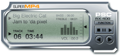
In this tutorial, you’ll learn how to create the basic interface shape and add depth to the shape for greater realism. In next week’s follow-up, you’ll layer a convincingly realistic LCD on top of the shape, and finally, add buttons to the display. The end result will look like this:
Create the Basic Shape
1. Create a new Photoshop document in RGB mode. Create a new layer. Choose the rectangle shape tool with the settings shown in Figure 1:

Figure 1
Make your foreground color gray.
2. Draw a large rectangle to cover most of your canvas area (Figure 2).
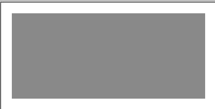
Figure 2
3. Choose the elliptical marquee tool, hold down the shift key to constrain it to a perfect circle, and make a circle. Hit the delete key to cut a corner out.
With the selection tool still selected, click and drag the selection to the opposite corner (Figure 3). Hit delete again.

Figure 3
4. Now let’s make the classic High Tech Interface shape at the bottom.
Choose the polygon lasso tool. Click and then as you move the mouse it will stretch until you click again to join the dots. Here is the secret: Hold down the shift key to constrain the shape to increments of 45 degrees.
Click all the way around until you get back to the start point. You will see a little circle. Don’t be shy, click it! And then, you will see a selection around the shape (Figure 4). Hit the delete key.

Figure 4
5. To give this rectangle rounded corners, choose the rounded rectangle shape tool and use the settings shown in Figure 5:

Figure 5
6. Create a new layer. Draw a rounded rectangle about the size you need for a screen.
Now for a little layer jumping. Cmd/Ctrl+Click on the “screen” to load the selection (Figure 6).
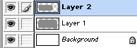
Figure 6
Choose the iface layer, which should be Layer 1.
7. Hit the delete key and you should have a shape as shown in Figure 7.

Figure 7
If your shape doesn’t look like this, you can download the PSD file here.
Add Depth
8. Make a selection (Figure 8) by Cmd/Ctrl+clicking on the layer thumbnail.

Figure 8
9. Now open the dreaded Channels palette. Don’t worry — I’ll hold your hand and you’ll come out safely.
Click on the New Channel button and your shape should appear in an alpha channel (Figure 9).
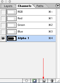
Figure 9
10. Figure 10 shows how your shape should look in the main window.

Figure 10
Deselect. If your shape is inverted, press Cmd/Ctrl+I, then deselect.
11. Go to Filter > blur > Gaussian blur and click OK (Figure 11).
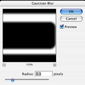
Figure 11
12. Now go back to the layers palette and click on layer 1 (Figure 12). This is important! Even if you think you don’t need to click on layer 1, do it anyway so you’re working in all channels, not just in the alpha channel.
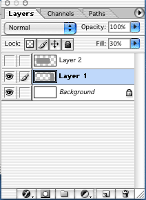
Figure 12
13. Let’s add depth.
Go to Filter > Render > Lighting Effects to bring up the dialog box you see in Figure 13.
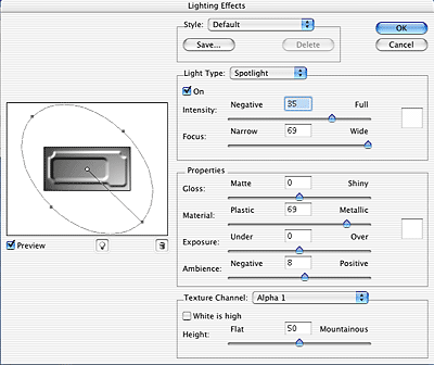
Figure 13
Under Texture Channel, choose Alpha 1. You should now see some depth in the preview.
Adjust the light in the thumbnail preview by clicking and dragging on any of the five points in the left-hand pane of the dialog box. Try to achieve a pretty even lighting effect without extreme shadows or highlights. When you’re satisfied, click OK.
14. Your layer should now look something like Figure 14.

Figure 14
15. The next step is to make this 3D shape look like it’s chrome.
Open the Curves dialog box by pressing Ctrl/Cmd+M or going to Image > Adjust > Curves.
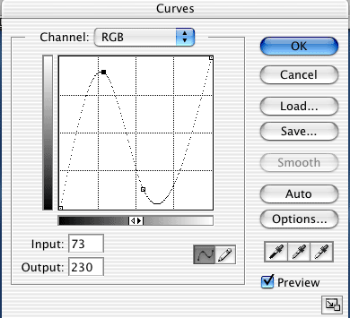
Figure 15
You will see a diagonal line cutting through the graph. Click about a third of the way from the left and drag the line up. Then click about a third from the right and drag down (Figure 15). If you can’t see any change in your image, check the Preview box in the Curves dialog box. Make fine adjustments until your chrome looks good.
16. It’s time for a quick little color adjustment.
Go to Image > Adjust > Hue/Saturation (Cmd/Ctrl+U). Click Colorize and adjust as shown in Figure 16 to produce a slight blue hue to the interface. This makes it appear more like chrome.
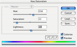
Figure 16
17. Add a quick drop shadow and your shape should look something like Figure 17.

Figure 17
If your shape doesn’t look like this, you can download the layered PSD file here.
Hold on to the file and stay tuned for next week’s follow-up!
This article was last modified on January 3, 2023
This article was first published on August 21, 2006
Commenting is easier and faster when you're logged in!

Recommended for you
Do You Have a Color Vision Deficiency?
Want to find out if you have any deficiencies in your color vision? Try the the...

Free Photoshop Filters Webcast
It can be a lot of fun to experiment with Photoshop’s many filters to crea...
Adobe's Guide to Tuning Photoshop for Peak Performance
If you do a lot of Photoshop work, it behooves you to spend some time to configu...