


It’s not everyday that one of the world’s most renowned sans serif type families welcomes into its fold new members – with serifs. Linotype is proud to present Frutiger(r) Serif, the new font family by Adrian Frutiger and Akira Kobayashi. Frutiger Serif evolved from Frutiger’s classic Meridien(r) design redrawn and expanded, it now harmonizes with several of Adrian Frutiger’s sans serif designs.
With Frutiger’s support, Linotype’s Type Director Akira Kobayashi took up the challenge to adapt and expand Meridien. Created for the French typefoundry Deberny & Peignot in 1957, Meridien was was one of Frutiger’s earliest designs. It is characterized by sharp, but elegant, serifs and no straight lines. Where most fonts have completely straight strokes, Meridien features gentle curves and soft arcs.
The existing digital version of Meridien is offered by Linotype, although this interpretation is quite different from the original metal type. Akira Kobayashi had an appreciation for the metal version, so he began Frutiger Serif from some of the earliest, letter-pressed specimens. The spirit of Meridien is still present in Frutiger Serif, although there have been many significant changes. New weights, widths, and styles not only come closer to Frutiger’s original design, but they now correspond better with several of Frutiger’s sans serifs.
The Frutiger Serif font family comes in 5 weights ranging from light to heavy and each weight is available in both regular and condensed. This increases the number of fonts in the family to 10; but since each of these also has an italic version, the family actually has a total of 20 fonts. Needless to say, Frutiger Serif also has all weights of italics in condensed as well – an addition that neither the original Frutiger nor Frutiger Next even have yet.
This article was last modified on January 18, 2023
This article was first published on May 21, 2008
Commenting is easier and faster when you're logged in!

Recommended for you

The Typographic Style Bible, 75 Years Later
Typography evolves slowly, its progress held in check by the demands of readabil...
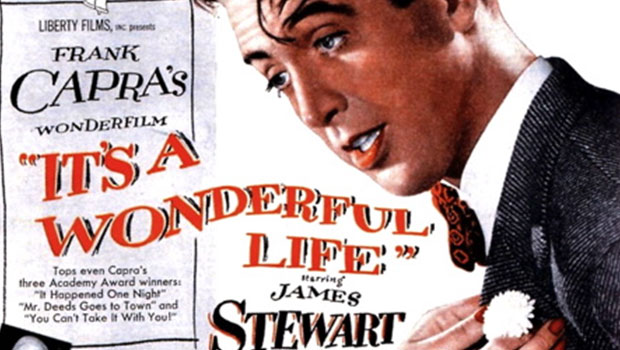
Scanning Around With Gene: It's a Wonderful Typeface
A look at the graphic design in and around this Christmas classic

Legibility and Readability: What’s the Difference?
Learn the difference between "legible" text and "readable" text and how to ensur...