


Malabar
For the next 30 days, all customers who purchase any font licenses at Linotype.com will receive the Heavy Italic font from the newly released Malabar typeface family for free! Malabar is a type family for extensive text. Its characters are seriffed and of the oldstyle genre. Malabar’s x-height is very high, a deliberate choice that makes the most important parts of lowercase letters visibly larger in tiny settings. The height of its capital letters is also rather diminutive, allowing for better character fit as well as eliminating a bit of clumsiness in German typesetting.
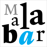
The family includes three weights, each with a companion Italic. Malabar Regular is equipped with small caps, and both it and Malabar Italic include oldstyle figures. All members of the family have both proportional and tabular-width lining figures, as well as special variants of certain punctuation marks vertically adjusted for all-caps text setting. The Regular’s wedge serifs become more slab-ish in nature as the letters’ weight increases. Malabar Heavy and Heavy Italic are best relegated to headline use only. Malabar Bold and Bold Italic may be used for text emphasis, a job for which the Heavy is too dark.
Malabar was designed by Linotype’s Dan Reynolds, and it received a Certificate of Excellence in Type Design at the Type Directors Club of New York TDC2 competition in 2009.
Really No 2
Really No 2 is a redesign and update of Linotype Really, a typeface that Gary Munch first designed in 1999. Its letters show a moderate-to-strong contrast of its strokes, recalling the Transitional and Modern styles of Baskerville and Bodoni; a subtly oblique axis brings to mind the oldstyle faces of Caslon. The serifs complete the typeface’s realist sensibility: a clear, readable, no-nonsense text face, whose clean details offer the designer a high-impact selection.
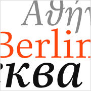
The new typeface is available in four separate versions: Pro, Cyrillic Pro, W1G, or Greek Pro. Each version offers different levels of language and script support. The Really No 2 W1G fonts include both Cyrillic and Greek coverage, in addition to a Latin character set that supports virtually every European language. Customers who do not require this level of language support may choose from the Really No 2 Pro fonts (just the Latin script), Really No 2 Cyrillic Pro fonts (Latin and Cyrillic), or Really No 2 Greek Pro fonts (which include both Latin and Greek). Regardless of which version you choose, all Really No 2 fonts include small capitals and optional oldstyle figures, as well as several other OpenType features.
Gary Munch’s original Linotype Really received a Certificate of Excellence in Type Design at the Type Directors Club of New York TDC2 competition back in 2000.
Virtuosa Classic
The newest script typeface in our library is another collaboration between Hermann Zapf and Akira Kobayashi. Virtuosa Classic is the 21st century OpenType re-release of a classic Hermann Zapf design, Virtuosa, which was his very first script typeface. Based on the same sketches that would inspire Zapfino 50 years later, Hermann Zapf developed Virtuosa in 1948–49. It was originally released in metal in 1952. The letters have a slightly different angle in the new Virtuosa Classic than their metal type counterparts did, but such things are easier to achieve with digital technology, and the typeface’s designers think that the results look better, too. Virtuosa Classic is an English copperplate script with character. The font includes two form variants for each capital letter, and there are a number of lowercase alternates and ligatures, too.

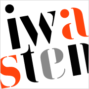
Iwan Stencil
The stencil typefaces that we see these days are often just sans serif capital letters. But the situation did not always look like this. Long before Jan Tschichold developed the Sabon in the 1960s, he created a number of other typefaces for various European foundries. A prime example is a stencil motif that he created in 1929, which Klaus Sutter, in 2008, digitized and updated for 21st century use. The result is Linotypes Iwan Stencil. Why the name “Iwan?” For a time during the mid-1920s, Jan Tschichold went by “Iwan,” the German spelling of “Ivan”.
This article was last modified on January 3, 2022
This article was first published on April 16, 2009
Commenting is easier and faster when you're logged in!

Recommended for you

TypeTalk: Type Tips for Letterpress Printing
The richness, depth and texture of a letterpress-printed piece is an exquisite t...

Study: Blending the Old with the New
We often hear the proverb “there is nothing new under the sun.” While one might...

How-to: Add Multiple Strokes to Editable Text in Photoshop
Have you ever tried to add more than one stroke to text using Photoshop’s Layer...