Logo for Maker of Little Blue Pill Gets a Makeover

Pfizer, maker of Viagra and Lipitor, among many other pharmaceuticals, recently underwent a brand freshening. What do you think of the change?
Written by Terri Stone on November 6, 2009
Categories: Graphics, Illustration, News

Related Reading

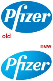
The motto of the venerable and successful Siegel+Gale branding company is "Simple is smart." It followed that slogan to the letter in its recent retooling of the logo for pharmaceutical company Pfizer:

What do you think of the changes to the logo? Is it better, worse, or about the same? To speak up, click one of the Comments buttons above or below this article.

For an excellent analysis of the revamped logo and Siegel+Gale's more radical changes to other aspects of Pfizer's brand, see Armin Vit's article "Pfizer Moves Pforward" on the UnderConsideration Web site.

1

Pfizer Logo

I don't think the gradient is doing anything to improve the look. It's not much of an upgrade.

2

Printing error

It's not much different than the old logo, not that it has to be. Nice subtlety in the skew of the pill. However, it's been my experience and observation that color gradations in short areas like this often appear as a printing error, especially if high-end printing can not be maintained across media. I think this is a mistake. Here's a thought...

The UNWISE man never learns from his mistakes.
The SMART man does learn from his mistakes.
The WISE man learns form the mistakes of others.

3

Pfizer logo change?

Looks the same, different typeface, same look.

4

pfizer

Drug companies obviously have way too much money to waste

5

Pfizer Logo

Excellent NEW logo. Perfect. Go with it Pfizer.
Reminds me of the UPS logo transition sveral years back with its gradient background.
Very etheral with the feel of open vast sky and yet too the brand name now stands out even more.
They took away the 'knobiness' of the old typeface which annoyed me for a long time.
Overall cleaner and sharper, good overall weight.
The fact that some people say the brand still looks the same is testament to the fact that with all it's improvement this NEW logo is a success.

PaulZ

PS Buy brand name. It really is much better for you than substandard generic.

6

Pfizer Logo

I think that it's more dynamic with the gradient and the tension on the upper left when the blue background almost touches the p

Definitely and improvement

Robert Robinet

7

Pfizer redesign

I think it's an improvement. Still the same recognition, but a bit more dynamic.

8

Ridiculous

This is a ridiculous waste of time and money. Are you kidding?

9

Pfizer Logo

They should have gone with that glassy Web 2.0 look instead of that gradient...

10

Pfizer Logo

This company is just looking for ways to spend money. They are abandoning thier $300M research center in New London. This new logo shows investors how the landscape has changed but greed looks the same as it used to. What they really need is a re-spelling~ "Fizer".

11

Tweak

Better balance between the type and the area it is contained in, just hope they did not pay too much for this obvious tweak.

Post a Comment

  • Allowed HTML tags: <a> <em> <strong> <cite> <code> <ul> <ol> <li> <dl> <dt> <dd> <p> <div> <br> <center> <img> <h2>
  • Lines and paragraphs break automatically.
  • Use <!--pagebreak--> to create page breaks.

More information about formatting options

CAPTCHA
This question is for testing whether you are a human visitor and to prevent automated spam submissions.
Image CAPTCHA
Copy the characters (respecting upper/lower case) from the image.
WebInk