Logos Are Type Too

Logos consisting mainly of letters may not always read like text, but that doesn’t mean that their designers can stomp willy-nilly on the rules of good typography. In other words, a logo is more than just a graphic entity, and how it looks depends in large part on how well its characters are placed.
I got to thinking about this after reading of a new European directive that requires herbal medicines to be tested for purity and efficacy in return for the right to bear the “seal of approval” shown on Figure 1. Even a quick glance at that logo set the alarm bells ringing.
Figure 1. The Traditional Herbal Registration logo is a classic example of bad kerning. The spaces between the three characters are exactly the same, but the feel of the overall spacing is clearly wrong.

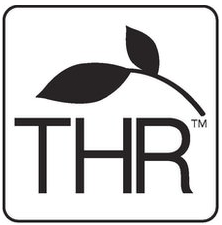
These three letters as set form a very uncomfortable ménage à trois. The H and R are on the most intimate terms, but the T is only in fingertip contact. There’s no need for this, as there’s plenty of room to use more natural spacing. Figure 2 shows the “before” and my edited “after.”
Figure 2. On the left, the original logo is crowded on the right-hand side. In the altered version on the right, moving the herb stalk slightly and re-kerning the HR combination has created more natural spacing without resizing the boundary rule or any of the type.

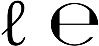
I don’t mind second-guessing the European Union in such cases, as these are the people who mandated the use in package labeling of two of the more unattractive glyphs I know of: those for the liter and “approximately” (or “estimated,” for imprecise content quantities), as shown in Figure 3.
Figure 3. The European Union’s typographic credentials were not exactly boosted by these awkward symbols for the liter (left) and “approximately” (right).

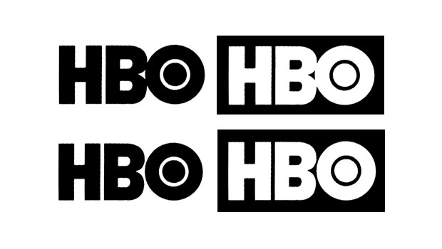
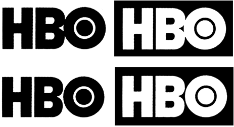
Quirky spacing is a hallmark of contemporary logo design, although unlike in the THR bug, it’s usually applied in an attempt to be eye-catching. Squeezing out spaces and creating ligatures has become such a cliché that it borders on being a tic among logo designers. Take, for example, the Home Box Office logo in Figure 4. There’s no reason—neither visual nor literary—for the BO combination to touch, leaving us to conclude that it was done just to be cute. I’m not necessarily against cute, but again, I think my “after” is an improvement.
Figure 4. On the top, the HBO logo designer seems to have felt that eliding the B and O would make the whole look more logo-ish. Perhaps. On the bottom, undoing that ligature creates a logo that reads better, is more balanced graphically, and does nothing to diminish the distinctiveness of the logo.

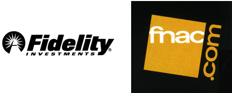
Not that all such ligaturizations (to coin a term) are bad. Figure 5 shows a couple of examples that pull it off rather well. In one case, the ligature formalizes what would have been a collision between characters in any case, due to tight spacing. In the second, the ligature not only binds the logo together but also acts as a pronunciation aid for a weirdly named book and media store.
Figure 5. The kerning of the Fidelity logo on the left is impeccable, but the tight spacing was going to make the ty combination awkwardly snug. The solution: Extend the crossbar of the t to create an intentional ligature. On the right, the unusual fn ligature informs the viewer that this French media outlet is indeed pronounced “fnac.”

I have one more example for you, in which tight and loose spacing combine in a single logo to create a remarkable distraction. Daedalus is the journal of the American Academy of Arts and Sciences, and it has chosen to use the ae diphthong in its masthead, an archaism once seen in words such as encyclopedia and pedagogy. Its logo appears in Figure 6.
Figure 6. The one tight character pair in this logo—the diphthong—jumps out at you. It’s the typographic equivalent of a sore thumb.

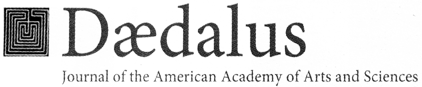
Using the diphthong is arguably an affectation, but using it amid very loosely spaced type is a mistake. The ae diphthong is not a single character—it is the marriage through ligature of an a and an e, and as such needs to be considered as two characters. Two very closely spaced characters. By having them so tightly spaced and all the other characters around them so loosely spaced is a distraction that draws the eye directly to the dark knot they create.
The old kerning axiom that the character pair with the most intractable spacing problem must key the spacing for the surrounding text applies here. The very use of the diphthong argues for tighter rather than looser overall spacing. Figure 7 shows my fix.
Figure 7. There’s no way that the spacing of the logo can be tightened to match that of the ae diphthong, but tighter tracking reduces the glaring contrast seen in the original and imparts more even color.

You could argue that the eye-catching effects I’ve found noisome here are in fact effective gimmicks to make a logo more distinctive and memorable. They caught my eye, after all. To that I would answer that ugly is always eye-catching, and even though these are small uglinesses in the scheme of things, they are—assuming they’re intentional—at best cheap and unnecessary tricks. We suffer enough visual discordance every day, and in that environment, pretty things should be eye-catching too.
 

James Felici has worked in the publishing industry for over 30 years. He is the former managing editor of Publish magazine, and written for PC World, Macworld, and The Seybold Report. A renowned type expert, he is the author of The Complete Manual of Typography.
  • Anonymous says:

    I think, probably the designer of HBO logo was inspired by the old video tape reading system, inside the VCR machine, when tape was intended to touch the head reader (the O in the logo is perfect round, ans solid as it is in the reading head of video tape recorders or players back in the 80´s) Without that touch, you have not any video signal going to your TV set :)

  • Anonymous says:

    Very interesting article!

    In the HBO logo, the O tends to pop out and become the central focus, at least to my eye. The thinness of the inner ring gives it greater proximity to the contrasting color, so it looks brighter than the rest of the white space (darker, in the reversed version) — this, with the filled-in interior, makes the O look less like a letter than an object (HBO’s version of the CBS eye perhaps). So the original ligature is probably intended to pull the O into the logo and have it read properly.

    The O is also too small and should extend further above and below the other letters to give it equal optical weight.

  • Anonymous says:

    While I agree with you on most of the logos, your perfect spacing on HBO makes it perfectly boring.

  • Anonymous says:

    Yep, you trot out an opinion about letter design in front of a bunch of designers and you’re going to get our opinions. I agree with the others about the HBO logo. With the space added between the B and the O – the O totally becomes more of an object and less like a letter. The uncontrolled white space now becomes awkward and a poor solution for the logo.

  • Anonymous says:

    Great tips for any designers, keep up the good work. I would love to have you on my team if I design any logos. Now a day, not a-lot of people look at anythings with a keen eyes as yours, they want it cheap, fast & look good.

  • Anonymous says:

    Perhaps the winner of the most blatant but unintentional typographical ménage à trois is the logo for Taiwan’s official Bureau of Health Promotion. (See top left of that page. The letters are “BHP”.)

  • Anonymous says:

    I had the sense the HBO logo was designed in that way so that the negative space made the O appear to be connected to the B perhaps like the old reel to reel projectors? The thickness of the HB being the projector unit and the O, the reel. I, too, like the original.

  • TSDunsmore says:

    I can appreciate where you’re coming from and respect your opinion as a professional in the industry. However, from the article it appears you are coming from the opinion that using optical kerning is the proper way to approach logotype design. This seems arbitrary to me since optical kerning varies based on personal taste. Secondly, I thought logotypes were designed so that the viewer knows they are in fact not part of a typeface, but a separate entity, one that uses letterforms but is not just characters spelled out from a font. What are your thoughts, James?

  • Anonymous says:

    You say “The ae diphthong is not a single character—it is the marriage through ligature of an a and an e, and as such needs to be considered as two characters. just like the W is a marriage through ligature of two “U”s and should be considered as two characters. The only difference is that we are used to one, and have let the other fall into disuse through laziness. The ae ligature is of equal antiquity, and is in fact the proper way to spell Daedalus.

  • Anonymous says:

    I’m happy to have stirred things up a bit. Logos are clearly an opportunity to push typography and letterforms in new directions, and I’m not at all doctrinaire about preserving the shapes of typeface characters as their original designers conceived them. But creating ligatures for no good reason is to me a cheap trick: an easy way to create a “look.” They also create a suggestion of how the text in a logo should be pronounced (which is why I though the FNAC logo was so clever), so to me the HBO logo suggests the pronunciation H-BO. The HBO logo is already pretty boring, and spacing its letters normally wouldn’t seem to make it any more so. It would simply eliminate a visual cliche.
    But the point about the O needing to be larger is well taken. It should indeed extend below the baseline slightly and overshoot the cap-height line to the same extent. This is true whether it’s merged partially into the B or not.
    Ultimately, the point of a logo is to create a memorable brand image, and that is often done with straight, unaltered type. Air France uses Antique Olive; Epson, Helvetica; Franco Maria Ricci, Bodoni, for example. Paul Rand added stripes to regular old City Medium to create the iconic IBM logo. At the opposite end of the scale are logos that create visual signatures but aren’t necessarily meant to be read at a glance. These act as a sort of signet: distinctive, but necessarily very legible.
    But my main point was that when the textual content of a logo is used as language, as in the case of the THR logo, consistent, natural spacing is an asset. Two letters standing alone may not need to be kerned, but as often as not, three will.
    And thanks for that link to the Taiwanese BHP site. I hope everyone takes a look at it. It shows an insight into Western letterforms and their graphic possibilities that is very–possibly uniquely–Asian.
    The point about the ae diphthong is complex. Part of the problem is that it’s is so rarely seen nowadays (it hasn’t been used in English dictionaries for decades; the Encyclopedia Britannica clings to in its title, but not its text). Because of that, it reads as two letters glued together, unlike a W, which is a full-fledged member of the alphabet. (The W is actually two fused Vs. In Latin, the V played the role of both U and V in modern Engish. The French still refer to the W as “double-v.”) But the principal point I was making is the visual problem the diphthong creates in this setting: It does not integrate gracefully into the line. Besides looking like two distinct characters, it’s also far wider than other vowels, making it stand out even more. It’s color is darker as well. All these things argue against it being used in letterspaced copy. And not to put too fine a point it, the original spelling of Daedalus is Greek, latinized as Daídalos.

  • TSDunsmore says:

    I am so glad you posted this, James. You have prompted me to revisit proper logo design and best practices and for that, I thank you.

    ―Assume nothing, expect everything

  • Anonymous says:

    While I agree with almost all your comments, I’d like to raise a slight quibble in regard to the HBO logo. I had a feeling I disagreed with you, but it took me a minute or two to put my finger on why — as it turns out, I may just be pointing out something you didn’t mention.
    One effect of separating the B from the O is that the B gains a small measure of importance. It could be argued, as there is no apparent change to the H, that its importance remains the same. In that case it would stand to reason that the O has lost a small measure of importance. It’s clear that the O is the intended focal point of the logo, so I think there’s a small but defensible reason to keep the B and the O attached.
    John Langdon http://www.johnLangdon.net

  • Anonymous says:

    However the rest look better in their original form. Especially THR.

  • >