
In 1985, if you were asked to name the most-used typeface in the world, the answer would not be evident. The answer was “Courier,” the typeface used on IBM and other typewriters, almost all impact printers, and new laser printers then hitting the market. Because it was a monospaced typewriter font, it was not considered a typeface. I recall giving a speech for the Print Quality conference in 1981 to an audience of printer manufacturers. I said that most of them would not exist if IBM had been able to protect Courier.
Since tens of millions of IBM typewriters and printers used Courier, it had become the de facto standard font for correspondence, reports, and almost all business and office communication. Although there were a few typewriter fonts, Courier caught on and took over within a few years. A lot had to do with IBM’s dominance at the time. Thus, any printout device had to have a version of Courier. Since type designs as designs are not protectable under law (their names can be trademarked), Courier became pervasive.

Typewriter fonts are monospaced because every letter has the same width, whether is it is lowercase i or a cap W. This allowed the spacebar to be used almost like a cursor, so you could space across a line and align with a letter that you had erased to permit insertion of a new letter. We all remember those round red erasers with the brush on the end. Well, some of us old-timers remember them. There was also correction paper that you typed over a letter to hide it with a white cloak of invisibility. Then came the correcting Selectric, which still required positioning over the letter. The miracle correction approach was Wite-Out and its little brush. Some typists used a roller.
Napoleon invaded Egypt, and, in his need to communicate with his military, he used a variety of systems. There was a semaphore system and there was a placard system. The placards that Napoleon’s troops used to send messages used a slab serif font. It was more readable through telescopes. It is also said that the crates sent back to France with the booty of war used similar lettering. There is an additional story that the letters were based on lettering seen in ancient ruins.

These typefaces have a more mechanical, regimented appearance than oldstyle serif fonts. The strokes that create the letterforms may make a slight transition from thick to thin, or, more commonly, there may be no transition at all. There’s no bracketing between the stem and the serif.
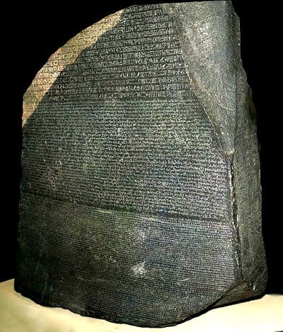
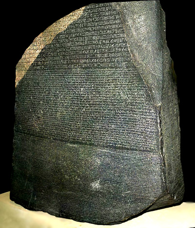
One of Napoleon’s engineers found the Rosetta Stone, which turned out to be the key that unlocked ancient hieroglyphics and allowed us to hear the voices of the past. This created interest in Egyptian archeology and a mania for anything Egyptian. Type foundries named their typefaces with an Egyptian reference. To this day this category of type is called “Egyptian,” even though there is no connection between the style and the country.
Many slab serifs have names like Cairo, Scarab, Memphis, Nile, and Karnak. Slab serif typefaces evolved rapidly during the Industrial Revolution as a result of the increased use of posters, billboards, and other forms of advertising. Their strong strokes are extremely effective for commanding readers’ attention. Slab serif typefaces are used for headings, ads, captions, and initial caps. Slab serifs are also called “Clarendons” when the serif is bracketed to the stem and “Cheltenhams” when the serifs are rounder. The Century family is based on the bracketed square serif, and forms the basis for most newspaper text fonts.

Enter Courier
Courier was the world’s most well-known typeface, but little is known about its designer, Howard G. (Bud) Kettler, who died in 1999 at the age of 80. Kettler’s career began at IBM in 1952 and continued into the 1990s with Lexmark, the company formed from IBM’s printer and typewriter business.
He was influenced by a book called Square Serifs by Poole Brothers that described the style of type just as he was given the assignment for a typewriter font design. Bud designed Courier in 1955 for the type bar typewriter. When the Selectric was created, Courier was adapted for the IBM type ball. Some serifs were shortened and the numerals were narrowed. Bud also designed the Advocate type style for the Selectric.
The font was about to being released with the name “Messenger,” but Kettler said, “A letter can be just an ordinary messenger, or it can be the courier, which radiates dignity, prestige, and stability.”
The font that Bud designed that he was most proud of was the Braille font for the IBM Braille Writer. He later worked with Adrian Frutiger on fonts for the IBM Selectric Composer, IBM’s entry into “cold type.”
With the advent of desktop publishing in 1985, Times and Helvetica were combined with Courier to be the standard typeface set for virtually every printer in the world as PostScript became the standard page-description language. Courier was included because users would want a typewriter font for their letters and business correspondence. Within a decade, Times and Helvetica displaced Courier from its typographic prominence. Today it is the font you do not want to see, especially when this message appears: “Font not found, substituting Courier.”
I knew the world had changed when a TV show had a teacher tell the class, “And I want your papers in 10 point Times Roman.” Sic transit Courier.
Frank Romano has spent over 40 years in the printing and publishing industries. Many know him best as the editor of the International Paper Pocket Pal or from the hundreds of articles he has written for publications from North America and Europe to the Middle East to Asia and Australia.
He is the author of over 44 books, including the 10,000-term Encyclopedia of Graphic Communications (with Richard Romano), the standard reference in the field. His books on QuarkXPress, Adobe InDesign, and PDF workflow were among the first in their fields. He has authored most of the books on digital printing. His latest book is the 800-page textbook for Moscow State University.
He has founded eight publications, serving as publisher or editor for TypeWorld/Electronic Publishing (which ended in its 30th year of publication), Computer Artist, Color Publishing, The Typographer, EP&P, and both the NCPA and PrintRIT Journals. His columns appear monthly in the Digital Printing Report. He is the editor of the EDSF Report.
Romano lectures extensively, having addressed virtually every club, association, group, and professional organization at one time or another. He is one of the industry’s foremost keynote speakers.
He has consulted for major corporations, publishers, government, and other users of digital printing and publishing technology. He wrote the first report on on-demand digital printing in 1980 and ran the first conference on the subject in 1985. He has conceptualized many of the workflow and applications techniques of the industry and was the principal researcher on the landmark EDSF study, Printing in the Age of the Web and Beyond.
He has been quoted in the New York Times, Wall Street Journal, Times of London, USA Today, Business Week, Forbes, and many other newspapers and publications, as well as on TV and radio. He has partnered with InfoTrends on strategic information for the printing industry.
He continues to teach courses at RIT and other universities and works with students on unique research projects.
Copyright 2000 – 2008, All Rights Reserved, WhatTheyThink.com.
This article was last modified on January 8, 2022
This article was first published on August 4, 2008
Commenting is easier and faster when you're logged in!

Recommended for you

Scanning Around With Gene: A Cornucopia of Corny Clip Art Cuts
Regular readers of this column know I’m a sucker for corny clip art, especially...

The Typographic Desk Reference, 2nd Ed.
Attention type lovers, users, and geeks! It is rare that I write about or endors...
TypeTalk: Laura Worthington, Script Designer Extraordinaire
Scripts have become some of the most popular typestyles in use today. They can b...