


After receiving a flyer from a fast food restaurant that featured the suggestion “Dunk Your Dipper,” graphic artist Siâron Hughes had an epiphany: she decided to make a serious cultural examination of the signage, slogans, menus and overall visual elements that distinguish chicken eateries throughout London. The result is a highly entertaining and illuminating book called Chicken: Low Art, High Calorie, which explores the visual language and branding of the fast food industry, indicative of ideas and concepts employed in the author’s home base and in urban centers around the world.
The new book, from Mark Batty Publisher, a leader in distinctive volumes covering the graphic and communication arts, is both a pictorial record and an investigative report. Dozens of amusing photos of signs, storefronts and menus are featured in the book, alongside comments from restaurant workers on customer reactions to store names and sign designs. There is also an in-depth chat with “Mr. Chicken,” a London-based sign-maker who has designed for several dozen fast food chicken joints in the U.K.
Hughes is a professional illustrator and web designer, originally from Wales, who studied graphic arts in London, where she began to focus on what she calls the “rhetoric, irony and candor” of certain graphic communication concepts. That’s when she first began exploring the variety of signs, graphics and menus at fast-food chicken establishments, ultimately resulting in the colorful and quirky Chicken: Low Art, High Calorie.
“Everywhere I went I was amusingly overwhelmed by the extravaganza of gaudy bright backgrounds ornamented with floating bits of fried chicken, chicken logos busy with numerous, incongruous fonts, and a very evident American influence,” Hughes said. “These vernacular designs, mostly done by the untrained eyes of the shopkeepers, break every rule of typography, but are ubiquitous.”
Hughes spent several months visiting fast-food restaurants with names like Chicken Inn Village, Chick King, ChickPizz, Fri-Chicks, Lick’n Chick’n, Cozy Chicken, Hen Cottage, Funky Chicken and many others. She documented their storefronts, signage, menus and more, also noting the wide variety of slogans used, such as “Paradise Patties,” “Taste Me,” “Lip-Licking Flavour,” “Best Breast in Wales” and more.
Most of the restaurants are not franchises, but are individually owned and operated establishments, many of which nonetheless borrow elements from some of the popular franchise chains.
“What started as a curious quest grew into something more personal. I have met the people who customise and adapt these unique and eye-catching visuals to suit their neighbourhoods,” Hughes said. “They are not so concerned with the theories and practice of graphic design as much as providing a service, which is actually in high demand. It was my goal to combine a study of visual language and branding with an insight into the lives of the people involved in this industry.”
This article was last modified on October 23, 2023
This article was first published on January 27, 2009
Commenting is easier and faster when you're logged in!

Recommended for you

Great tips, Great Community at CreativePro Week 2017
Excerpted from Erica Gamet’s article on CreativePro Week 2017 in issue 98...
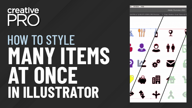
CreativePro Video: Style Multiple Items at Once in Illustrator
Learn a quick and easy way to change the appearance of multiple icons all at onc...

InDesign and HTML5
This article was taken from the handout to David Blatner’s InDesign 2014 C...