

Monotype Imaging Holdings Inc., a leading global provider of text imaging solutions, has released the 20-font Ysobel Pro typeface suite. All Ysobel fonts can be viewed, purchased and downloaded from the company’s e-commerce sites: www.fonts.com, www.linotype.com, www.itcfonts.com and www.faces.co.uk.
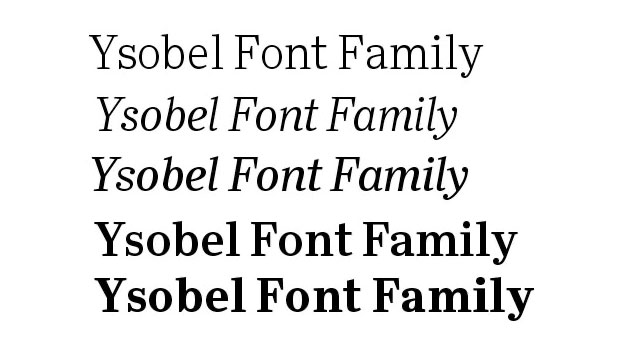
The Ysobel (pronounced “Isabel”) typeface family is intended primarily for newspaper and periodical copy. Designed by Robin Nicholas, head of typography at Monotype Imaging Ltd., and type designers Alice Savoie, also working at Monotype Imaging’s UK subsidiary, and Delve Withrington based in the U.S., the Ysobel typefaces were designed for both text and display applications.
According to Nicholas, the idea for the Ysobel faces started when he was asked to create a custom, updated version of the classic Century Schoolbook typeface, which was designed to be an extremely readable typeface – one that made its appearance in school textbooks beginning in the early 1900s. “I wanted to give the design a more contemporary feel, although the client ultimately decided to keep their typeface closer to the original. The project nevertheless gave me ideas for a new design,” said Nicholas.
Development began with the text version of Ysobel, which comprises eight fonts. All weights feature lining and old style numerals, fractions, superior numbers and extended Latin language coverage. Small caps are also available in the Ysobel Pro Regular font. The 12-font Ysobel Display Pro family is a completely redrawn version of Ysobel; it is narrower and features other nuances for improving the design’s appearance at large text sizes.
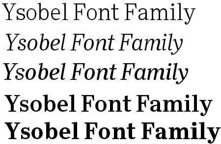
“Ysobel has the soft, inviting letter shapes of Century Schoolbook but contrasts these with more angular serifs,” said Haley. Its capitals are also narrower than those of Century Schoolbook, and the lowercase letters are more full-bodied. In addition, curved terminals, such as those in the “C,” “c” and “e,” were drawn as open shapes to aid readability in text copy. Other changes were added to ensure character legibility at small point sizes.
Nicholas, whose employment with Monotype Imaging began nearly 45 years ago as a draftsman for The Monotype Corp., has designed or co-designed several fonts including the Arial® typeface, which is used today by millions of users of the Microsoft® Windows® operating system. Nicholas has directed the design of fonts such as the Clarion® and Columbus® fonts, as well as the digital versions of many Monotype® faces including the Bell, Centaur®, Dante®, Monotype Janson, Fournier, Van Dijck®, Monotype Walbaum, Bulmer® and Pastonchi designs. Custom fonts for brand identities are also part of Nicholas’s portfolio, including faces designed for major commercial airlines, an automobile manufacturer, bank and a home furnishings company. In addition, Nicholas designed the Felbridge family, intended for both print and online use, and the Nimrod® family, a suite of fonts for newspaper text, headlines and ads. According to Nicholas, Nimrod was also a face that served as inspiration for the Ysobel design.
Ysobel Pro fonts support 48 western, central and eastern European languages, including Baltic and Turkish and is available in the OpenType® cross-platform font format. Typefaces include OpenType features such as ligatures, small caps and several numerical figures.
Individual Ysobel fonts, selection packs and the complete typeface family can be viewed, purchased and downloaded from www.fonts.com, www.linotype.com, www.itcfonts.com and www.faces.co.uk.
Customers may contact Monotype Imaging in the U.S. toll-free at 800-424-8973, or in Europe at (+44 0)1737 765959, or 001781 970-6020, option 2. Linotype may be reached at +49 (0) 6172 484-418. Customers from other parts of the world may dial 001 781 970-6020 (U.S.).
This article was last modified on August 15, 2021
This article was first published on October 12, 2009
Commenting is easier and faster when you're logged in!

Recommended for you
TDC Typeface Design Winners 2015
The annual Type Directors Club (TDC) Competition is one of the most prestigious,...

Chalk One Up for Inspiration
Reading about the anonymous students—calling themselves Dangerdust—at Columbus C...
Fun with Pattern Fonts
Q: Do you have any suggestion on how to liven up my design using some unusual fo...