
In our digital world, things rarely get better without getting more complicated. That’s certainly the case for fonts, where the latest and greatest model is OpenType. This column is all about what OpenType is, and isn’t.
First of all, OpenType is a font format, a programming structure that allows you to create type in a given typeface. As such, it varies only in the particulars from the other two popular font formats you’ve probably used: TrueType and PostScript Type 1. Those particulars, though, are pretty substantial.
The Mac OS and Windows use different icons to designate OpenType fonts:
OpenType creates a single, unifying envelope for both PostScript and TrueType technologies, which use different math for describing the shapes of the character outlines they contain (PostScript: Bezier curves; TrueType: conic b-splines). Structurally, OpenType is a TrueType font with slots inside that can accommodate either TrueType or PostScript character data. This structure gave manufacturers of both kinds of fonts an easy way to migrate to a common, universal format. An OpenType font also has the charming attribute of working equally well on both Mac or PC — you don’t need separate versions for the two platforms
It will probably never matter to you, but an OpenType font’s filename extension tells what kind of font data it contains, as shown below. Fonts whose names end in .otf contain PostScript outline information, while those that end in .ttf contain TrueType font data.
In the following examples (Mac above, Windows below), the Hypatia fonts contain PostScript font data, as indicated by its .otf filename extension. The Comic Sans fonts contain TrueType font data and get the extension .ttf.
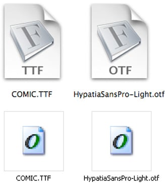
There is, however, an important practical side to the file name issue, and the key — as well as some the confusion — lies in how the Mac OS and Windows handle the OpenType font icons. Windows assigns the OpenType icon correctly to all OpenType fonts, letting you know that they’ll also work perfectly well on a Mac.
But the Mac’s OS X decides which icon to assign to a font according to its filename extension, not its font format. In the illustration above, it assigns Comic Sans a TrueType icon, which gives you no idea that it’s really an OpenType font and could be used on a PC as well as a Mac. As a Mac user, then, you may have fonts on your machine that will work on the PCs of your clients or workgroup colleagues, but the only way to know for sure is by trial and error.
What’s Inside
The list of things an OpenType font can include or enable is huge, and almost all of these things are strictly optional for a font designer. In truth, the only feature that all OpenType fonts share is that they can be used on either a Mac or a Windows PC. The fact that it’s an OpenType font says nothing about what’s in it. Although an OpenType font can contain nearly 65,000 characters, the vast majority of them contain fewer than 250.
This array of characters illustrates the character set of what Adobe calls its “Standard” OpenType fonts. Except for the characters highlighted in yellow, this is the same character set used in Monotype’s “Basic” OpenType fonts.
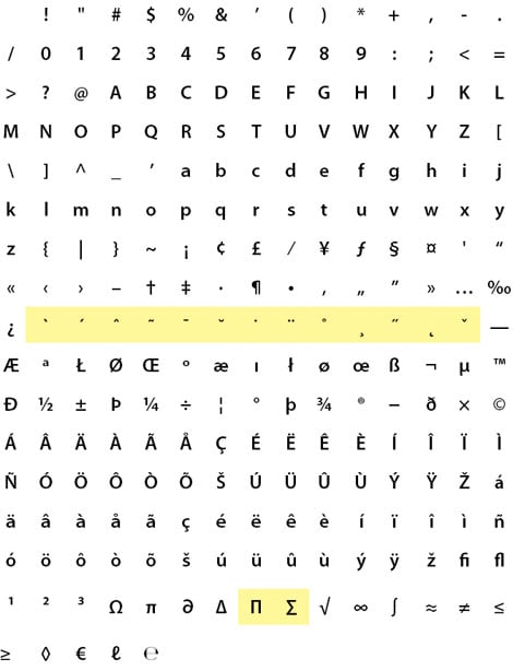
Certain OpenType fonts — Adobe’s “Pro” line, for example — may contain hundreds of additional characters, but the name “OpenType” alone says nothing about a font’s character set.
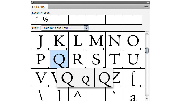
An OpenType font can also contain more than one form of a character. OpenType is based on the Unicode character-I.D. system, which identifies all characters and symbols in all the world’s languages by a series of unique I.D. numbers. To keep this scheme manageable, Unicode recognizes that a single character — say, a capital A — can be have several different representations, each identified by a separate glyph, as seen here:
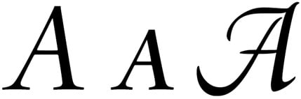
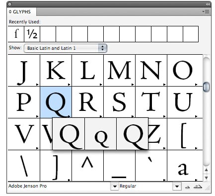
Above, you see a roman A, a swash A, and a small-cap A, each a distinct glyph used to represent a single character. In page-layout programs such as InDesign and QuarkXPress, you can use a Glyphs table to navigate a font’s contents and identify alternate forms of a single character.
The little triangle in the corner of a character box in InDesign’s Glyphs panel indicates that alternative forms exist for that character. Clicking the triangle makes those alternates visible, as shown here.
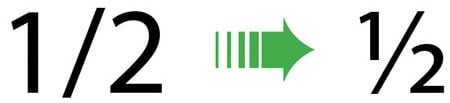
In addition to having the capacity to hold tens of thousands of characters, OpenType fonts can recognize particular categories of characters that programs can insert automatically into documents. (In font marketing literature, these automations are usually called layout features.) For example, if your OpenType font contains numerator and denominator characters, you can have your program automatically create fractions. In this case, every time you type numerals separated by a slash, your program will convert them to proper fractions. You can also choose specific strings of characters and convert them to fractions one at a time.
In an OpenType font adapted for fraction-building, the keystrokes shown here on the left are automatically converted into a fraction, like that on the right.
Not all programs can use OpenType fonts in this way, although most of the ones used by graphic artists — including QuarkXPress and Adobe’s Creative Suite applications — do.
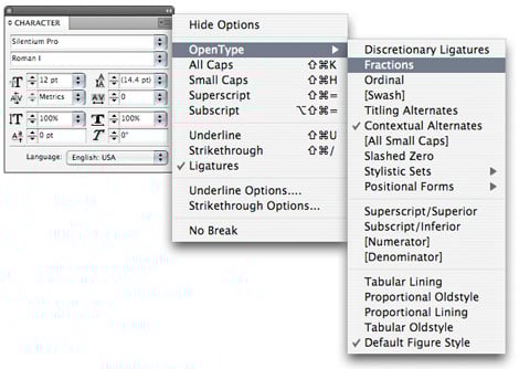
In Adobe InDesign, select OpenType from the Character palette menu, and a pop-up menu will show you which options are available for the font you’re using. Click on the ones you want to implement.
In InDesign’s OpenType menu, available options for the font you’re using are shown without brackets. Those displayed in brackets are not supported by your current font.
In QuarkXPress, you can accomplish the same thing by clicking on the OpenType symbol in the Measurements palette or by clicking the OpenType heading in the Style/Character Attributes dialog box.
The easiest way to access OpenType features in QuarkXPress is through a click on the measurements palette.
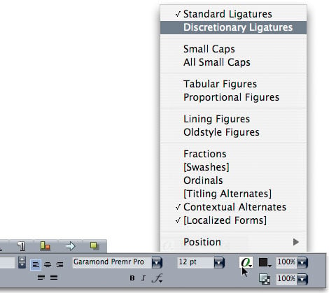
You have two ways of applying these options. First, you can simply turn a feature on, and all the type you key in from the current cursor point onward will display its effect. You can also select a passage of text and apply one or more OpenType options to it. For example, you’d probably want to allow your program to insert ligatures throughout an entire document, but you’d only want certain characters to be set in small caps.
Knowing what a particular OpenType font can do is not obvious, and you certainly can’t tell just by looking at it. Normally, font vendors list all of an OpenType font’s characteristics on their web site, but once you have that font on your computer, there’s no way to know what’s in it or what it can do — you’ll have to consult your program’s Glyphs palette or its OpenType options menu. If you use a font-management program (Suitcase Fusion, FontAgent Pro, etc.), you can create sets of OpenType fonts that share particular features. But it may easiest to keep a written list of which fonts can do what.
Below is a list of the most common OpenType layout features available.
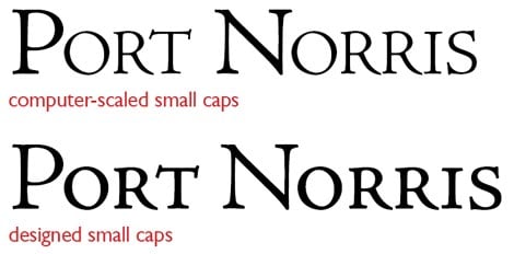
Small Caps
Designed small capitals (as opposed to computer-scaled ones) are a common OpenType feature:
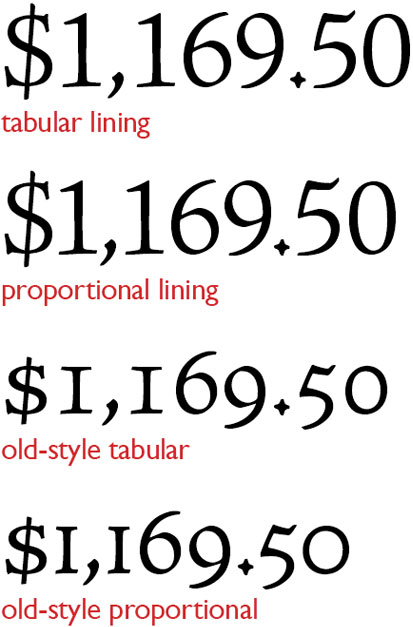
Alternate Figures
As I noted in my column “Pick a Numeral”, figures come in many forms, and OpenType fonts often offer you a variety to choose from, including lining and old-style figures in both tabular (monospaced) and proportional forms, as shown here:
Automatic Fractions
Some OpenType fonts only include a collection of pre-built common fractions, such as eighths and sixteenths. Better are those that offer a series of characters specially designed for use as numerators and denominators, from which you can build any custom fraction. Note that if you’re using such a font and keep fraction-building turned on all the time, you may end up with some unwanted fractions, in situations such as “on duty 24/7.”
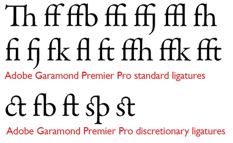
Alternate Ligatures
Almost all text fonts contain the fi and fl ligatures, but OpenType fonts may contain other common ones as well, such as ffi and ffl. They may also contain more offbeat or historical ones such as the ones shown below. Some fonts distinguish between “standard” ligatures and “historical” or “discretionary” ligatures so you don’t end up with odd or out-of-date looking type.
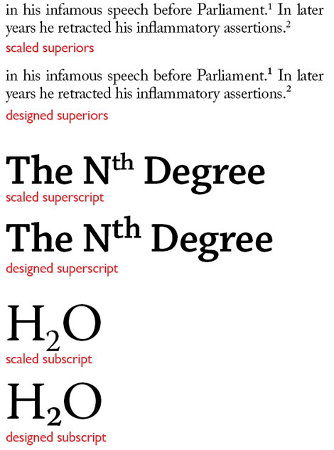
Superscript and Subscript/Ordinals and Superiors
As in the case of small caps, fonts that include characters specifically designed for use as superscripts/subscripts and ordinals/superiors will yield better results than simply having your program scale full-size numerals to size for use in these roles.
Titling and Case-Specific Forms
Some OpenType fonts contain titling versions of typefaces, and these often appear in capitals-only form (see my column “Titling Faces Are Hard to Find but Hard to Beat”). Ideally, material in all caps should be set with specific punctuation and diacritical marks designed for it. (Hyphens, for example, should be elevated.) Likewise, all-caps material may need special spacing, as the kerning tables in regular fonts typically don’t contain adjustments to pairs of adjoining capital letters. All of these things may have individual or collective controls in select OpenType fonts.
Contextual Alternates and Positional Forms
These features are used mostly in historical settings and certain non-English languages. In Arabic, for example, the shape of a character typically changes according to its position in a word (for instance, beginning, middle, or end). In English text as late as the 18th century, this was also the case for the “long s” often seen in settings such as this:

Slashed Zero
In situations where zeroes and capital Os could be confused for one another, the ability to easily insert a slashed zero character may just make your day. Certain OpenType fonts include this as a specific layout feature. Find-and-replace works too.
Worth It
To get all of these goodies wrapped up in one font means a lot of work for the typeface designer. It’s more work than many designers are willing to invest. And those who do make the investment reasonably expect to be paid for their efforts. It’s no wonder, then, that while a standard OpenType font may retail for about $50, a feature-laden high-end version may go for $200 or more.
But if fine type is your goal, access to such features as true small caps, legible fractions, a full set of ligatures, and properly proportioned small characters is worth the price of admission.
This article was last modified on December 14, 2022
This article was first published on May 13, 2010
Commenting is easier and faster when you're logged in!

Recommended for you

Can You Read Me Now? Testing the Limits of Readability in Design
I’ve long been obsessed with how things work. Sometimes I think maybe desi...
Just Say "No" to Automatic Leading
This could be a very short article: Never use automatic leading. Period. End of...

Chalk One Up for Inspiration
Reading about the anonymous students—calling themselves Dangerdust—at Columbus C...