


As tempting as a no-nonsense dismissal of rendering intents might seem — “My intent is simply to get some good-looking output!” — choosing the right rendering intent in Photoshop and other applications is important if you want accurate, predictable color.
Many would-be color-management heroes get caught up in the widespread confusion about rendering intents, and not without good reason: Applications often refer to rendering intents differently, controls aren’t always where you’d expect to find them, and keeping the various intents straight can be a challenge. But making the best choice for any given image isn’t so difficult if you understand what rendering intents are and where they come from.
What Are Rendering Intents?
Rendering intents are simply methods — sets of rules, say — for converting colors from one color space to another. They are a standard part of the ICC (International Color Consortium) profile format used by virtually all current color-management systems, including ColorSync on the Macintosh and ICM on Windows. While they are primarily designed to address the problem of handling out-of-gamut colors, they have an effect on all colors.
Out-of-gamut colors are simply the colors present in the source color space that the destination color space cannot reproduce. For example, the color displayed on a monitor from RGB values of 0,0,255 is not readily reproducible in print, and the color produced in print using 100 percent cyan ink cannot be displayed by most monitors. When we try to create a match between monitor and print, we have to do something with out-of-gamut colors, and that’s precisely where the rendering intent comes into play. The rendering intent being used defines how out-of-gamut colors are mapped (or not) to colors that exist in the destination color space.
The ICC profile specification defines four different rendering intents: absolute colorimetric rendering, relative colorimetric rendering, perceptual rendering, and saturation rendering. To give us a good starting point for discussing each, in Figure 1 we show a full spectrum in the Adobe RGB 1998 color space. Figures 2 through 5 show that same spectrum converted to an inkjet space using each of the four rendering intents.
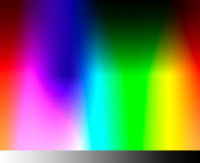
Figure 1: A full spectrum in Adobe RGB 1998.
Absolute Colorimetric Rendering
Absolute colorimetric rendering reproduces in-gamut colors exactly, and clips out-of-gamut colors to the nearest reproducible hue, sacrificing saturation and possibly lightness. From this description, it might sound like you’d always want to use absolute colorimetric rendering, but there are two big problems with this approach.
First, our eyes are highly adaptable to different lighting conditions, and one of the many tricks they play is adapting to different “colors” of white, a phenomenon known as chromatic adaptation. When we judge color, our eyes seek out white, then judge other colors in relation to that white. Our eyes accept a wide range of different colors as white, so the white in the scene we’re evaluating biases our perception of all the other colors (this is one reason why we use standard lighting for proofing, since the color white is greatly influenced by the light source that illuminates it).
Absolute colorimetric rendering tries to reproduce the source white exactly in the target space. If your target space represents a print and there’s a visible paper-white border, an absolute colorimetric print will usually look strange: The white areas in the image will almost always have some color added, but our eye adapts to the paper-white surround, so the image appears to have a color cast.
Second, our eyes are much better at evaluating color relationships than they are at evaluating absolute colors. When you clip the out-of-gamut colors in an image to their nearest reproducible hue, you change the relationship between the in-gamut and out-of-gamut colors, which often destroys the image.
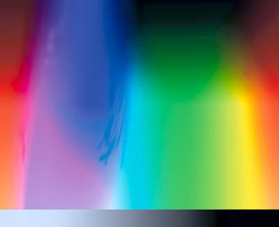
Figure 2: Converted to an inkjet space using absolute colorimetric rendering. Note the discontinuities, particularly in the blue areas, and the apparent color shift on the grayscale.
Absolute colorimetric rendering is mostly useful for proofing, when our proofing device has a larger gamut than the final output we want the proofer to simulate. Since the source space (the final output) has a smaller gamut than the destination space (the proofer), no gamut clipping takes place, and the absolute colorimetric rendering makes the proofer lay down ink in the white areas to simulate the paper color of the final output.
Relative Colorimetric Rendering
The other three rendering intents all translate the white of the source to the white of the output, and shift all the other colors accordingly. Since we usually judge our output in the context of its native white, we almost always want to use one of these three rendering intents that perform white point conversion, unless we’re proofing as described in the previous paragraph.
Relative colorimetric rendering is similar to absolute colorimetric rendering. The only difference is that relative colorimetric scales the white point of the source to the white point of the target. Like absolute colorimetric rendering, it clips out-of-gamut colors to the nearest reproducible hue.
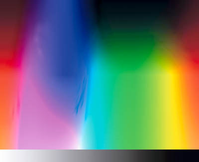
Figure 3: Converted to an inkjet space using relative colorimetric rendering. Again, discontinuities are obvious, but the grays appear more natural.
Perceptual Rendering
Perceptual rendering attempts to compress the gamut of the source space into the gamut of the target space. Exactly how this is accomplished is left to the discretion of the tool used to build the profile, but typically perceptual rendering desaturates all colors to bring the out-of-gamut colors into the target gamut while more or less maintaining the overall relationship between colors. Preserving the relationship between colors helps preserve the overall appearance of images.
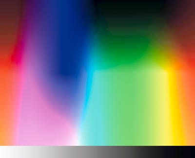
Figure 4: Converted to an inkjet space using perceptual rendering. Perceptual rendering preserves smooth gradients across the colors.
Saturation Rendering
The final rendering intent — saturation rendering — maps the saturated primary colors in the source space to the saturated primary colors in the target space, without bothering about differences in hue, saturation, or lightness. It’s designed for rendering business graphics like pie and bar charts, where we simply want vivid colors and aren’t particularly concerned as to exactly what those colors are.
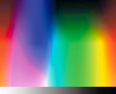
Figure 5: Converted to an inkjet space using saturation rendering, which preserves smooth gradients but shifts the colors.
Which Should You Use?
I’m often asked the question “which rendering intent should I use?” The only sensible answer is that you should use the rendering intent that produces the result you like best. But for most seekers of knowledge, that’s not a very helpful answer.
Conventional wisdom has it that one should use perceptual rendering for natural imagery such as scanned photographs or digital camera captures, and relative colorimetric rendering for vector art such as Illustrator or FreeHand files. As a basic rule of thumb, this isn’t a terrible approach, but it doesn’t always yield the best results.
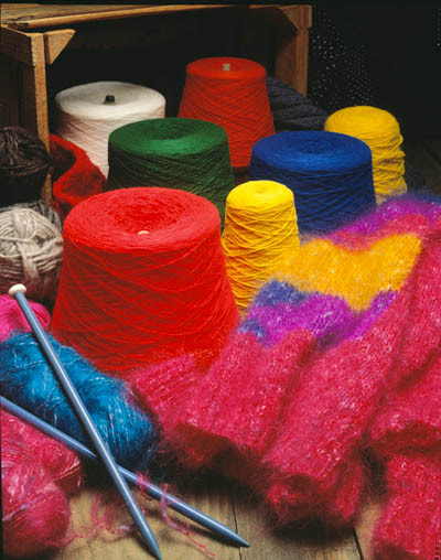
Figure 6a: Original image.
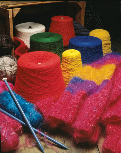
Figure 6b: Converted for a Web press space using perceptual rendering.

Figure 6c: Converted for a Web press space using relative colorimetric rendering. Note the plugged-up detail on the top of the cone of red yarn.
Many photographic images could benefit from a relative colorimetric rendering, rather than a perceptual rendering. Remember, color-management systems know nothing about the content of the image itself; they only know about the gamut of the color space the image inhabits. When you use perceptual rendering, the color management system applies the same gamut compression to all images, even when the image contains no visually or aesthetically significant out-of-gamut colors. For instance, with pastel images, perceptual rendering will apply unnecessary gamut compression, while relative colorimetric rendering may produce a result that’s more faithful to the original.
Figure 7 shows an image converted to the same Web press space as used in Figure 6, again using perceptual and relative colorimetric renderings. In this case, the differences are more subtle, but the relative colorimetric rendering preserves more of the saturation in the water at lower left than does the perceptual rendering, without any obvious clipping of saturated colors.
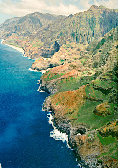
Figure 7a: Original image.
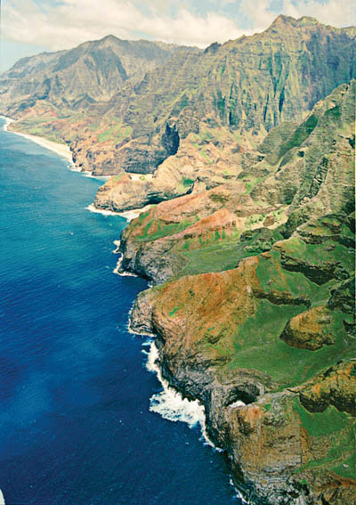
Figure 7b: Converted for a Web press space using perceptual rendering.

Figure 7c: Converted for a Web press space using relative colorimetric rendering.
With vector art, unless you’re trying to reproduce one specific color such as a logo, the same principles apply: If your artwork contains important out-of-gamut colors, relative colorimetric rendering may clip them to the point where they become indistinguishable from an in-gamut color with the same hue. In that case, perceptual rendering would probably produce a better result.
Application Notes
One of the many wonderful new features of Photoshop 6 is that it allows you to see how the different rendering intents will affect your image, as I described in a past column.
Some applications, notably QuarkXPress 4.x, don’t offer any control over rendering intent. In this case, the profile’s default rendering intent gets used. (Almost all output profiles have perceptual rendering set as the default intent.) There’s little you can do about this limitation except to be aware of it, and to manage your color outside XPress wherever possible.
Other applications may use different names for the rendering intents. For example, PageMaker 6.5 calls perceptual rendering “Image,” relative colorimetric rendering “Graphics,” and absolute colorimetric rendering “Colorimetric.” (It doesn’t support saturation rendering.) Fortunately, the trend seems to be to move away from idiosyncratic naming in favor of adopting the terminology blessed by the ICC.
Different Strokes
Choosing the correct rendering intent for the job at hand is one of the essential tasks in making color management work. Look at the relative gamuts of your source and destination: The same image may need different rendering intents for different output process. For example, an image might benefit from perceptual rendering when printed to an inkjet printer, but when the same image is going out to the much larger gamut of a film recorder, relative colorimetric rendering might work much better. If an image doesn’t contain any important strongly saturated colors, you’ll probably get a better result using relative colorimetric rendering than you would using perceptual.
Rendering intents are simply tools. It’s up to you to use them. If you take the trouble to understand what they do and then use them wisely, you’ll produce better color than if you simply accept the default settings of this or that application.
This article was last modified on January 3, 2023
This article was first published on April 4, 2001
Commenting is easier and faster when you're logged in!

Recommended for you
Using Bleed for Print Design
Based on an article originally published in the DesignGeek e-zine. One of the fi...

Photoshop Blur Gallery: Spin Blur
Learn a non-destructive, highly controllable way to apply selective blurs to ima...

Top New Features in Photoshop
A little over a week ago, Adobe rolled out updates for Photoshop, Muse, and the...