


If you liked whiling away the study hours during your college years thinking about whether or not the chair that supported you might really exist, you’ll love contemplating the nature of color: In a very real sense, color is all in our heads. But there are tangible, concrete payoffs to understanding a little color theory, particularly if you care about color management and getting your colors right.
This column isn’t a how-to, with a set of step-by-step instructions. It’s about color itself — why we see color, and why sometimes colors match and sometimes they don’t. In short, it’s about the basic scientific underpinnings of color, and about how we attempt to represent color using numbers, both on and off the computer.
What Is Color?
One of the fundamental truths about color that’s important to understand is that color is something we humans impose on the world. The world isn’t colored; we just see it that way. A reasonable working definition of color is that it’s our human response to different wavelengths of light. The color isn’t really in the light: We create the color as a response to that light, just as we create the sensation of pain when struck by an object. The color brown is no more inherent to a given pebble, say, than is the pain we might feel if that pebble struck us solidly in the forehead.
One corollary of this is that we can’t really measure color itself — our response to different wavelengths of light — just as we can’t measure pain. (Someday we may be able to do so by measuring electro-chemical signals in the brain, but that day seems far off.) When we talk about “measuring color,” what we’re really measuring is not any inherent quality or even our response to various wavelengths of light, but rather the stimulus that creates it — something like measuring the motion and mass of the pebble.
It’s All about the Light
Color is created by the interaction of three elements — an illuminant (a light source), an object, and an observer (the person who experiences the color). We’ll talk more about the observer in a minute; for now it’s most important to understand the relationship between the light source and the object.
When an object appears a given color, it’s because the object transmits or reflects certain wavelengths of light. For instance, though it’s something of a simplification, one can say that an object that appears blue reflects or transmits predominately blue light. The object may be absorbing other wavelengths of light, or the available light may be primarily in the wavelengths we recognize as blue, but the bottom line is that the object appears blue.
The Visible Spectrum
Visible light makes up only a small slice of the electromagnetic spectrum, sandwiched between ultraviolet and infrared. Aside from its wavelengths, it isn’t really different from any other type of electromagnetic radiation: What makes it special to humans is that we have specialized organs — eyes — that happen to respond to wavelengths of electromagnetic radiation within that range, from approximately 380nm to 720nm. Different mixes of visible wavelengths make us see different colors, and if there’s no light, we don’t see anything.
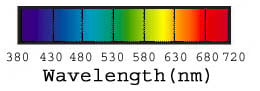
Figure 1: The visible spectrum runs from near ultraviolet at 380nm to near infrared at 720nm.
Spectra
The most accurate method we have of measuring the color behavior of objects and light sources is to record the amount of energy present at each wavelength of visible light. We take such measurements using a spectrophotometer, an instrument that divides the visible spectrum into discrete bands and records the amount of energy present in each one. The spectrophotometers used in the graphic arts and publishing industries typically divide the visible spectrum into 32 bands, each 10nm wide. Instruments with finer gradations –5nm, 2nm, and even 0.5nm — exist, but they are prohibitively expensive for use outside research facilities. When we measure a color sample with a spectrophotometer, we obtain its spectral response curve, which shows how much radiant energy the sample transmits or reflects at each wavelength, represented as a percentage.
Figure 2 below shows the spectral response curves of three samples, which appear cranberry red, forest green, and cornflower blue.
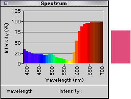
Figure 2a: The spectral response curve for the cranberry red at right
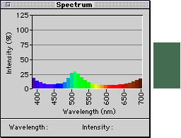
Figure 2b: The spectral response curve for the forest green at right.
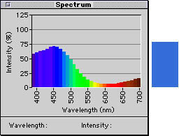
Figure 2c: The spectral response curve for the cornflower blue at right.
Of course, to know what wavelengths of light an object will reflect or transmit, we need to know which wavelengths are present in the light that illuminates the object. We can make the same kind of measurement for light sources that we do for objects, but when we measure a light source, we obtain its spectral power distribution — a fancy way of saying that we know how much energy that light source emits at each wavelength. Figure 3 shows the spectral power distribution of the CIE D65 illuminant, which represents idealized daylight (real daylight varies according to the weather, altitude, geographical location).
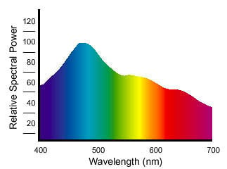
Figure 3: The spectral power distribution of a light source is the amount of energy it emits at each wavelength in the visible spectrum.
Spectrophotometers that measure reflected or transmitted light use their own light source with a known spectral power distribution: In simple terms, we know the spectral makeup of the light source, so we can tell how the object interacts with that light — how much radiant energy it absorbs and reflects at each wavelength.
Spectrophotometers always capture spectral data, but outside of some fairly specialized applications such as formulating inks, plastics, paints, and dyes, we usually don’t interact with the spectral data itself. Instead, the spectrophotometer’s software or firmware converts the spectral data into some other kind of measurement that we can use more easily. Examples include ink density, dot area, and any of several mathematical models that represent human perception (such as the CIE 1931 Standard Observer, which we’ll discuss shortly).
Spectral measurements let us predict very accurately the makeup of the light that will enter our eyes for a given sample (or object) under a given light source. If our eyes behaved like spectrophotometers, the task of matching colors would be in some ways simpler, but in others it would be practically impossible. We’d have to make sure the materials we used to produce color had exactly the same spectral response as the original: A typical scene contains objects with widely differing spectral responses, and it would be practically impossible to produce a set of colorants (inks, dyes, toners, the things we use to make color) that allowed us to precisely match the spectra of each of a multitude of real-world objects. Fortunately, because of the way our eyes work, we don’t have to.
This article was last modified on July 18, 2023
This article was first published on April 25, 2001
Commenting is easier and faster when you're logged in!

Recommended for you

Tip of the Week: Repeating Tabs
There are three new Links panel icons in InDesign CC that you'll see when workin...
How to Turn Off InDesign’s New Welcome Screen
One of the features that recently debuted with the English version of InDesign C...

Illustrator Downloadable: Summer Citrus Pattern Set
Add some zing and zest to your next design with these tasty patterns, symbols, a...