


Peachpit Press is offering this book at a discount to creativepro.com readers. Follow this link.
Stephen Crooks, John Derry, and Donal Jolley all use Painter in their work. But their pieces — a tribute to the spirit of NYC, an homage to artist Wayne Theibaud, and a pair of small town landscapes — couldn’t be more different. Tour the artistic possibilities of Painter.
Stephen Crooks
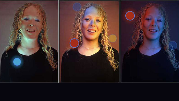
“My goal from the outset was to create these works as a gift of consolation and of healing,” says Stephen Crooks, a New York-based freelance illustrator and designer, when speaking of the series of paintings he created in memory of the tragic events of September 11, 2001. All three works depict the same view of New York City, envisioned at different times in the morning.

5:00 AM captures Manhattan in the pre-dawn hours, and symbolizes the mysterious spirit Crook finds inherent in the people who dwell there.
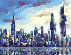
7:00 AM captures the time of day when fragmented sunlight first spills over the city and symbolizes the diversity of New York.

10:00 AM and the sun rises high over New York, bathing the skyline in a heavenly glow, that symbolizes the spirit of the people of New York, undiminished by tragedy.
Crooks created the basis for the rows of buildings, the figures and water in separate source files. Then he imported the elements into a final layout file as separate layers, so they could be repositioned until he was satisfied with the composition.
With each painting, he began with the sky to establish the light source and color theme. Then he worked from background to foreground on each layer of buildings, using a favorite painting technique of diffusing and toning down the color of each receding layer. This method helped to enhance the illusion of atmosphere. To add to the atmospheric perspective, Crooks also decreased the saturation of the colors of the distant buildings using Effects, Tonal Controls, Adjust Colors.
In all three paintings, Crooks combined loose brushwork with hard-edged areas using the Brushes variants from the Ver 5 library. (To load the Ver 5 brush library, choose Load Library from the Brush pop-up menu on the Brushes palette, navigate to the Painter 7 application folder and choose Ver 5.) He blocked in large areas of color using the Loaded Oils, Coarse Hairs and Big Wet Ink variants of Brushes. Then, to move color around, he used the Brushy variant of Brushes (also from the Ver 5 library).
John Derry
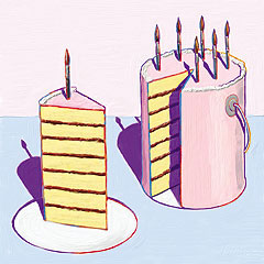
© by Corel Corporation
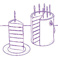
John Derry created Piece of Cake — an homage to the artist Wayne Theibaud — for the promotion of Painter 7, using a variety of tools including Pencils variants, colored shapes and thick Impasto. To begin, he drew a tight, black-and-white sketch using the Thick and Thin Pencil variant of Pencils. In the sketch, he established the shape of each element and the cast shadows. He drew each element on a separate layer, so he could move the elements around as he fine-tuned the composition. (To add a new layer, click the right triangle on the Layers section bar, and choose New Layer from the menu.)
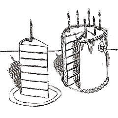
When he was satisfied with the composition, Derry drew a final clean, colored line sketch using a dark purple that would be used later for the shadows and the contour lines around many of the objects in the illustration. With the layered sketch active, he chose File, Clone to create a flattened duplicate of the sketch. So that he could use Tracing Paper, he deleted the contents of the clone canvas by choosing Select, All and pressing the Backspace/Delete key. To activate Tracing Paper, he chose Canvas, Tracing Paper and carefully traced the final shapes of the elements.
Using the drawing as a guide, he drew colored shapes with the Pen tool. The vector-based shapes gave him the capability to finesse the color of individual elements by simply refilling rather than repainting. When the basic color areas were as he wanted them, he flattened the image by choosing Drop All from the menu on the right side of the Layers section bar.
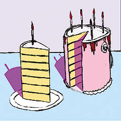
Using a custom Impasto brush based on the Dry Ink variant of Brushes, Derry added the texture of thick brushstrokes to the image. (To sample color from each area, he pressed the Alt/Option key to temporarily change from the Brush to the Dropper tool.) He painted subtle brushstrokes that followed the forms to make contours. For the cake icing, Derry used a modified Gloopy variant of Impasto to dab thick paint in-between the layers of the cake slice and around the top of the cake. Using a small Opaque Flat brush, he also painted varied color on the contour lines around the cake, candles and plate. To add more realism to the paint for the table and wall, he applied more paint in a few areas to build up thicker bristle marks. To complete the painting, Derry adjusted the lighting on the Impasto brushwork so that it would have more subtle highlights and shadows. He chose Canvas, Surface Lighting and reduced the Amount and Shine settings slightly.
Donal Jolley
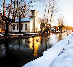
Graphic designer and artist Donal Jolley created Winter Morning (above) and Clay Chapel (below), two of twelve images for the Turning Point 2002 Calendar. To begin the calendar, Jolley worked with his client David Jeremiah to select reference photos. Beginning in Photoshop, Jolley opened the reference photos for Winter Morning (shot by Robert Hayes) and Clay Chapel (taken by Jolley). He removed unwanted elements from the foreground, trees and skies by cloning using the Rubber Stamp tool. To achieve the mood he wanted in each image, he intensified the yellows and oranges in Winter Morning and the foreground greens in Clay Chapel using Photoshop’s Hue and Saturation controls. So that he would be able to isolate areas of the images (for instance, the snow, sky and water in Winter Morning and the truck and church in Clay Chapel), he made selections and saved them as alpha channels. Then he saved the image with its alpha channels in Photoshop format, so he could work on it in Painter.
Jolley planned to use Painter’s brushes for textured brushwork that would add painterly movement to the images and break up the smooth photographic look. Using several layers and paying careful attention to the volume of the forms, he painted with the Artist Pastel Chalk and Square Chalk variants of Dry Media (with a rough paper texture chosen in the Papers section of the Art Materials palette). When he wanted to constrain paint to a particular area of a layer (such as the sky), he loaded a selection based on the alpha channel he had saved for that area by choosing Select, Load Selection and choosing it in the Load From menu. Then he painted within the area. When he wanted to sample color from the layers below, he enabled Pick Up Underlying Color in the Layers section. To blend and pull color while adding texture in the sky, he used the Grainy Water variant of Liquid. To achieve a “salt” effect on the water reflections in Winter Morning, he used the Fairy Dust variant of the F-X brush. Then he added final colored details to the snow, church and water with a small Artist Pastel Chalk.
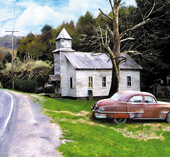
For Clay Chapel, Donal Jolley used Watercolor brushes in addition to the Dry Media and Liquid variants. Jolley appreciates the flexibility of painting on layers. When he wants to make changes to an area he often paints the changes on a new layer, so he can control the strength of the effect using the Opacity slider in the Layers section. After establishing the overall brushwork using the Square Chalk and Artist Pastel Chalk variants and blending with the Grainy Water variant, he painted transparent watercolor glazes onto the old car to enhance the look of the rusty metal. He also added light watercolor washes on top of the pastel brushwork on the midground trees, then painted texture on the foreground grass and road using the Splatter Water variant of Watercolor.
When the brushwork on Winter Morning and Clay Chapel was complete, Jolley added more texture as follows: First he saved a copy of each image using a different name and flattened the layers in the copies by choosing Drop All from the menu on the right side of the Layers section bar. Next, he made two duplicates of each image by selecting all (Ctrl/Command-A) and Alt/Option-clicking with the Layer Adjuster. On the top layer, he used Effects, Surface Control, Apply Surface Texture, Using Paper, also with subtle settings to add paper grain. On the next layer, he used Effects, Surface Control, Apply Surface Texture, Using Image Luminance, with subtle settings, to “emboss” the brushstrokes. Then he adjusted the Opacity of both layers to his liking, using the slider on the Layers section.
He saved a duplicate of each of the final layered Photoshop format files in TIFF format, which flattened the images. Because Jolley was more familiar with color correction and conversion in Photoshop, he opened both final TIFF files in that program, made color adjustments and then converted the images to CMYK for printing in the calendar.
“The Painter 7 Wow! Book,” copyright 2002 © by Cher Threinen-Pendarvis, is published by Peachpit Press. For a list of bookstores that carry Peachpit Press and Adobe Press titles, call (800) 283-9444 or order online at www.peachpit.com.
This article was last modified on March 14, 2022
This article was first published on November 27, 2002
Commenting is easier and faster when you're logged in!

Recommended for you

The Excuse Moose
Some creative blöks are easily side-stepped or avoided, such as the Perfection F...
ClipDrop Review
ClipDrop offers a range of high-powered and occasionally unique solutions to eve...

Scanning Around with Gene: Barbecues, Bar-B-Ques, or BBQs — We Love 'Em All
The New York Times recently ran an article called “Pimp My Grill” ab...