
Photoshop How-To: Make a New Image Look Old
In this technique, we’ll show how to take a crisp, clean vector image, place it onto an old weather-beaten surface, and make it appear as if it had been there for years. While we’ve seen different variations on this technique before, we’ll put our own “down & dirty” spin on it.
STEP 1
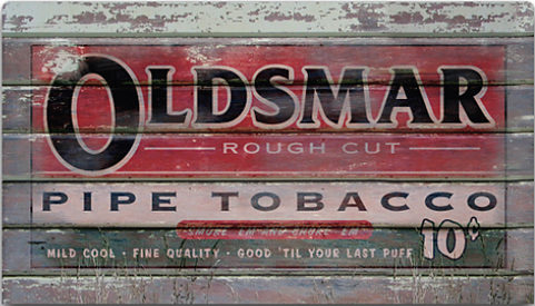
You’ll need two images for this technique: a sign, poster, or image that you want to appear old and weathered and an old building or wall that contains some texture (wood planks, bricks, etc.). See Figure 1.
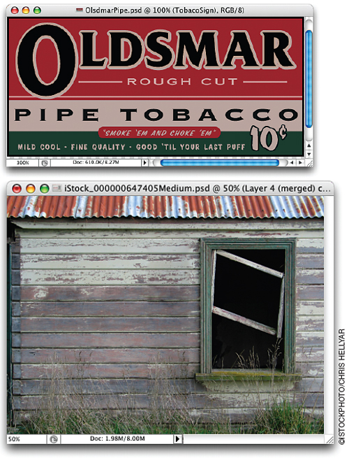
Figure 1
STEP 2
Open both images. Choose the Move tool (V) from the Toolbox, then click-and-drag the sign onto the image of the old building. Press Command-T (PC: Control-T) to bring up Free Transform and resize and reposition as needed (Figure 2). Press Return or Enter to apply the transformation.
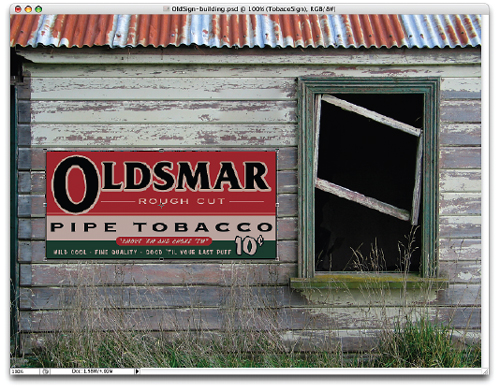
Figure 2
STEP 3
Choose the Rectangular Marquee tool (M) from the Toolbox. Make a horizontal selection over one area where the wood planks meet (Figure 3). Hold the Shift key and drag over other sets of wood planks, to add multiple selections as shown.

Figure 3
STEP 4
Choose Select > Feather to bring up the Feather Selection dialog, enter 2 pixels, and click OK (Figure 4).
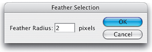
Figure 4
STEP 5
Press Command-L (PC: Control-L) to bring up the Levels dialog. Move the Highlight Output slider (the white one at lower right) toward the left to darken the selected areas (Figure 5). Click OK to close the dialog and then press Command-D (PC: Control-D) to deselect.

Figure 5
STEP 6
Change the layer Blend Mode (of the sign layer) to Overlay and lower the Opacity to 85% (Figure 6).
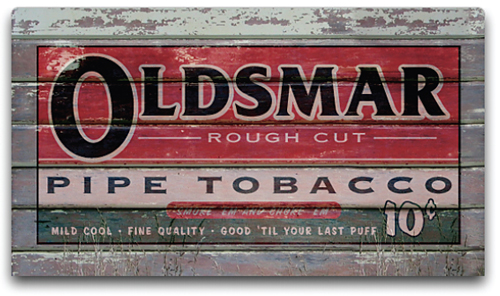
Figure 6
STEP 7
Choose the Eraser tool (E) from the Toolbox. Click on the Brush picker up in the Options Bar and choose Spatter 39 pixels. Lower the brush Opacity (in the Options Bar) to 20%. Now, erase away areas from the sign to give the illusion of that weather-beaten, wear-and-tear look (Figure 7).
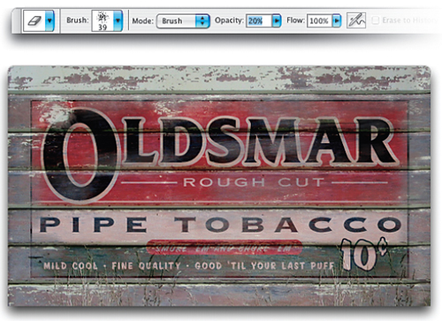
Figure 7
You definitely want to erase some of the edges, but don’t forget to erase some larger areas on the inside of the sign, especially over some of the text area. Follow the existing wear spot of the original building image as a guide.
Scott Kelby is co-founder and editor-in-chief of Layers magazine, editor of Photoshop User magazine, and president of the National Association of Photoshop Professionals. He is also author of the bestselling books The Photoshop CS2 Book for Digital Photographers and Photoshop CS Down & Dirty Tricks.
This article was last modified on January 3, 2023
This article was first published on April 10, 2006
Commenting is easier and faster when you're logged in!

Recommended for you

Super Simple Swatch Creation from Hailpixel
For a new and easy way to experiment with color and generate swatches, check out...
Batch Process Images with PhotoBulk
If you work on a Mac and regularly have to process images to size, optimize, or...

Turn a Photo into a Planet Using Photoshop
We’re all familiar with panorama photography, and you may have used Photos...