
Photoshop Tips: Duotone vs. Multichannel Images

A great way to save on your printing costs is to use two inks instead of four. You can also produce some incredibly striking images, and some cool effects, for print, Web, and artistic purposes. But which color mode is right for your project, Duotone or Multichannel? Let’s do a comparison.
Duotone color mode takes a grayscale image and adds an accent color. If you’re starting with CMYK or RGB, you’ll have to use the command Image> Mode> Grayscale first. You can then access Image> Mode> Duotone. Duotone, by the way, is sometimes used as a generic term that also covers monotone (one color), tritone (three colors), and quadtone (four colors). You choose your colors in the Duotone dialog box (see Figure 1).
 Figure 1
By clicking on a color swatch you open the Color Picker. Typically when creating a Duotone, you’ll find using Custom colors simpler. When the Color Picker opens, click on the Custom button. Select the type of ink from the pop-up menu (dependent, of course, on your print job’s specs), and choose a color. In this example, we’ll create a sepia look by using Pantone Process Yellow (see Figure 2). (To the left of the color swatch is the Duotone Curve button. We’ll explore what you can do with this option later.) The Overprint Colors button at the bottom is used primarily with tritons and quadtone images. It gives you control, to some degree, over how inks will interact. Note that you can re-open the Duotone dialog box at any time to make changes by simply using the command Image> Mode> Duotone.
 Figure 2
When we compare the grayscale and duotone images, you can see that Photoshop has changed the hue of all the pixels, rather than perhaps just adding some colored accents (see Figure 3).
 Figure 3
Let’s look a little more closely, using Color Samplers and the Info palette (see Figure 4 and 5).
 Figure 4
 Figure 5
When comparing the two Info palettes, notice first that the duotone’s color values are shown as “1” and “2,” which represents the inks selected in the Duotone dialog box. Next, notice that the black percentages for each spot are unchanged — Photoshop simply added an equal amount of the second color to the pixel’s color value.
Now let’s look at the Channels palette to see what a duotone is actually all about (see Figure 6).
 Figure 6
You’ll see that there is but a single channel, despite the fact that we’re using two colors in the image. In Photoshop, rather than controlling the placement of ink by editing a color channel, we use the Duotone Curves dialog box (mentioned earlier). Open the dialog box by using the menu command Image> Mode> Duotone, then clicking on the box to the far left of the ink you want to edit (see Figure 7).
 Figure 7
If you work with Photoshop’s Curves adjustment (Image> Adjust> Curves), this box will look somewhat familiar (see Figure 8). The diagonal line represents how much ink will be placed at given color values. Think of it as a grayscale continuum, ranging from white to black. By default, the ink is distributed proportionally for each pixel value, from 0% to 100%.
 Figure 8
You can change values by clicking and dragging on the line or by entering numbers in the fields. Let’s see what happens when we make some adjustments (see Figures 9-12).
 Figure 9
 Figure 10
 Figure 11
 Figure 12
As you can tell, you have a great deal of control over how the ink is distributed according to pixel value. Re-opening the Info palette shows what actually happens to the pixels’ colors (see figure 13).
 Figure 13
Notice that Ink #2 (black) remains unchanged. The first ink, however, is altered in direct relationship between the percentage specified in the Info palette and the value you assign in the curve. The percentage of ink shown in the Info palette corresponds directly to the percentage in the curve.
One further note on the construction of duotones: You are not limited to “black and another color.” You can use any two colors you desire (see Figure 14).
 Figure 14
You can also extend the tonality of a grayscale image by using black and a supplemental gray ink (see Figure 15).
 Figure 15
Note that Photoshop let’s you save duotone images in a limited number of file formats (see Figure 16).
 Figure 16
Next we’ll explore the Multichannel color mode.
This article was last modified on January 3, 2023
This article was first published on July 10, 2003
Commenting is easier and faster when you're logged in!

Recommended for you
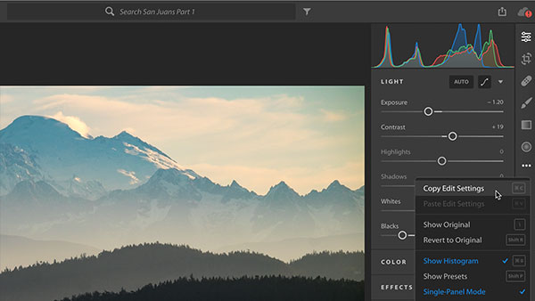
Four Under-the-Radar Lightroom CC Features Worth Knowing About
Adobe’s new Lightroom CC application is a streamlined sibling to Lightroom Class...

Creating a Pop Out Effect with Photoshop and InDesign
At the 2016 InDesign Conference in Washington, D.C., Nigel French reminded me of...
Creating a Blend Mode Test Layer in Photoshop
Blending Modes use a top layer to change the appearance of the layer, or layers...