

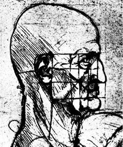
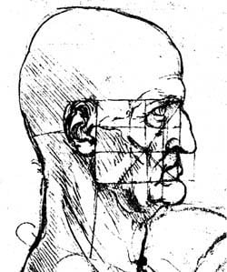
As a professional graphic artist you know you need high-quality source images to achieve high-quality scans. Unfortunately, many of the clients you may encounter will be unable to grasp this simple truth. In fact, clients routinely break this cardinal rule by submitting bad photos, damaged drawings, or tearsheets — pages that have literally been torn from books, brochures, and magazines — as original art and expect you to work miracles on their line-art logos.
Of course, the best solution is to educate your clients and encourage them to acquire reproduction-quality line art. But the truth is that we are all slaves to deadlines. When you find yourself in a pinch, you may have to resort to the following workarounds to get the job finished on time — assuming your client is not breaking any copyright laws, of course. These three quick tips represent the most common scanning problems you’ll encounter when working with line art. You’ll be surprised at how much you can improve the quality of your black-and-white images by tweaking them both during and after the scanning process.
Compensating for Low Contrast
Logo art and line drawings with little contrast between foreground and background can be difficult to scan. A multitude of factors contribute to low contrast, including tinted backgrounds, textured paper, and generational degradation (when you’re stuck with a copy of a copy of a copy). You may even find that the lines in a pencil sketch or technical blue print are just not dark enough.
You can compensate for low-contrast originals by adjusting the threshold value in your scanning software. In line-art mode, your scanner uses the threshold setting to determine whether a dot should be pushed to white or black. Lower threshold settings generate scans that interpret more dots as white, and higher threshold settings produce scans that push more of the dots to black.
Here’s the important point: You can change the threshold setting to distinguish the background’s tonal value from that of the foreground — to define the foreground while filtering out the background. It really doesn’t matter how small that difference is between the two, how low the contrast may be in the original art. If you’re getting too much noise, reduce the threshold setting; if the image is too light — if you’re losing foreground — increase the threshold. Once you’ve determined the correct cutoff point, the scanner will produce a useable line art image.
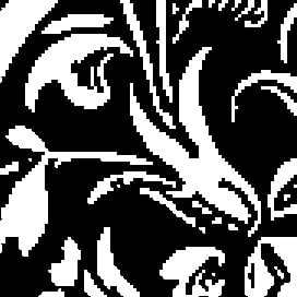
In Figure 1 the original image exhibits extremely low contrast, with some of the "black" lines having a gray value of 70 and some portions of the background having a gray value of 85. As you can see, using the default threshold setting of 128 (which is halfway between the RGB values of 0 and 255) produces a scan filled with artifacts. By lowering the threshold setting to 75, we were able to produce a much cleaner line art scan that would require only minimal manual editing (Figure 2).
This technique also works well for line art containing overly thin or thick lines. If thin lines are breaking up when you scan, increase the threshold to force more of the pixels to black. If thick lines are plugging up when you scan, decrease the threshold to force more of the pixels to white.
One word of warning: Some scanner software implements a brightness setting instead of a threshold adjustment. Brightness settings work in exactly the opposite manner: Higher (or brighter) settings produce scans that push more dots to white; Lower (or darker) settings produce scans that interpret more dots as black.
Dealing with Show Through
Documents printed on thin paper — such as newspapers or magazines — can be difficult to scan because the semi-transparent paper allows text and pictures from the opposite side of the sheet to show through. Scanners pick up this show-through as noise, or random dots. Luckily, there’s a simple, non-technical solution that is also very effective.
Simply place a sheet of black construction paper behind the page you want to scan. This will block light and make the overall tone of the page a darker shade of gray, and so it will mask the random noise. Then, using the technique described above, lower the threshold setting (or increase the brightness) to push the background color to white.
Enlarging Line Art
As a general rule you should always return to the original art and rescan it if you need to change the resolution or size of a line-art image. However, there are a handful of legitimate reasons for enlarging a black-and-white line-art image using an image-editing program instead: For example, your client may have submitted a small piece of original art that must be both enlarged for design purposes and scanned at high resolution for the output device — a double whammy that can exceed the capabilities of a desktop scanner. Worse, the client may already have scanned a poor-quality original and given you a degraded raster image to use.
Never increase image size using your image editor when the picture is in black-and-white line-art mode. Doing so increases the size of each individual black dot and creates aliased, jagged edges. Figure 3 illustrates this effect, showing the classic staircase pattern that is introduced when you resize monochrome images.
To avoid such problems, use the resampling function of your favorite image-editing program. Resampling functions — which are usually available through the Image Size command — create new data (or dots) by averaging the gray values of adjacent dots. So in order to take full advantage of the resampling function you must either scan or convert the black-and-white line art into a grayscale image.
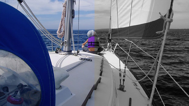
Once you’ve converted the image into grayscale mode, use an image-editing program (such as Photoshop) to increase the size and/or the resolution of the image. The resampling function will anti-alias the edges of the picture — meaning that it will create intermediate shades of gray to maintain the illusion of smooth edges. We produced Figure 4 by resizing the image after converting it to grayscale.

If you are planning to print the image, you can discard the grayscale information after you have resized the image, and use high-resolution black-and-white data instead. You should use the Threshold or Levels command in Photoshop to control which dots are pushed to white and which dots are pushed to black.
On the other hand, if you are planning to display the image on screen, leave it in grayscale mode. Simply stated, black-and-white line art is unsuitable for display on a monitor. At the low resolution of 72 dpi typically used for on-screen graphics, black-and-white line art will always exhibit jagged, aliased edges. Leaving the image in grayscale mode takes advantage of anti-aliasing, where differing shades of gray maintain the illusion of smooth edges.
Putting It All Together
These techniques all have a fudge factor, meaning that if you look very closely at the final images you will still be able to discern little visual glitches. But you can usually achieve an acceptable level of quality using these little tricks, and meet your deadlines and preserve your sanity in the process.
Read more by Luisa Simone
This article was last modified on January 3, 2023
This article was first published on June 28, 2000
Commenting is easier and faster when you're logged in!

Recommended for you
Free Scripts to Convert Color Images to Grayscale
While creating a series of presentation templates for a client, I hammered toget...
Getting Creative with Corners in InDesign
Overcome InDesign's limited set of corner options by mixing and matching them.

Linotype Pays Tribute to its Home Town
The Mayor’s Office has declared July 18–24 “Type Week,” in hon...