
I’m perhaps a bit late with this topic, seeing how the recent elections are finally over, but I thought it might be fun to see how some past candidates for public office promoted themselves. It seems that not that much has changed, though you could argue the graphics have gotten a bit more sophisticated.
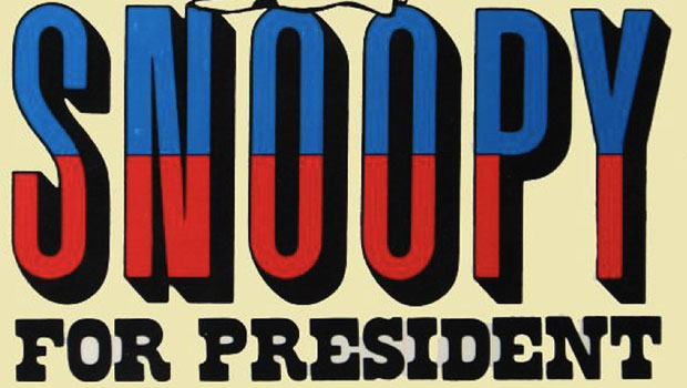
These days you still see most of the basic campaign promotions – buttons, bumper stickers and posters. And large-scale graphics have had a big impact on campaigns as well. Everywhere you look these days it seems there are very large signs and stage-backdrops, but even those are nothing new. I’ve included a variety of images today, many from the Library of Congress collection and a few from various online sources. Some are “official” campaign materials, and others are independent – produced by outsiders to promote their candidates. And just for fun, I’ve included a few fictional or joke candidates in the mix. Click on any image for a larger version.
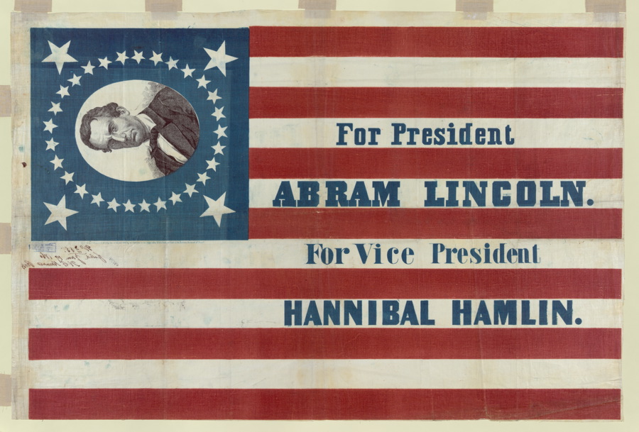


Of course the emphasis in campaign materials is on the candidate, so you almost always get a photograph or illustration of that person, front and center. As you’ll see, Barack Obama wasn’t the first to use highly stylized imagery.


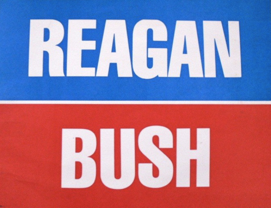
And there is no doubt the predominant color theme for election material is red, white and blue, which I guess makes sense, but I do have to say I really like it when candidates veer from this cliché.


I think it’s key for candidates to have a variety of campaign materials so people don’t get too sick of seeing the same image over and over again, but of course the efficiency of large print quantities and the control that comes with consistency is very appealing to a campaign.


These days most everything is offset printed, so material looks pretty slick, but in the past it was very common to see campaign materials that were screen printed, or even hand made, giving them a quite-different look.


I can’t say I’ve noticed any patterns that distinguish winners from losers when it comes to campaign materials, though it does seem most of the winners have pretty straight-forward graphics.


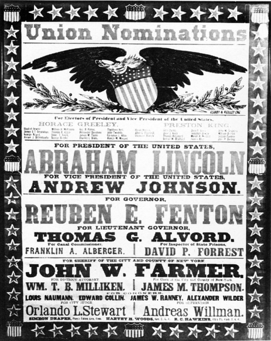
In recent elections most candidates have a logo – not just type – to promote themselves. This is relatively new, though the choice of typeface in the past did say something about the individual candidates. I’m sort of over the logo-look and wish we’d return to more basic poster layouts – I’m voting for a candidate, not a bar of soap.
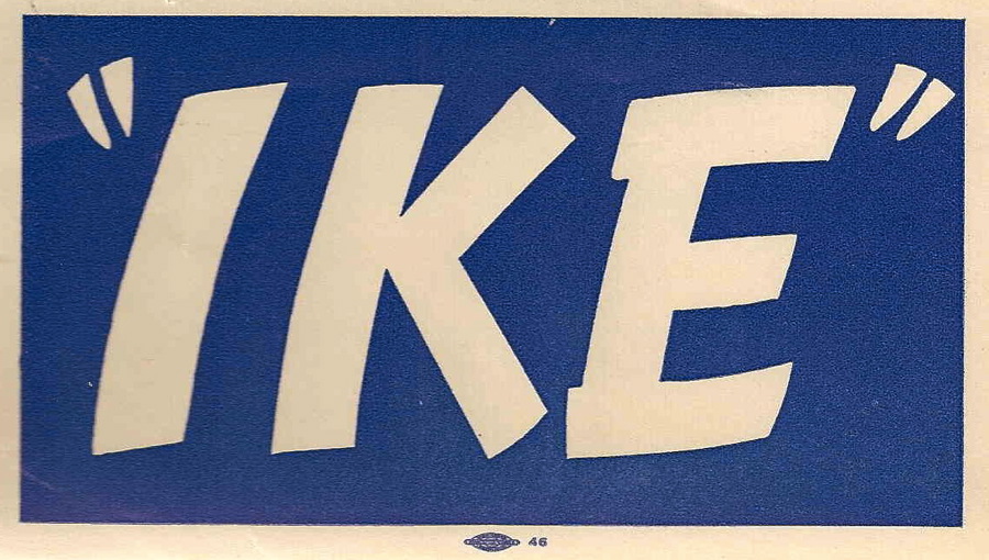

Most candidates are shown smiling, though that isn’t the case for the older posters – I’m not sure why people didn’t smile as much back in the early days of photography and illustrations. Maybe they felt it was unsophisticated.


I’m really glad the current round of elections are over – I was getting very tired of seeing so much of the candidates, even the ones I support. I’ve often thought it would be fun to design a campaign look, though it is certainly hard to avoid some very obvious clichés. But then in some ways that’s what elections are all about – saying the same thing over and over again until everyone is sick of it!
This article was last modified on February 28, 2021
This article was first published on November 9, 2012
Commenting is easier and faster when you're logged in!

Recommended for you

Replace InDesign CS3’s Welcome Screen Offline Logo
Okay, this falls into the category of “nearly-useless-but-fun InDesign tri...

dot-font: A Type Champion Medals in Leipzig
dot-font was a collection of short articles written by editor and typographer Jo...
Working with OpenType-SVG Color Fonts
Calling all color fanatics and lovers of fonts and fun!