

My favorite type era is definitely the Seventies, which I’ve written about before here and here.
It’s not just the popular styles of the era that I like, but the way type was set back then seemed, well, different. For one thing, type tended to be set much tighter than it is today, with letter spacing a rare exception, and overlapping characters more the norm.
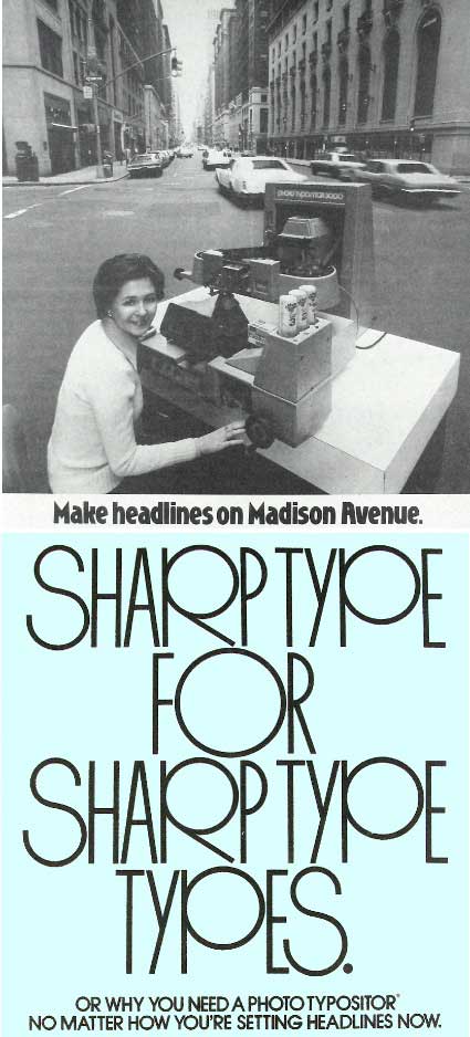
And because much of the display type was set by hand either on a machine like the PhotoTypositor, or by using dry-transfer lettering, graphic designers were more experimental, looking at each character as a distinct piece of the puzzle. And even though with OpenType we now have more potential for alternate characters, they are rarely used these days. In the Seventies, swash characters and other alternates were very popular and were a way for a designer to put a distinct mark on how the words were set. Today’s images pick up where we left of last week and all come from various issues of Better Homes and Garden magazines dated 1970 to 1974. I’ve thrown in a few images just for fun to capture that Seventies style. Click on any image for a larger version.


Of course the Seventies were a colorful decade on many levels – men wore moustaches, women wore peasant dresses, sideburns were all the rage and appliances came in Harvest Gold and Avacado.


And type tended toward the big, bold and ornate. Here are two of the more popular styles of the time, Pump and Revue. Note the way the designer connected the lower case d and the upper case R. This kind of customization was easy when using dry transfer type and a Rapidograph pen.


Of course many styles popular in the Seventies were designed in previous decades, but thanks to distribution by companies like Letraset, they became more widely available then, so they got used more. Bookman swash is a great example. It was everywhere there for a few years.


And more ornate Sixties and Seventies-style designs were trendy, like Octopus Shaded, ITC Neon and ITC Pioneer.


Designers were experimenting more with type effects, too, which were not that easy to achieve back then, but hand-modifying type was not that unusual. People do that now in Illustrator and Photoshop, I suppose, but it isn’t quite the same.


There wasn’t anywhere near the selection of type we have today back then and when a design became popular, it was often over used quickly. That was certainly the case with Souvenir, Serif Gothic and Busorama.


You can see that type tended to be set very tight back then, with characters often touching or even over lapping.


I suppose it’s because I first learned about type during this period (well, it was actually a few years later in the late Seventies) that endears it to me, but I still prefer my type set tightly and I love to throw in an alternate character every now and then. I miss the choices we had for that sort of customization.
Got any favorite Seventies type styles? Chime in and let us know.
This article was last modified on April 20, 2023
This article was first published on June 14, 2012
Commenting is easier and faster when you're logged in!

Recommended for you

J2SCatalog: Automatic Document Generation in InDesign CS
J2S is pleased to announce the release of version 1.2 of J2SCatalog, a plug-in f...
What Font Is This?
It’s a common problem: You open an old file and QuarkXPress reports that a...
Extensis Announces Mac OS X 10.5 Optimization Update for Suitcase Fusion
Extensis, a division of Celartem, Inc., today announced Suitcase Fusion 12.1.7,...