

Fonts.com recently released the following typefaces:
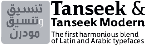
Tanseek from Monotype Imaging:
The Tanseek typeface family is the first “system” of its kind designed purposely to combine “serif” and “sans serif” faces to achieve a balanced, visual relationship between the Latin and Arabic alphabets. It brings harmony between Arabic and Latin-based texts, across serif and sans serif styles in a variety of weights to provide a rich typographic palette for graphic designers.
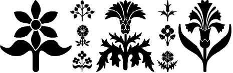
Blooming Ornaments from Gerald Gallo:
The Blooming Ornaments font was inspired by patterns of the Middle Ages. There is an assortment of 47 ornaments located under the traditional character keys. These ornaments are sure to add charm and interest to any project.
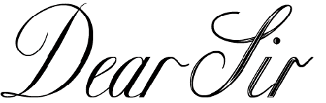
Copper from Classic Font Company:
The Copperplate Set is a series of fonts that can be used to produce letters and documents that replicate 19th century scripts. The set contains two families, the Copper and Classic designs, and a suite of decorative headers and footers called Decor. The Copper typefaces are based on copperplate handwriting that would be produced by using a split-nib pen. Classic which is based on engraved lettering, has a more precise flavor. Both families have many extra glyphs and alternate characters that enhance the feeling of hand lettering.
Elephantmen from Comicraft:
Worn and torn, dry and cracked, resistant to wind and rain, the skin of the elephant is a thing of dry beauty and ancient wisdom. During the gold rush, the phrase “Seeing the elephant” became synonymous with the high cost of each prospector’s dreams and hopes. Like the circus elephant, gold was an exotic sight, and seeking it was an unequalled experience – the adventure of a lifetime. Now Comicraft has created Elephantmen, a font based on the design found in the pages of the comic book of the same name.

Jesaya from Typodermic:
The Jesaya typeface’s crisp shapes put a sharp new face on whatever you have to say. Shaved corners prevent typographic injury while seven weights (from Ultralight to Heavy) give Jesaya range. This is a family of fonts that will not gather dust on your hard drive.

Amitale from Bergsland:
Amitale Book, from David Bergsland, is a new family intended for text composition. It is part of his continuing effort to create typeface families that are easy on the eyes in text composition. Based on Bergsland’s earlier sans serif design, Brinar, Amitale benefits from bracketed serifs that augment the reading process. In addition to a complete complement of standard characters, Bergsland has also graced Amitale with many new OpenType® features.
This article was last modified on December 17, 2022
This article was first published on October 10, 2008
Commenting is easier and faster when you're logged in!

Recommended for you
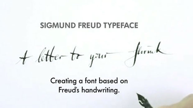
Freudian Glyphs: The Sigmund Freud Typeface
Let’s “kick” off the week with a cool new font-related Kickstarter project. This...

TypeTalk: The Ins and Outs of F-ligatures
F-ligatures are special characters found in just about every professional font....

TypeTalk: Trending Fonts
Looking back at the past year’s most popular font offerings is a good way to vie...