*** From the Archives ***

This article is from January 6, 2011, and is no longer current.

Starbucks Sets the Mermaid Free

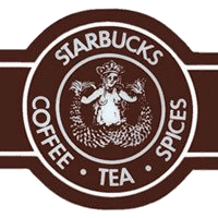
Did you know that Starbucks Coffee is just two months’ shy of turning 40? People change quite a bit in four decades, and so has the coffee giant’s logo. (See https://en.wikipedia.org/wiki/Starbucks#Logo for a quick history.) This was the original mark:

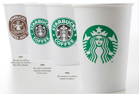
And this is its evolution, ending with the logo that will be in the company’s many stores in March of this year:

As the Gap fiasco showed, tweaking a logo is risky business. A critical public is apt to tear apart the efforts of even the most successful identity designers. Starbucks acknowledged this by posting a video on its site in which CEO Howard Schultz explains the logo’s evolution:

Schultz says that by dropping the words “Starbucks Coffee” from the logo, the company gains the “freedom and flexibility to think beyond coffee.” I can’t even imagine what it will try to dominate next.
What do you think of the new logo? Click the word “Comments” to join the conversation.

  • Terri Stone says:

    I think it’s a successful evolution. But then, I’m just happy they didn’t call the place Peqod (https://en.wikipedia.org/wiki/Starbucks#Founding).

    Terri Stone
    Editor in Chief, CreativePro.com

  • Anonymous says:

    It looks to me like all they’ve done with each successive change is to zoom in closer and closer to the Mermaid’s face. Because the brand is so well known, they can simplify, simplify, simplify, and still be easily recognizable.

    Removing the word “coffee” is so cliche, though. The major brands have been doing this for decades now. They remove all traces of “product” so the brand can stand for the only thing really care about… PROFITS! Yes, I’m a bit cynical.

    Ken Hutchinson
    Graphic Designer

  • Anonymous says:

    All I can think of now when I see the logo sans the Starbucks name is “tuna”. :(

  • Anonymous says:

    Personally I identify their “brand”, be it coffee or otherwise, by the text surrounding that image… just having the mermaid image alone people will say “which company is that?” They could have just filled in that inner circle with anything and left the circle text, and people would still know right away who it is. Just my 2 cents. Off to Dunkin’s now ;-)

  • Anonymous says:

    That’s why one goes into business, after all. We demonize the oddest things in this country… but none more absurd than the stigma we seem to attach to being successful. Maybe if more folks put as much energy towards being successful as they put towards loathing those who are, we’d be in a better position.

    As for the logo, I think they are being very presumptuous to assume that their logo iconography is strong and recognizable enough to stand alone without accompanying text (a la Nike, Apple, etc.). While this may be true to folks who are already customers, I don’t feel that would apply to those who don’t spend $6 a day on a venti something-or-other.

    Which would not be me, I find their coffee to be pretty darn lousy.

    My $0.02, adjusted for inflation.

  • Anonymous says:

    Not a big fan of Starbucks -though I must admit Christmas isn’t the same if I don’t get a chance to guzzle one of their gingerbread lattes! But I always liked their logo.

    I think the change is all right – it keeps what appealed to me in the old brand and loses what was ‘meh’. I might grab a t-shirt or mug with the wordless brand where I wouldn’t have with the old imprint.

  • Anonymous says:

    The Starbucks logo that I identify is the green donut with type Starbucks inside. I don’t even recognize the fish, I mean, mermaid.

  • Anonymous says:

    “We demonize the oddest things in this country… but none more absurd than the stigma we seem to attach to being successful.”

    I never said there is anything wrong with being successful. I just don’t believe that profit should be the ONLY thing that matters. Maybe this wasn’t the place to say that, but let’s face it, Starbucks is pretty shameless about squeezing every last drop out of the people they call customers.

    Ken

  • Anonymous says:

    Why simplify your icon logo when it is as beautiful as the original. They might as well have gone the acronym route and called themselves SCTS. Doesn’t that sound appetizing? I feel that an older, more detailed logo like they had tells the story of quality and service that has stuck around for a very long time because their product is the best on the market.

  • Anonymous says:

    I’m not sure I like it. I want to think of a warm, inviting, and cozy place when I think of coffee shop and I think that Starbucks has done that with it’s interior space and the past logos evoke more of that feeling, but this logo does not say that to me at all. It’s cold, and the brighter green adds to that coldness.

  • >